Onboarding
Overview
One of Handshake’s products is Handshake Direct Mobile, which is an app that enables the buyers of manufacturers and distributors to place orders on their own time without needing a sales rep present. For example, a convenience store owner would be able to order a candy that has just sold out without needing to contact their rep from the candy distributor by using Handshake. Handshake Direct Mobileallows buyers to place orders more frequently and with ease, and therefore increases sales for the manufacturer and distributor.
Currently, Handshake Direct Mobile exists only as an iOS app. I joined Handshake just before we started working on the Android version of the Handshake Direct Mobile app, which we were designing from the ground up, so it was an opportunity to rethink the user experience and visual design of the app completely.
We conducted a ton of user research by having calls with existing Handshake users and internal stakeholders, held a team offsite to kick off the project, and got started on the redesign. One takeaway from this research was that Handshake can do more to make HSDM roll-out, training, and onboarding easier, so the onboarding experience was one that we knew could use some work.
Initial Wireframing
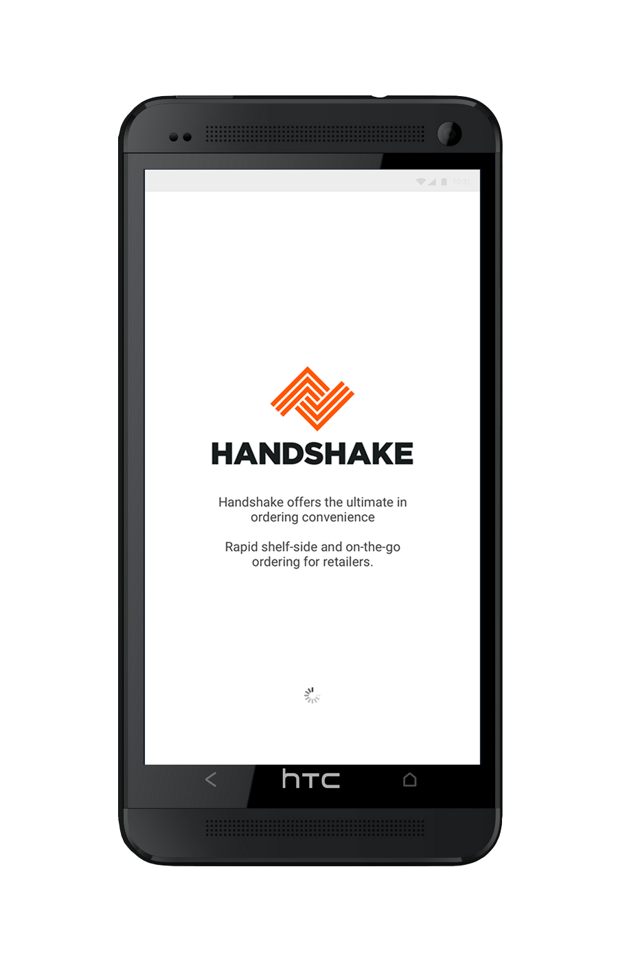
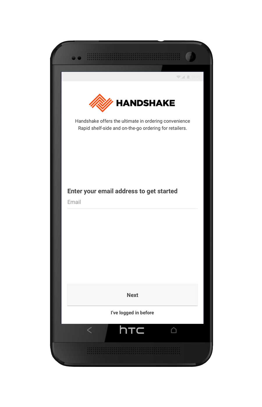
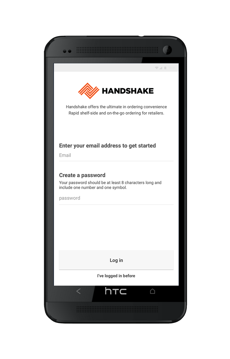
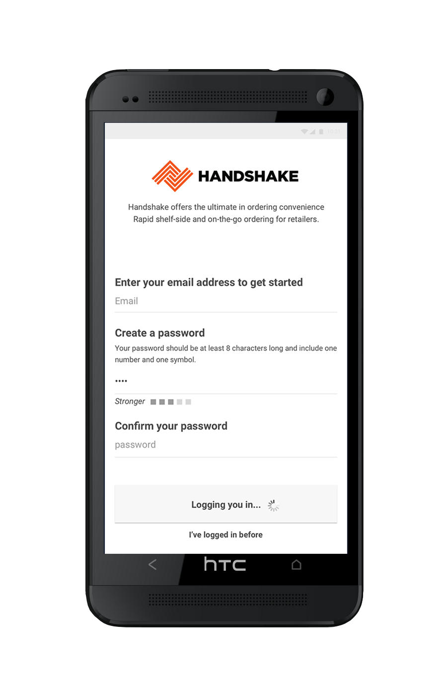
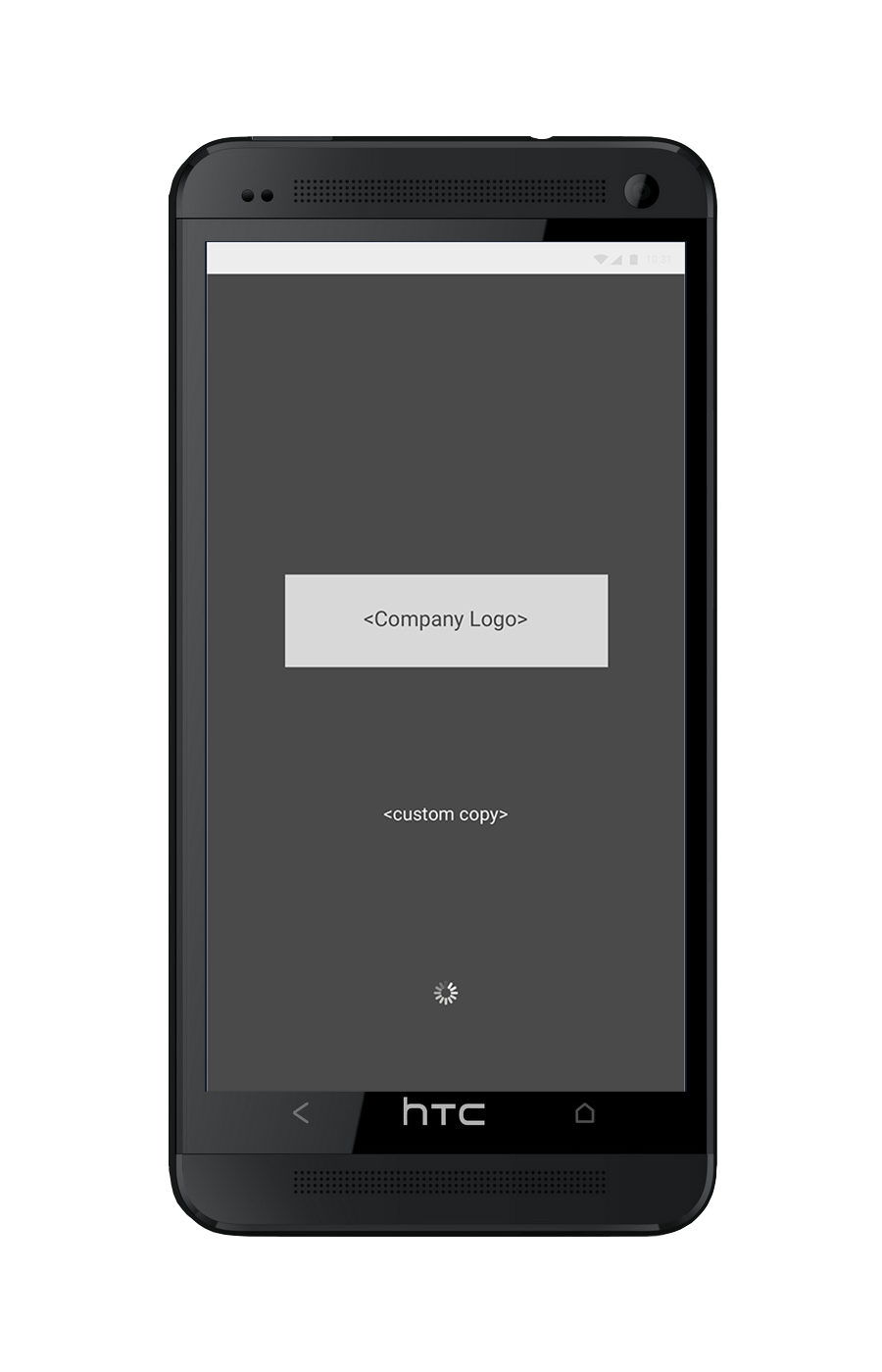
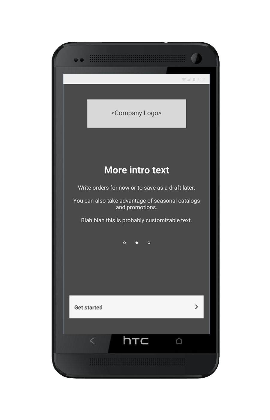
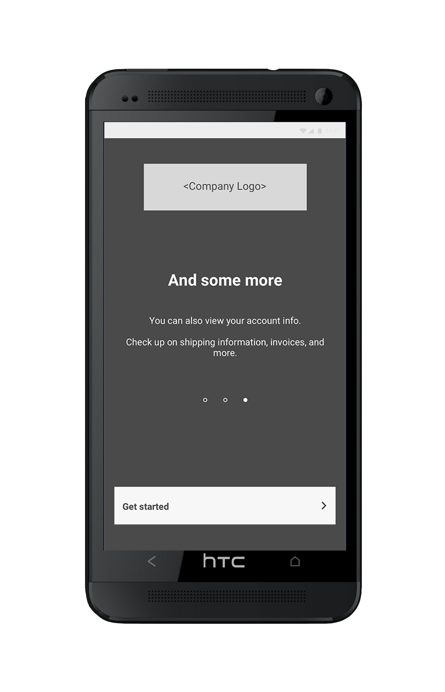
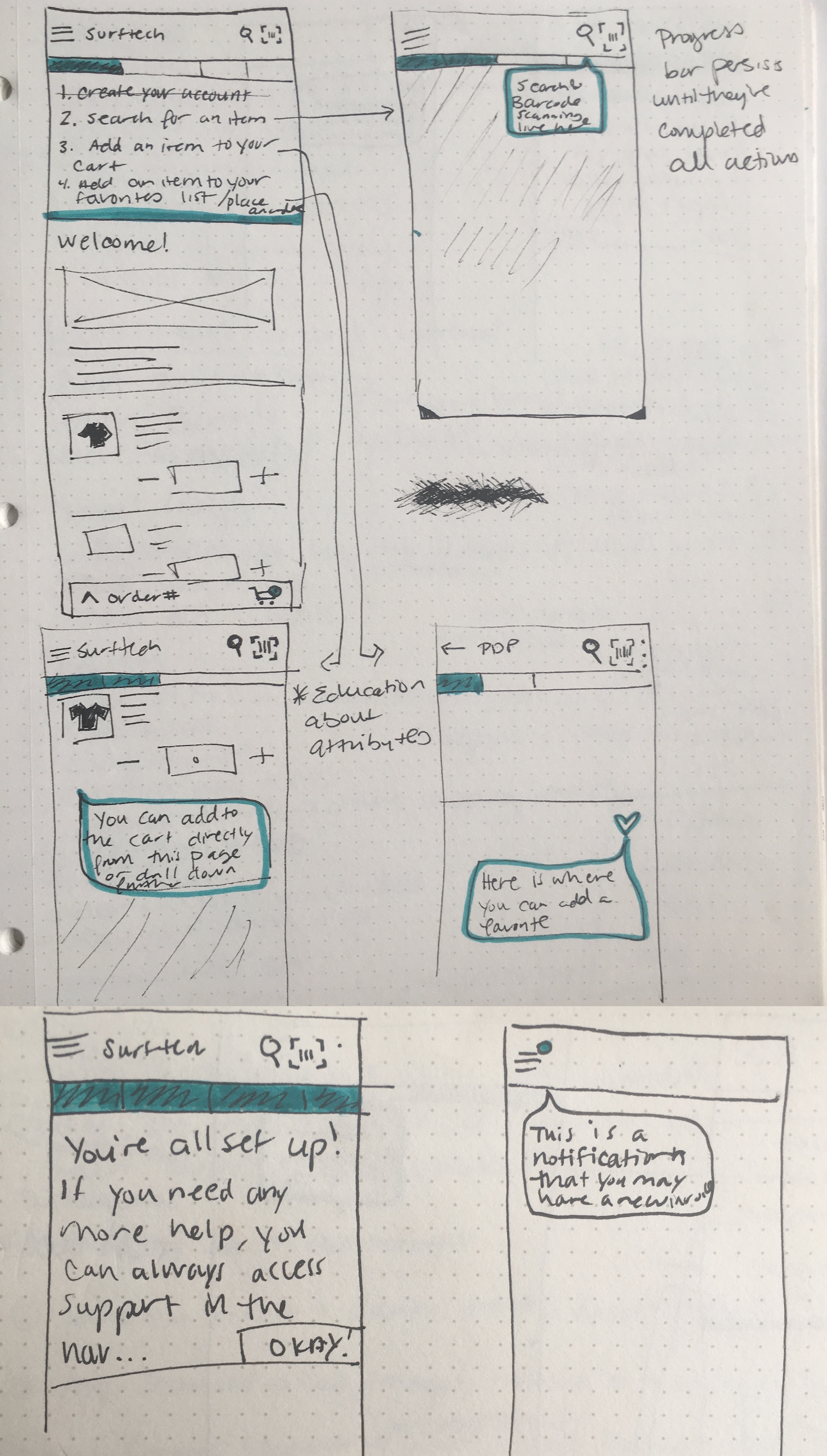
One particular challenge of getting users into the app for the first time is that we do not have a standard login or account creation experience, since you need to be invited to use Handshake Direct Mobile by a particular manufacturer or distributor. As a result, there is not a true “sign up” experience. Additionally, the app is branded as Handshake before you log in, but after logging in it is branded to the manufacturer/distributor, so that was an added level of difficulty. These are a few initial wireframes I created of what the FTUX could be upon login.
Email Design
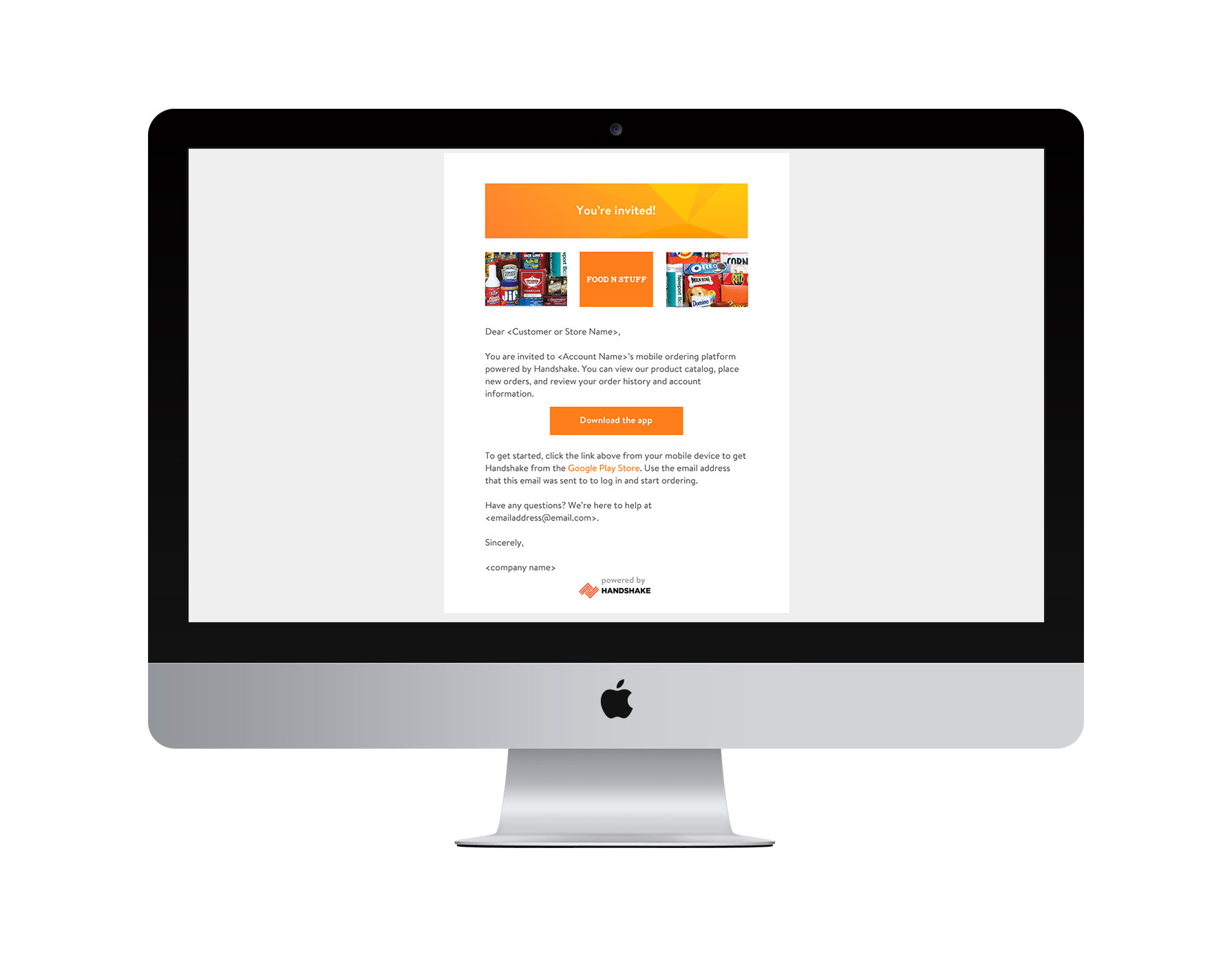
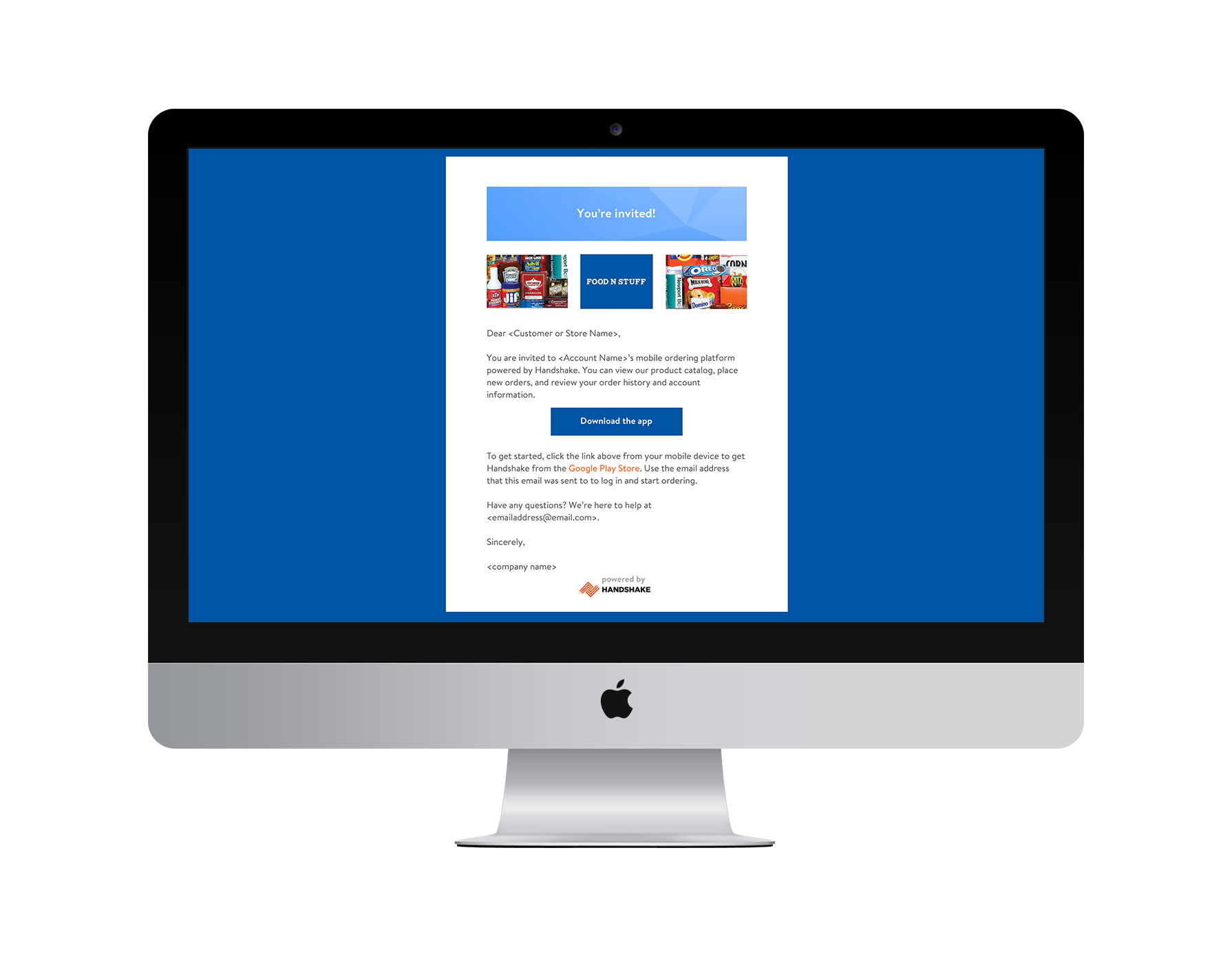
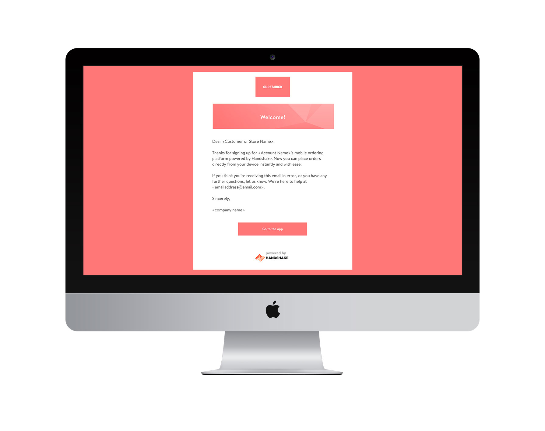
I also worked on some communication emails associated with Handshake Direct Mobile. These also had the interesting challenge of needing to be customer branded, but still mention the Handshake app.
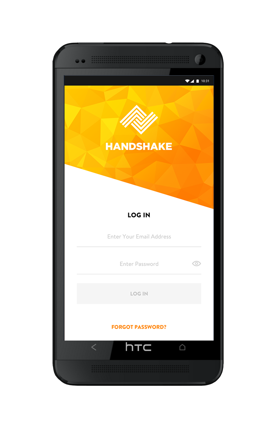
Login Screen Design
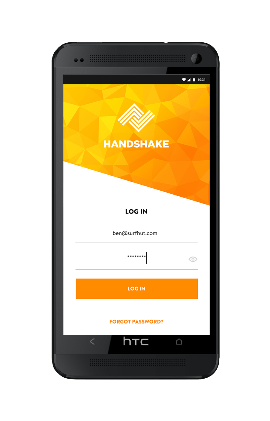
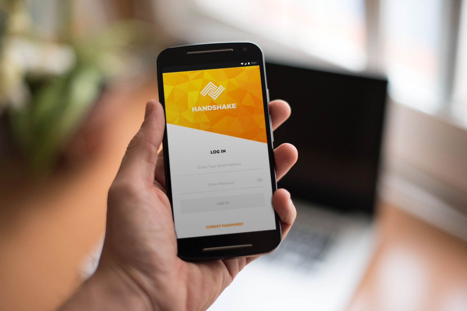
I worked with our senior product designer on the final version of the login screen. Due to engineering constraints, we made this screen purely a log in page without the ability to create a password for the first release of the app. I designed the prism and gradient background for the login screen, which was a lot of fun.
