Leadin Style Guide
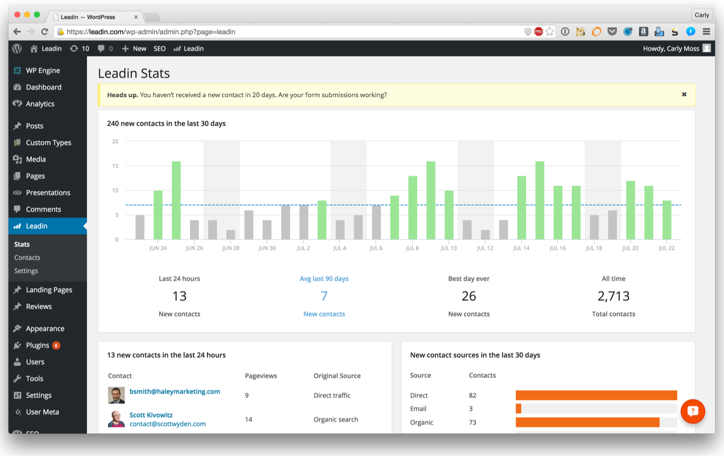
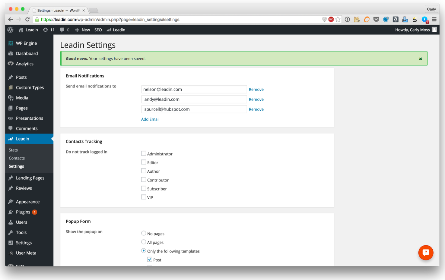
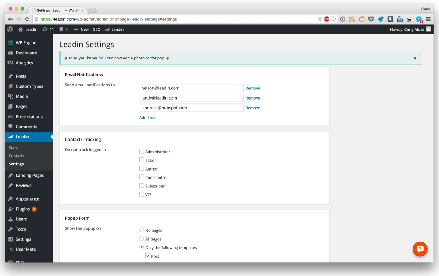
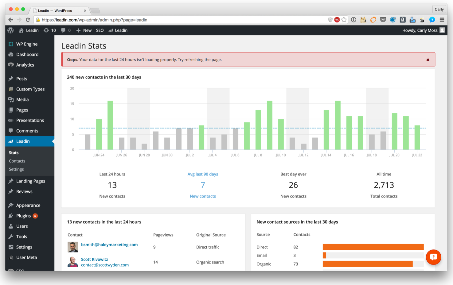
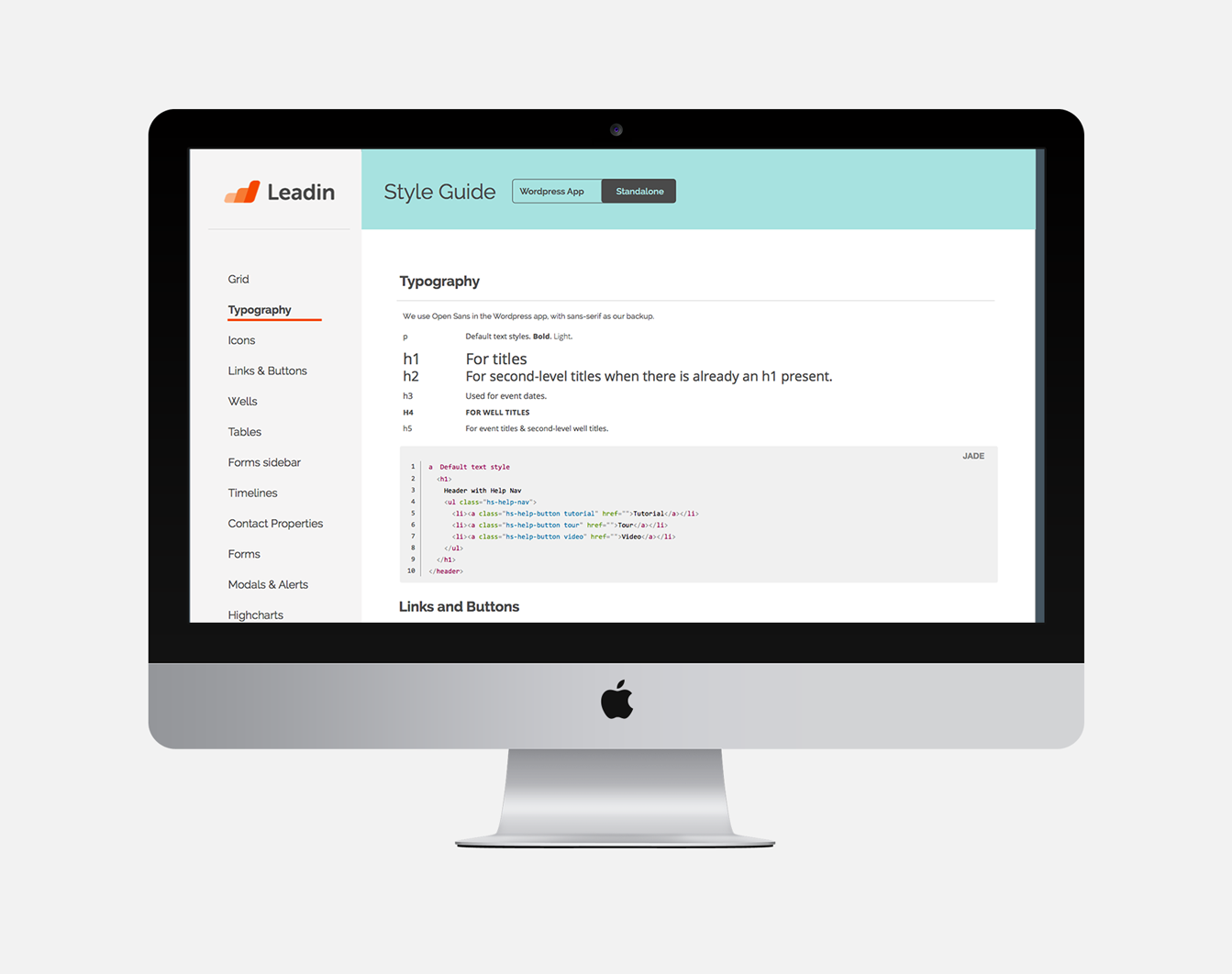
As Leadin moved from being a WordPress-only plugin to a standalone application that could be used on any website, the overall look and feel was no longer constrained to look WordPress-y. We decided to design the standalone application separately from the WordPress styles, but to keep the WordPress plugin looking Wordpress-y. In order to keep track of these styles, I was tasked with building a style guide.
Leadin Login
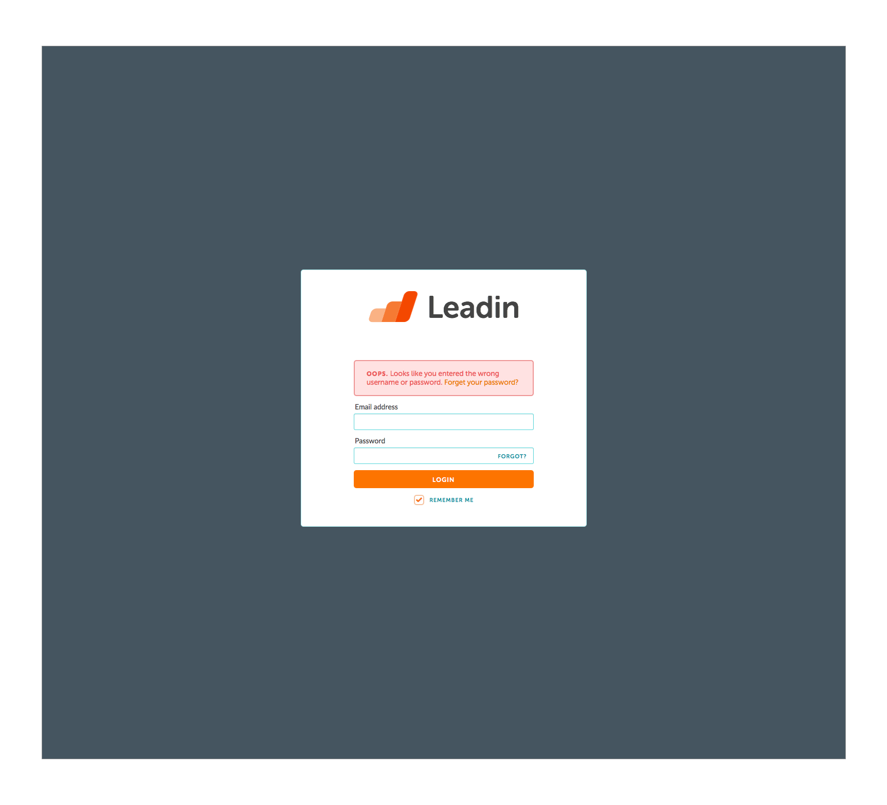
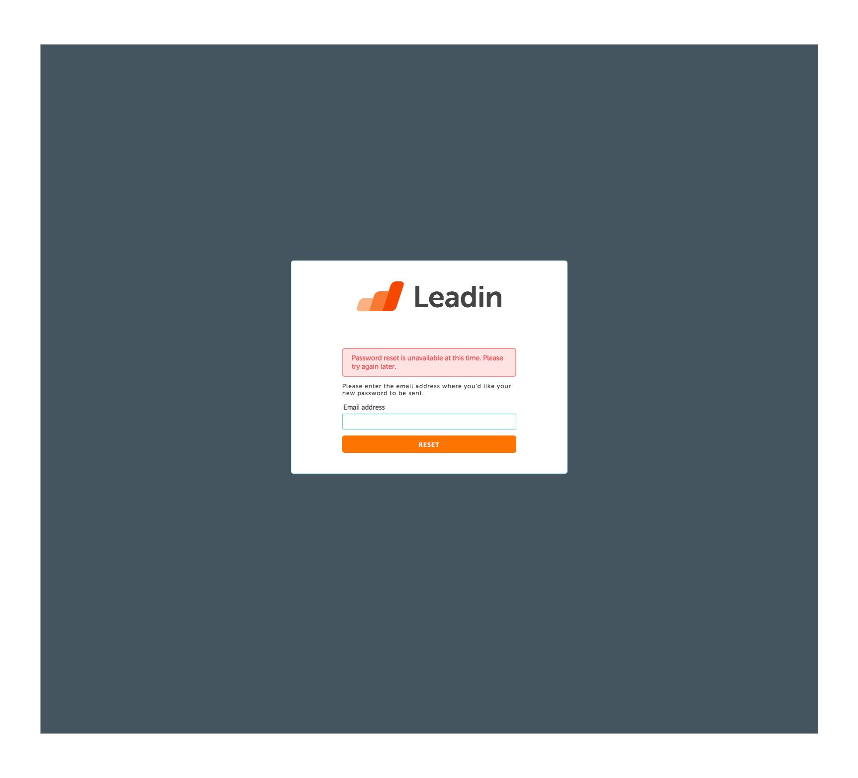
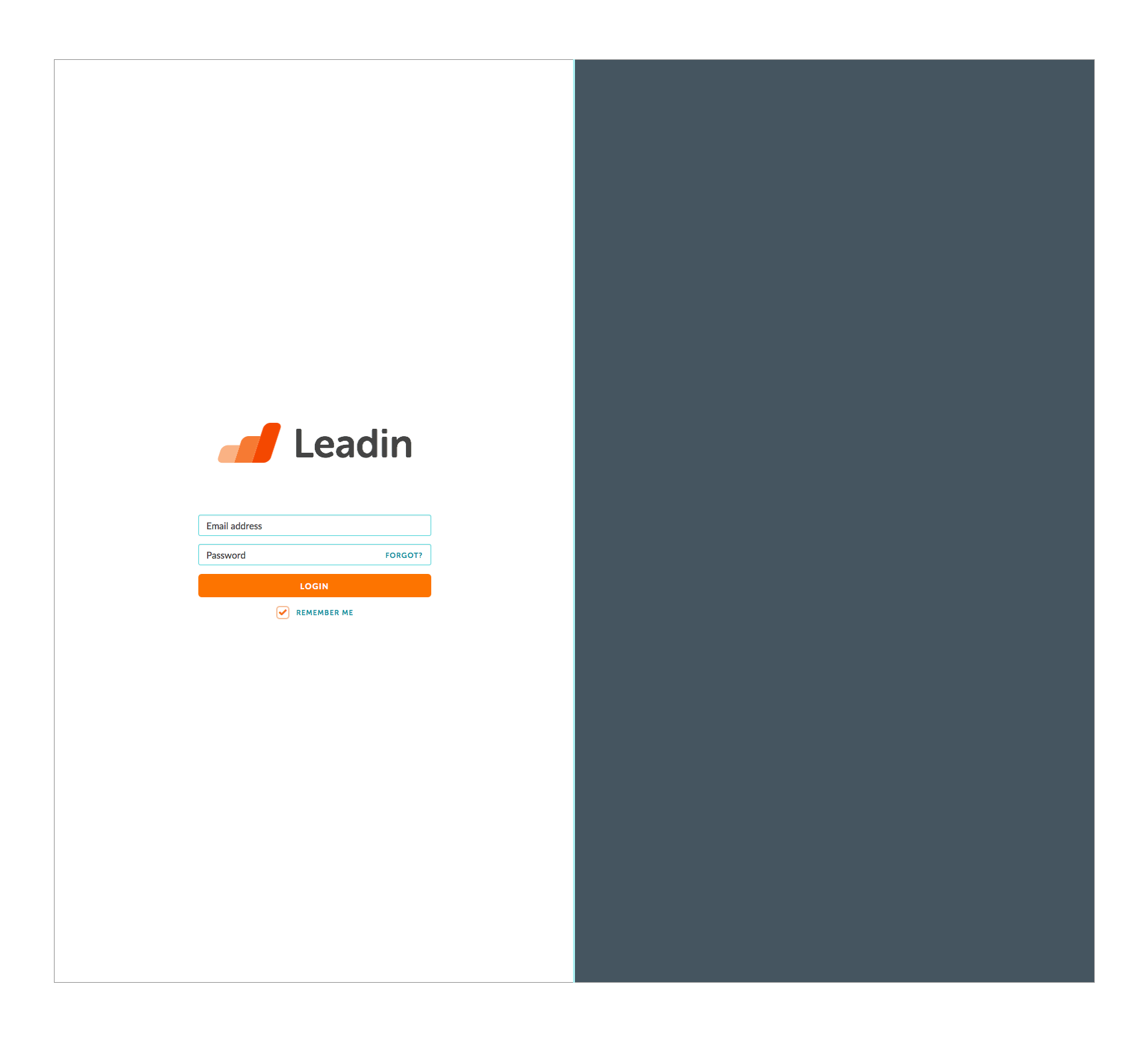
Leadin started as an experimental project within HubSpot as a way to track visitors on your WordPress site. When I joined the Leadin team in January 2015, I was the third member. By the end of my co-op, we had nine team members. Over that time, Leadin grew massively not only in team size but also in the scope of the product. We started developing the non-WordPress version of the app so that anyone could track visitors on any sight. I was tasked with designing the login flow. The overall look and feel of the Leadin standalone app was already set, but I designed this particular flow and specifically the error states in them.

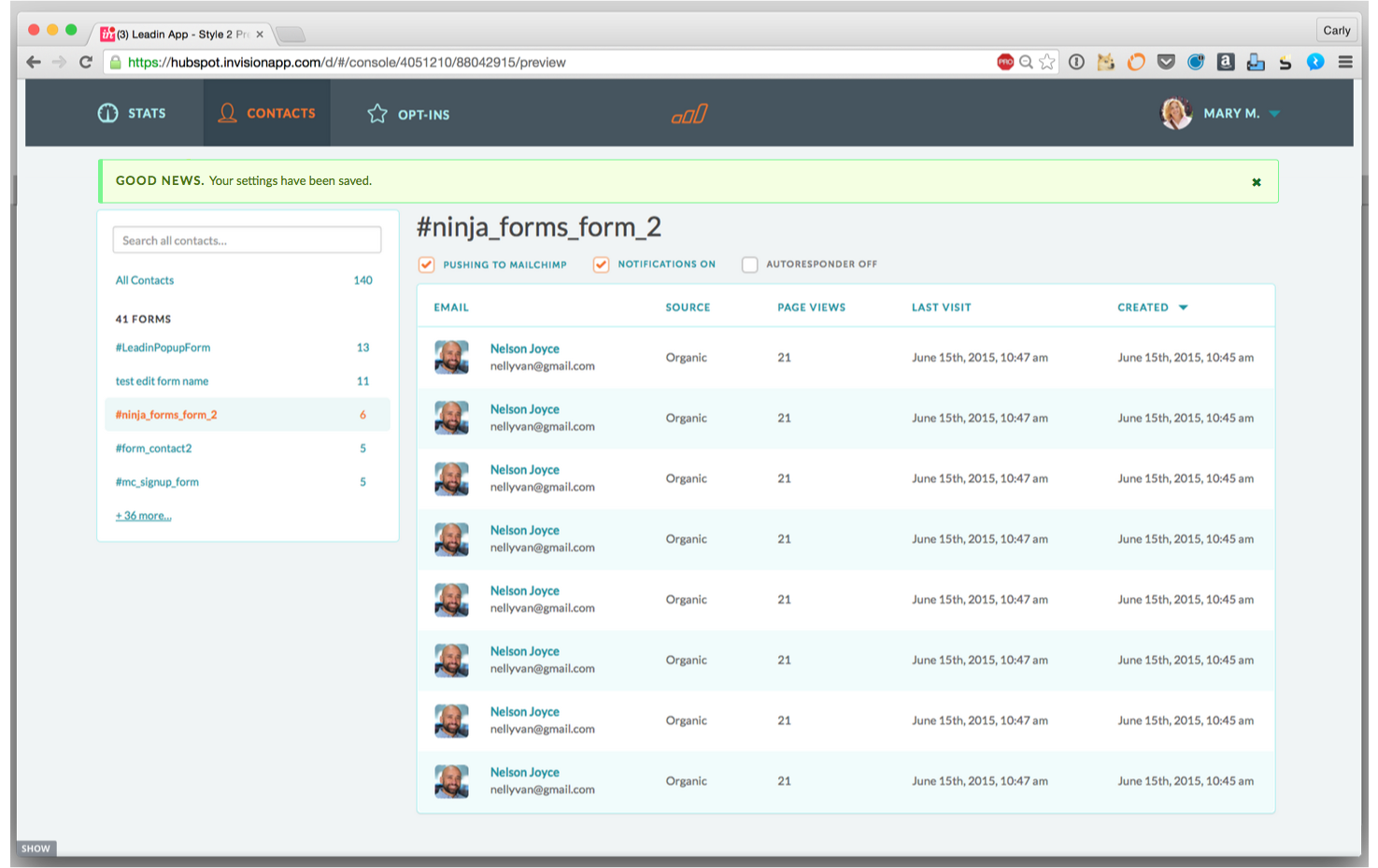
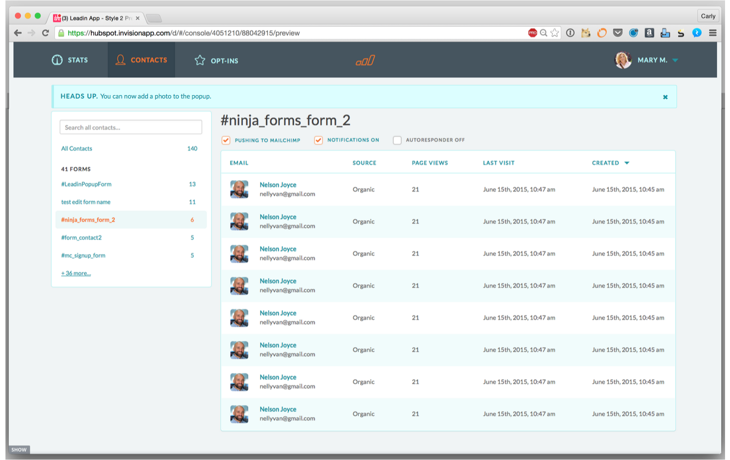
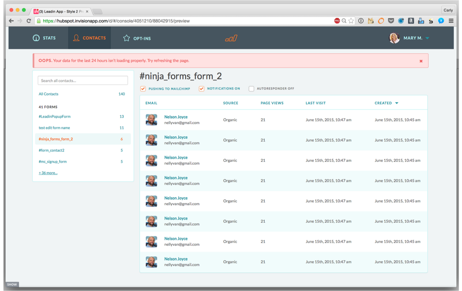
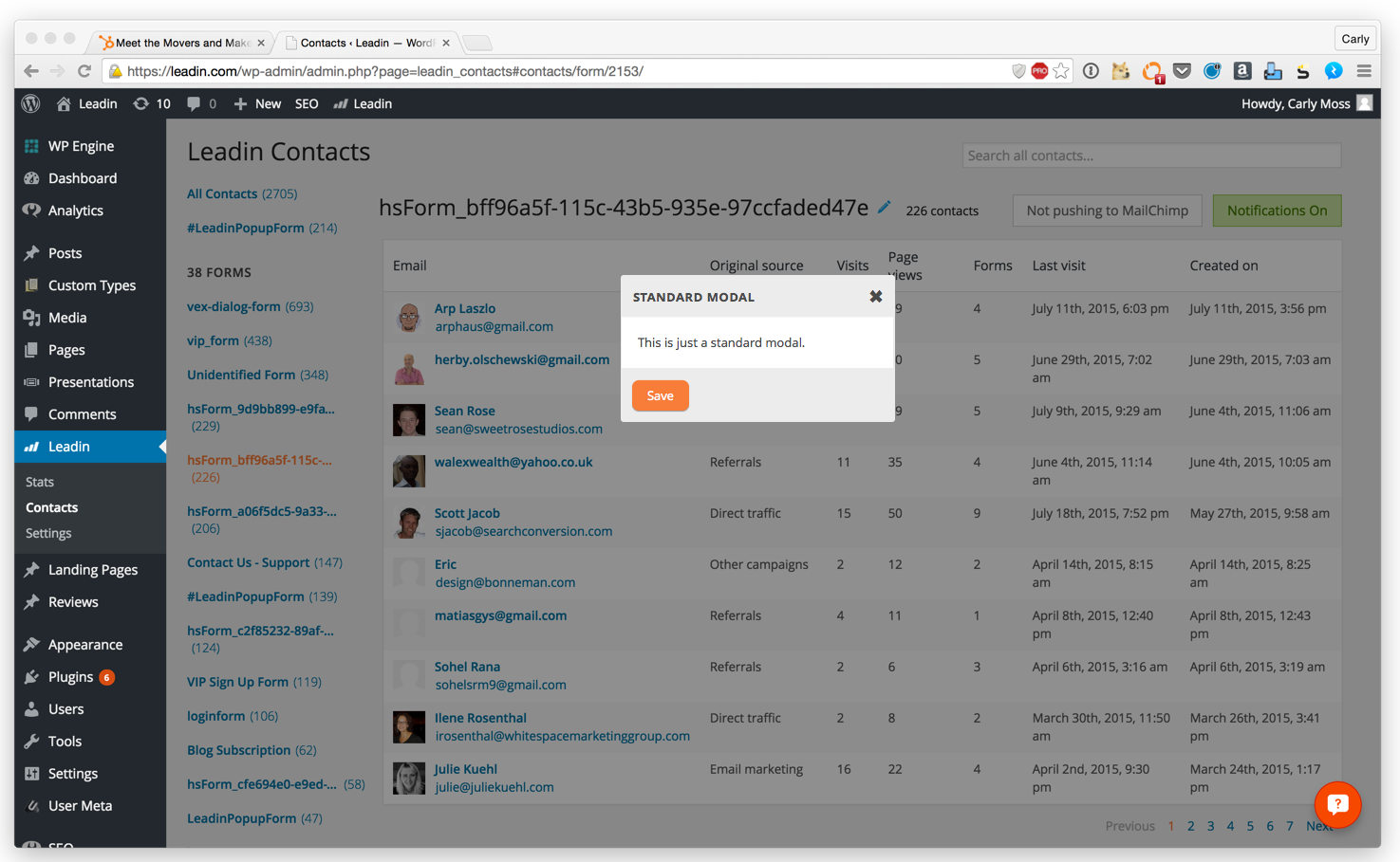
Leadin Alerts
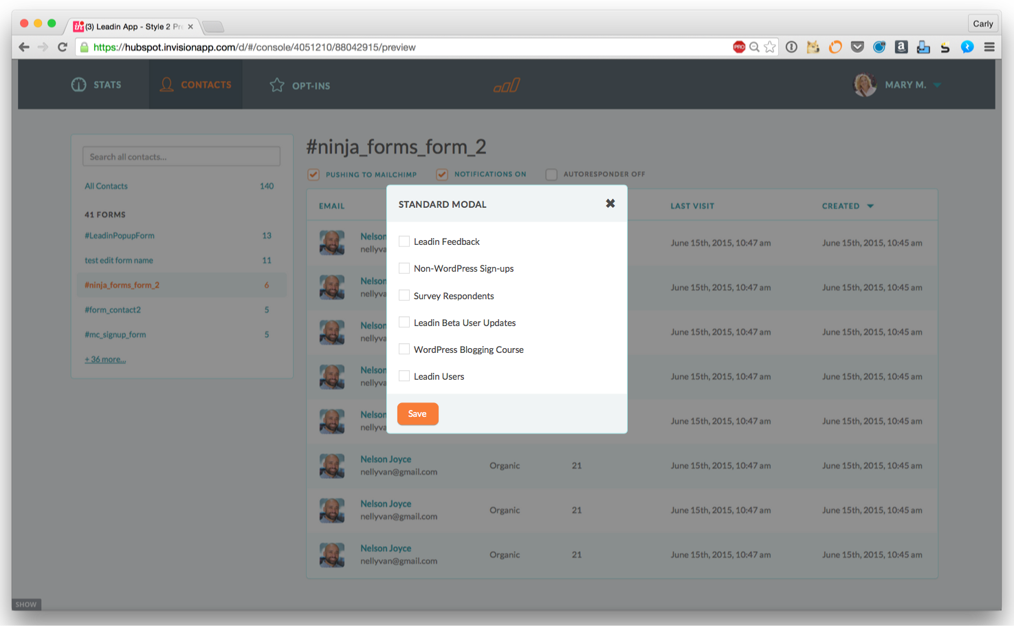
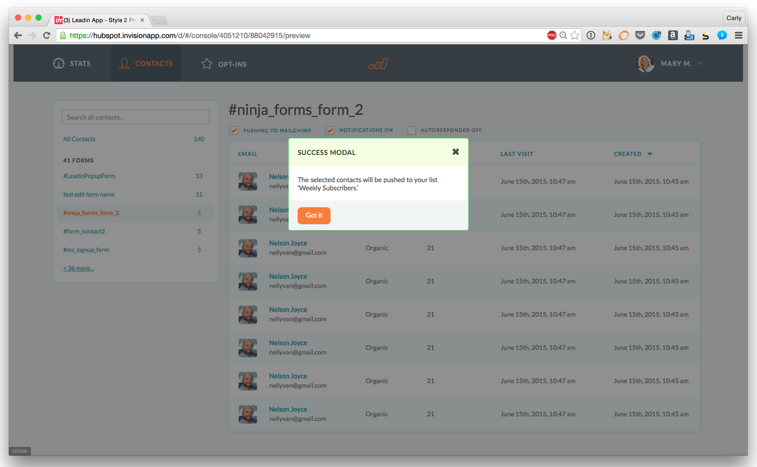
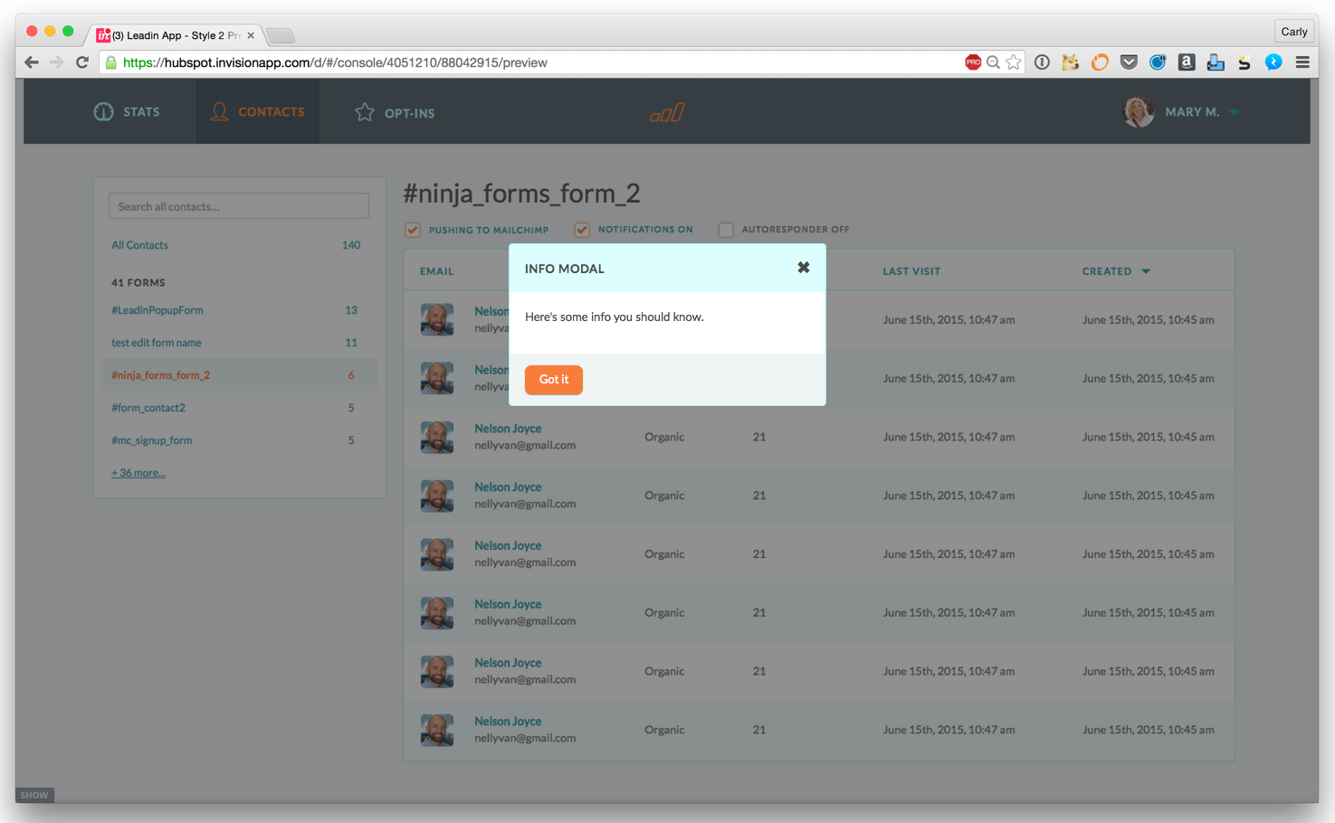
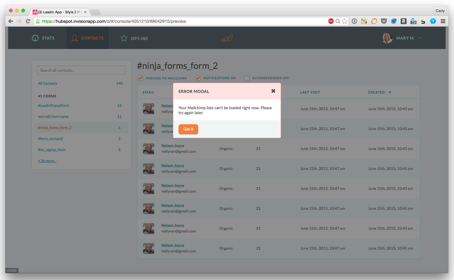
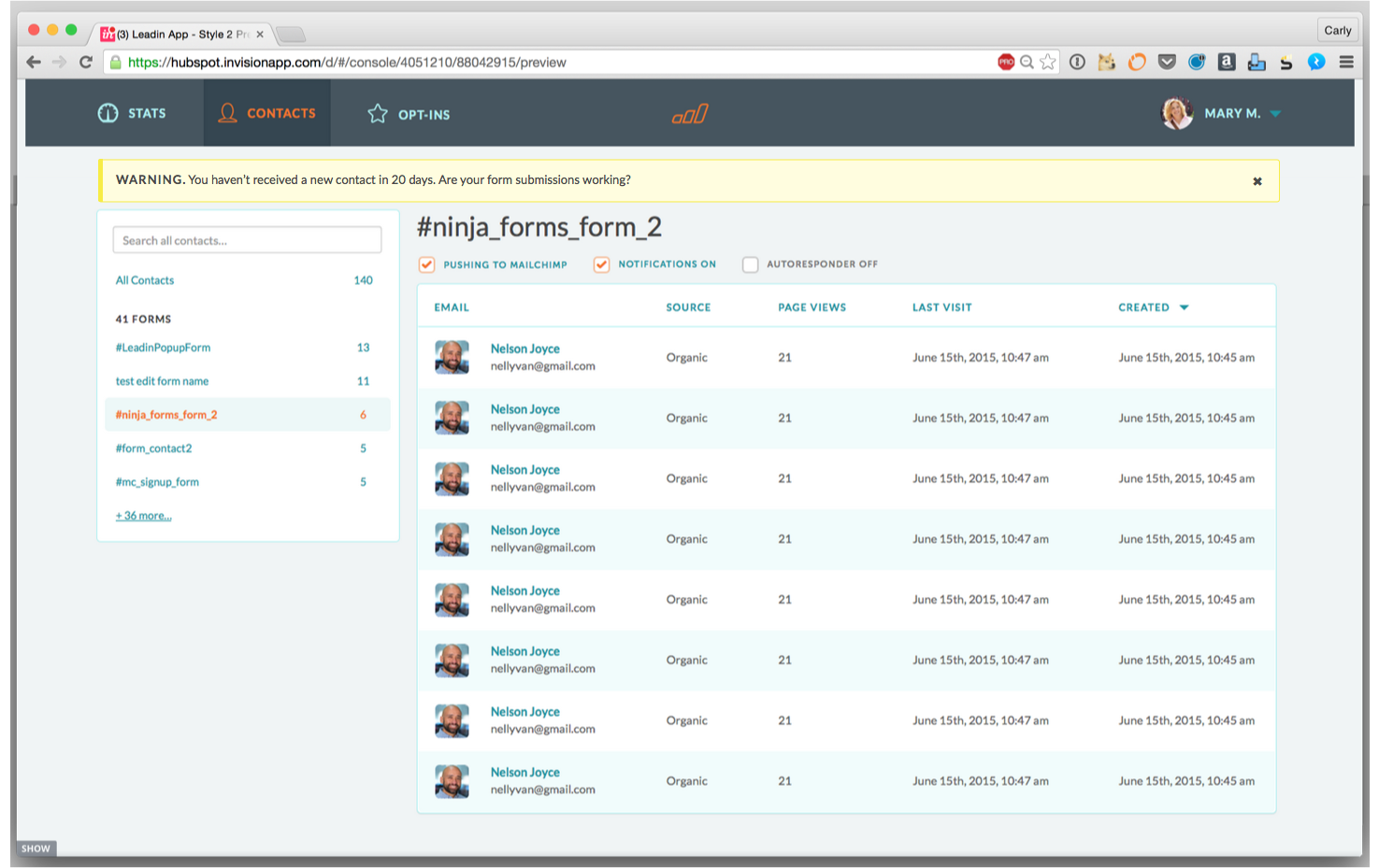
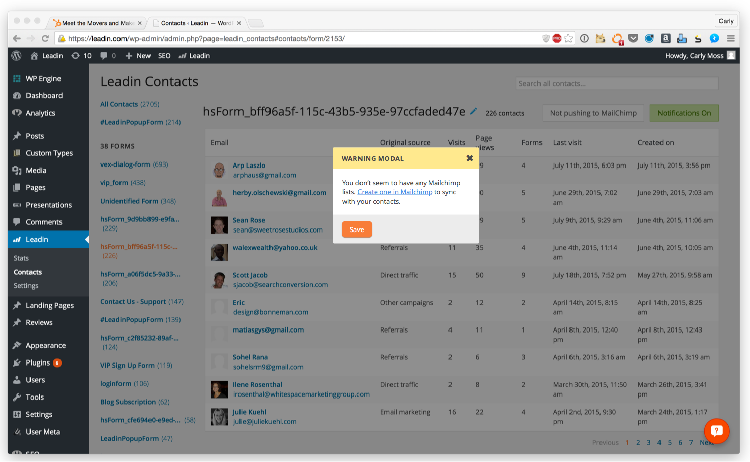
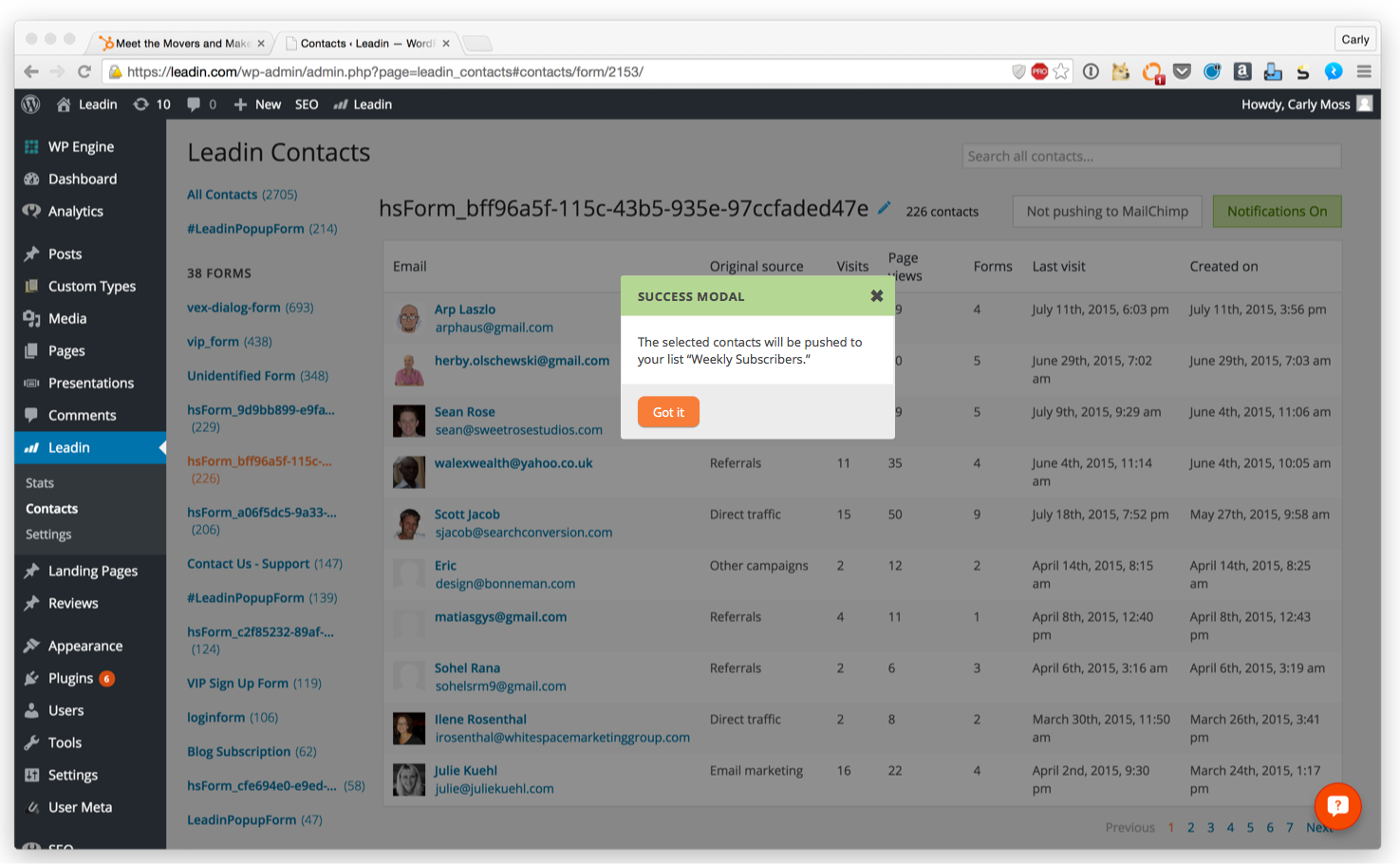
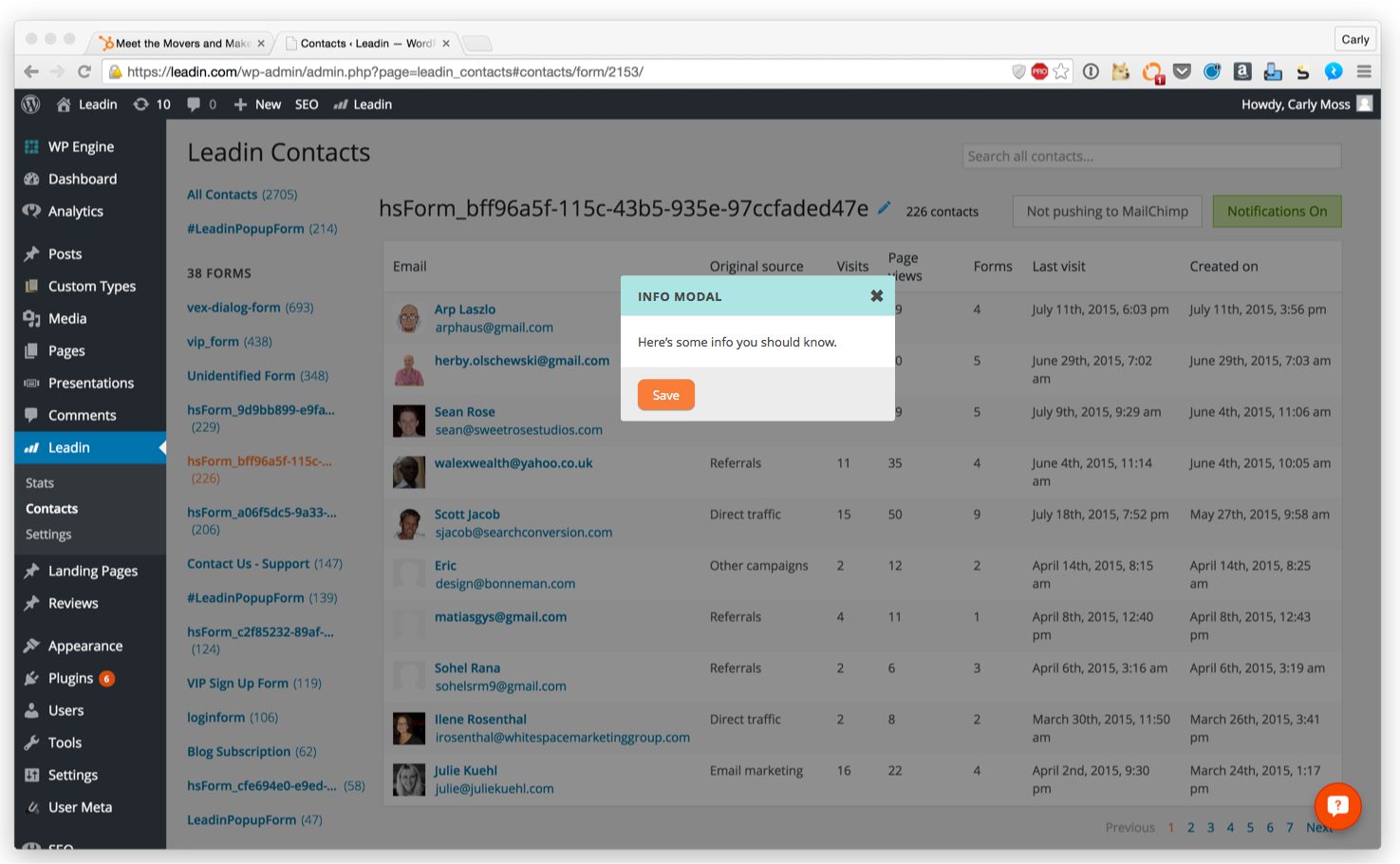
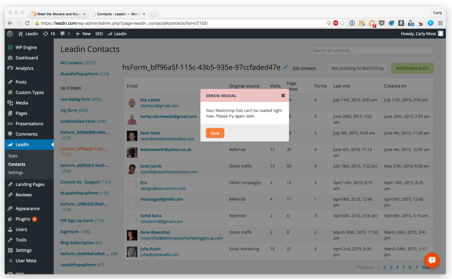
I noticed that a lot of the alerts and modals on the early version of Leadin were inconsistent, so I designed a standard style for them. I had to create two sets for the WordPress Leadin plugin as well as for the Leadin standalone application.
