15Five iOS Redesign
Mobile Product Designer | 2019
15Five is a performance management platform that helps companies improve employee engagement, development, and retention through continuous feedback, goal tracking (OKRs), and manager effectiveness tools. It’s designed to align individual performance with company objectives while supporting ongoing growth and communication.
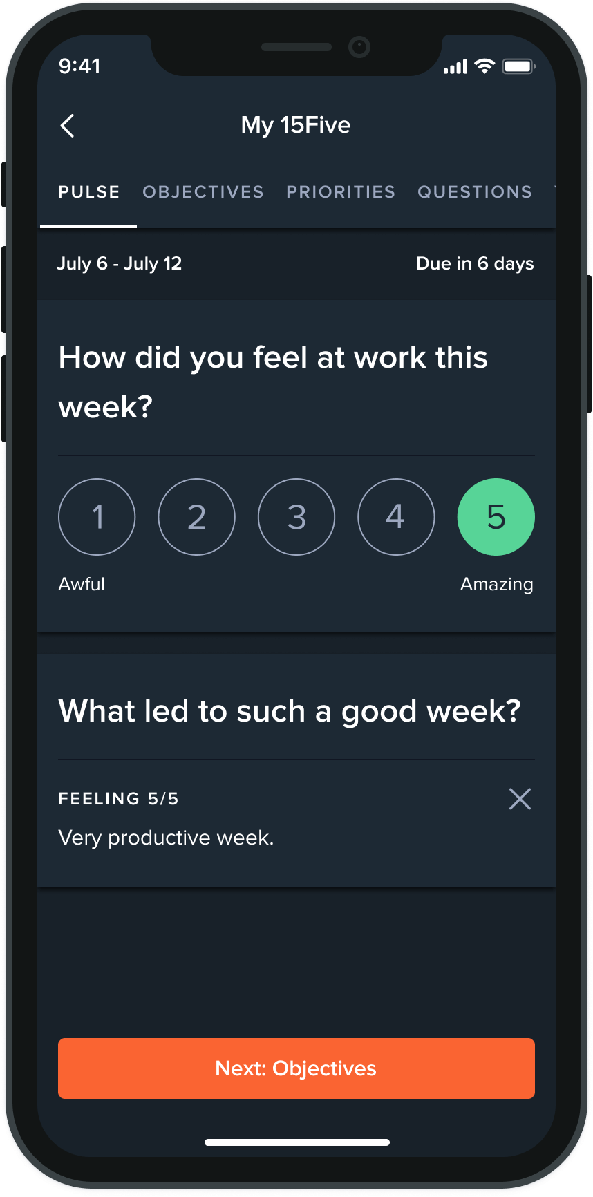
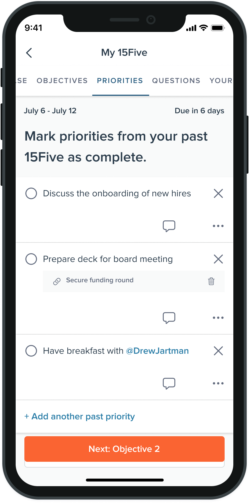
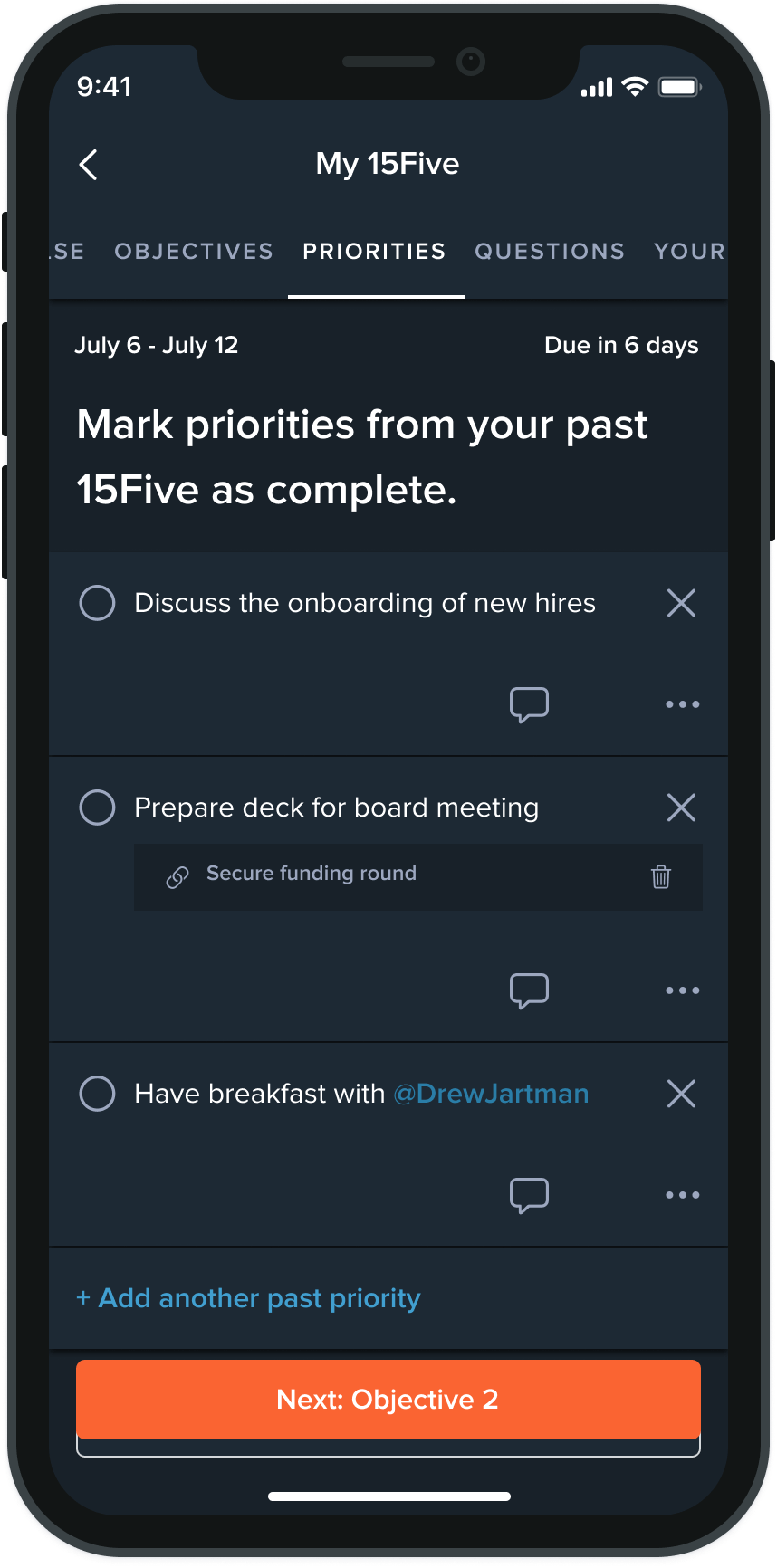
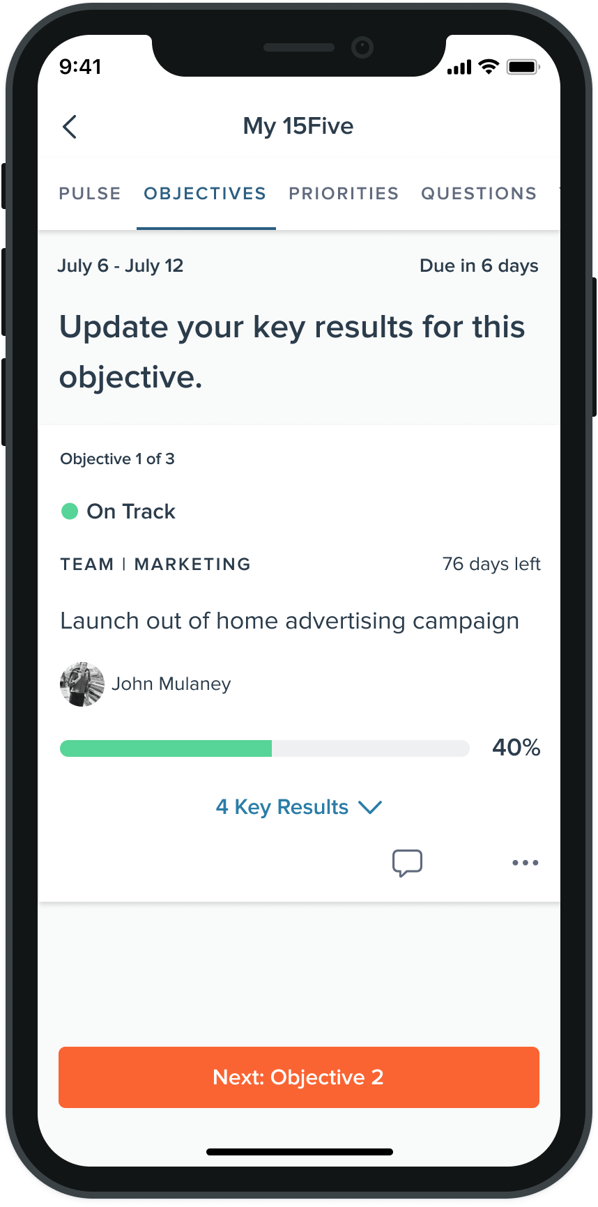
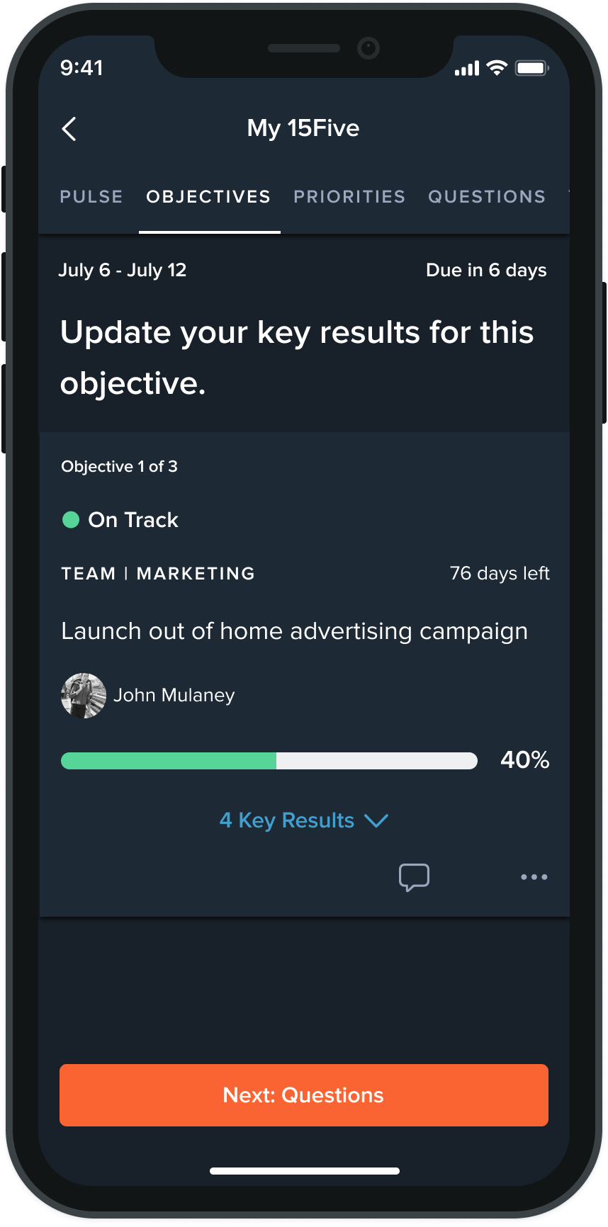
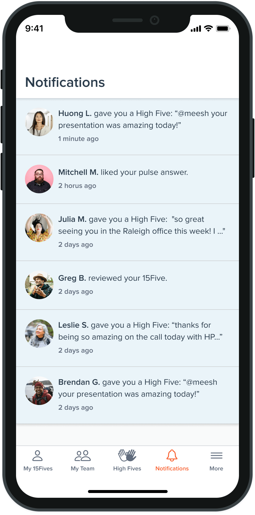
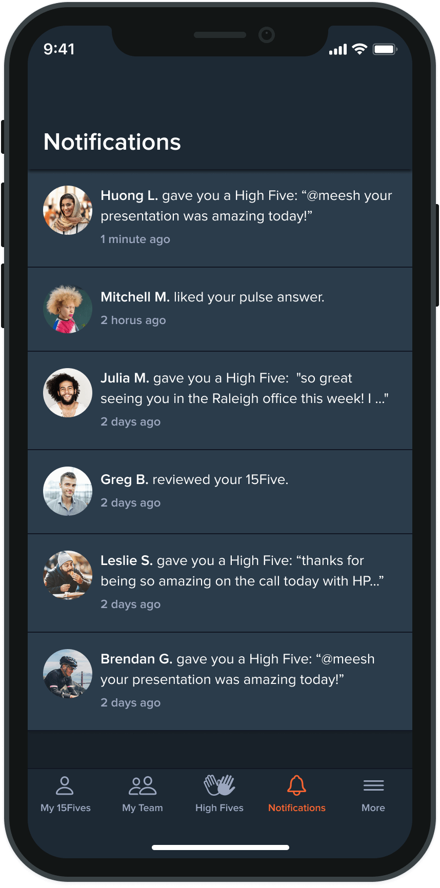
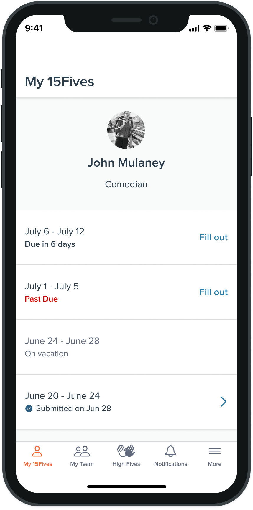
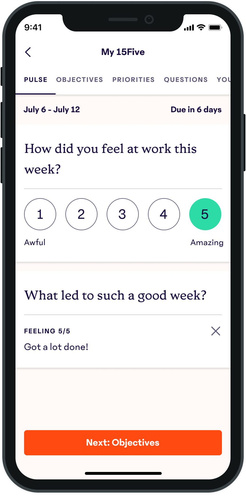
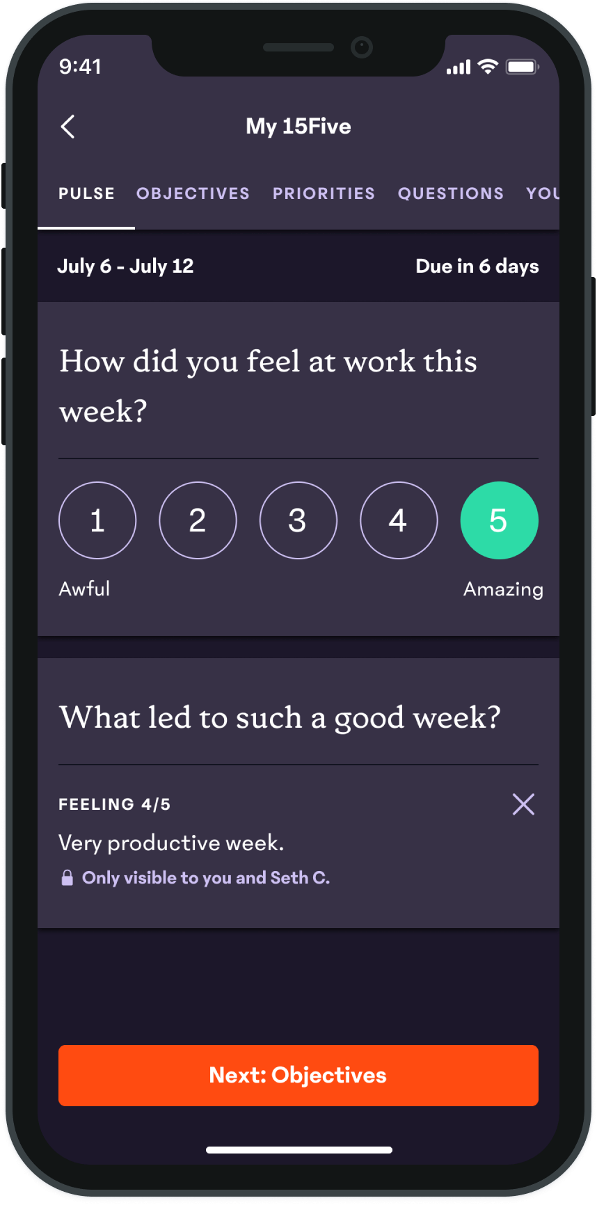
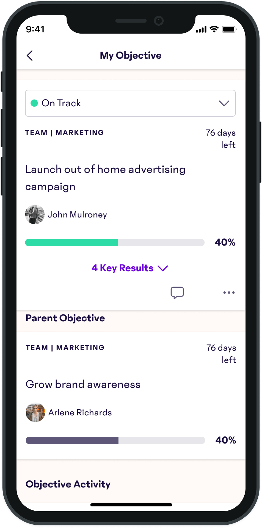
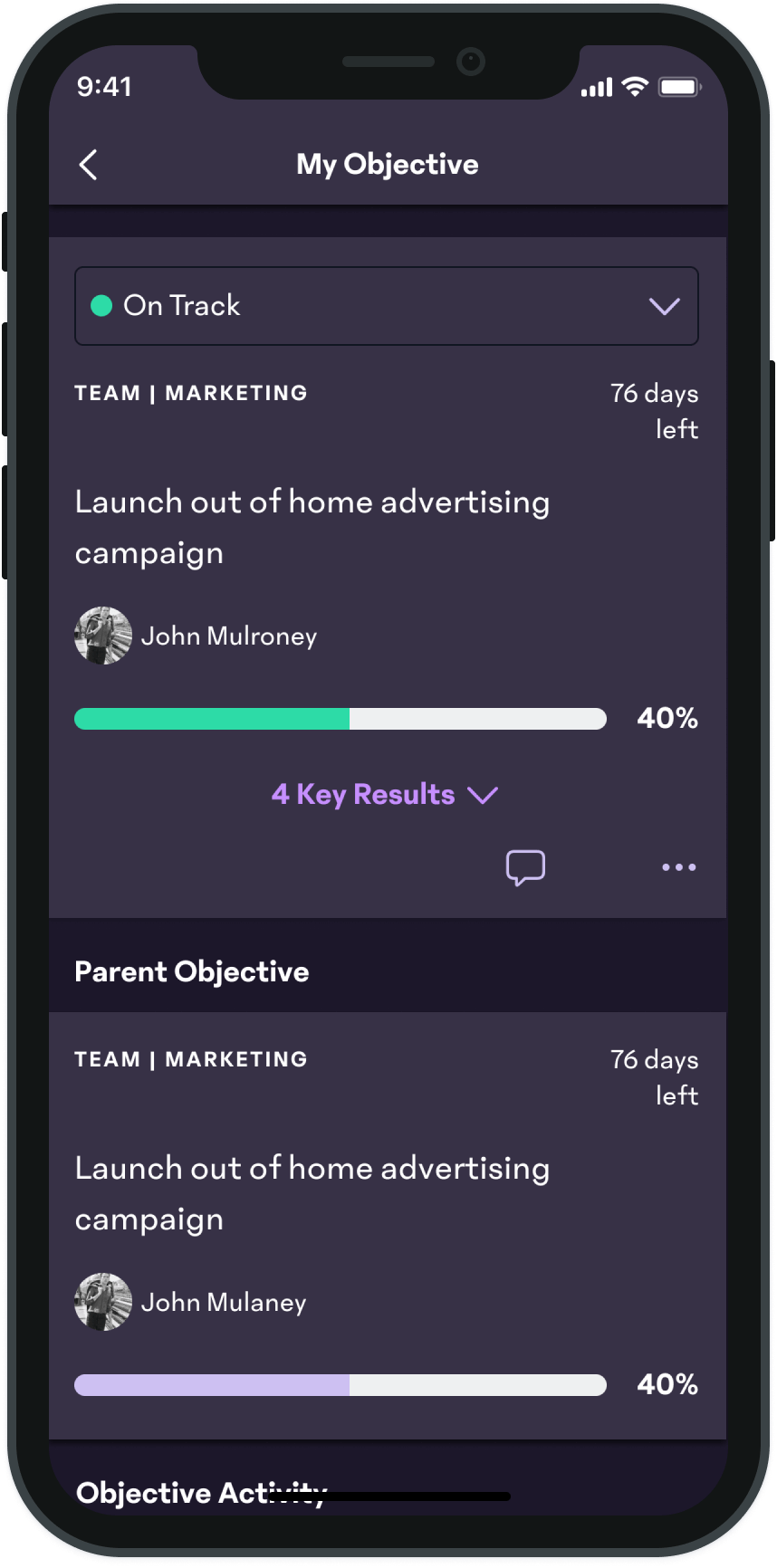
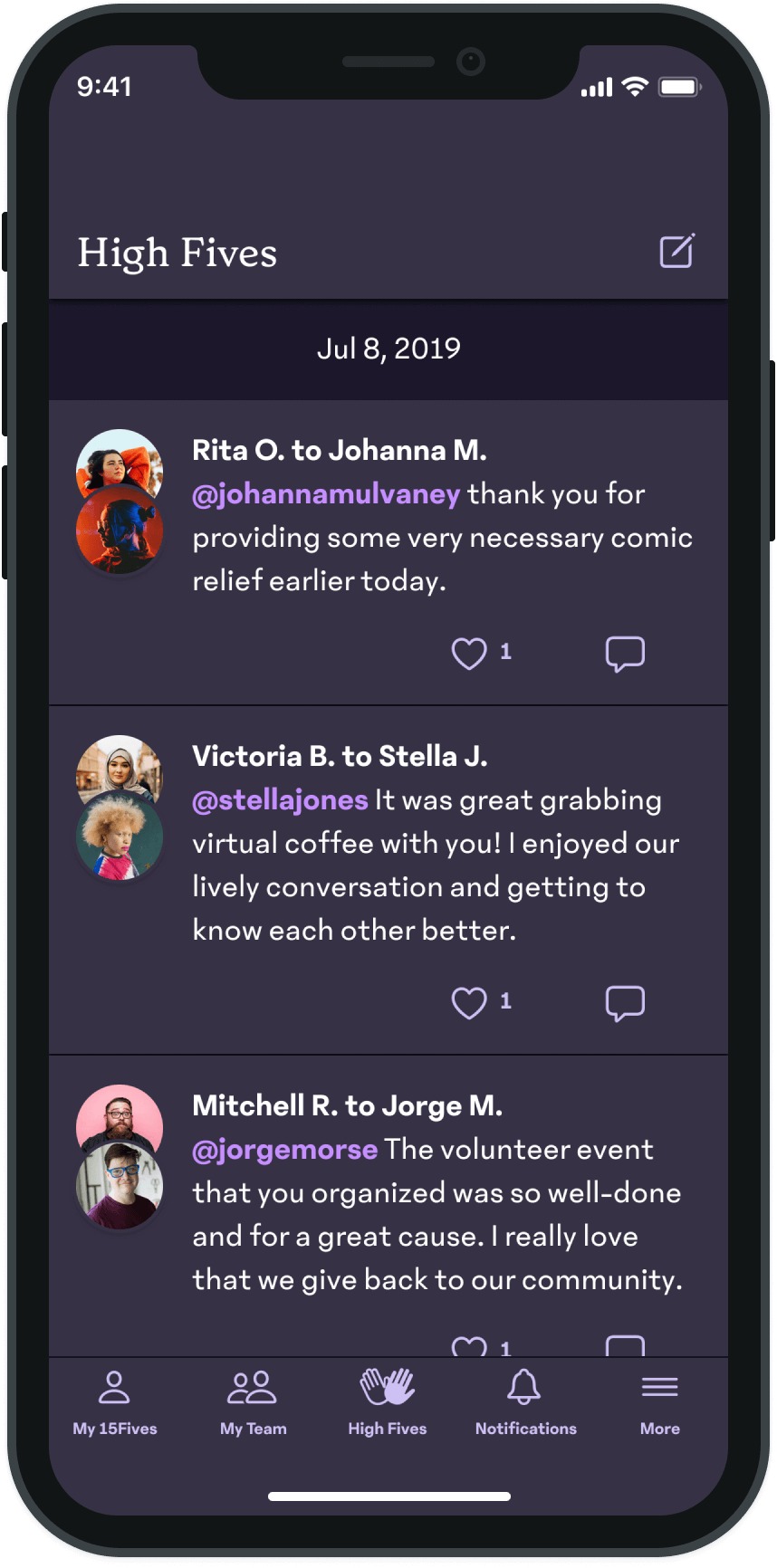
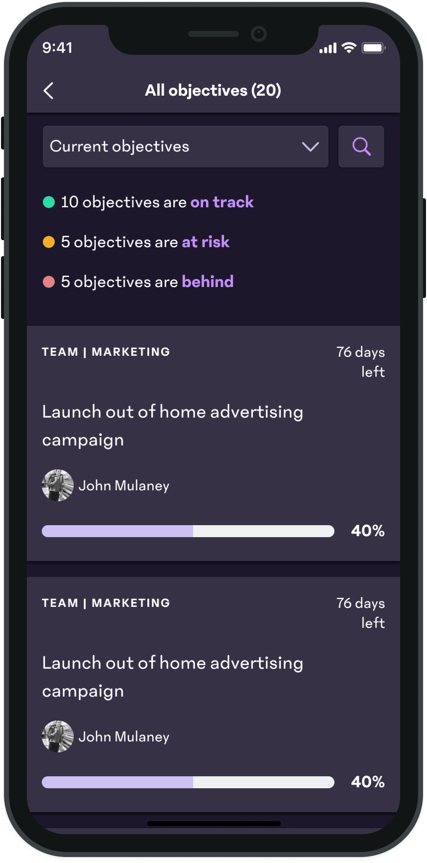
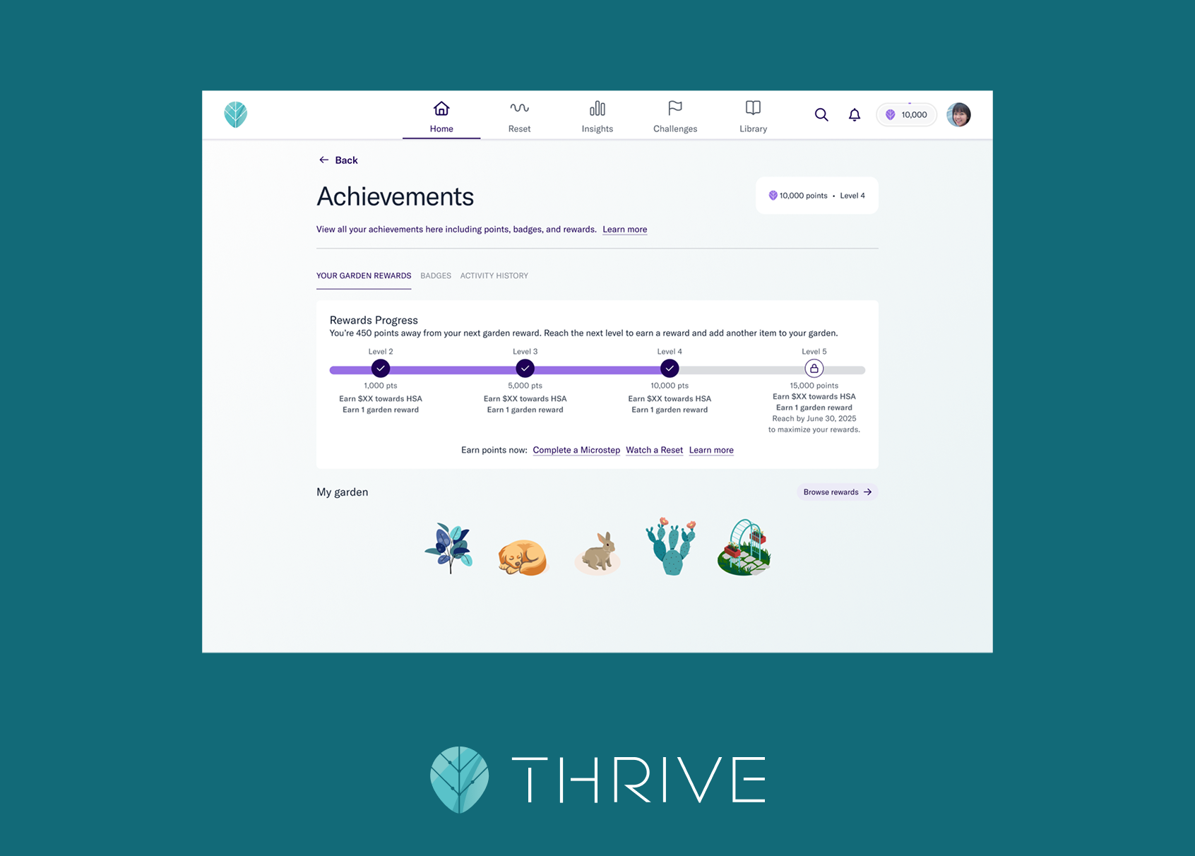
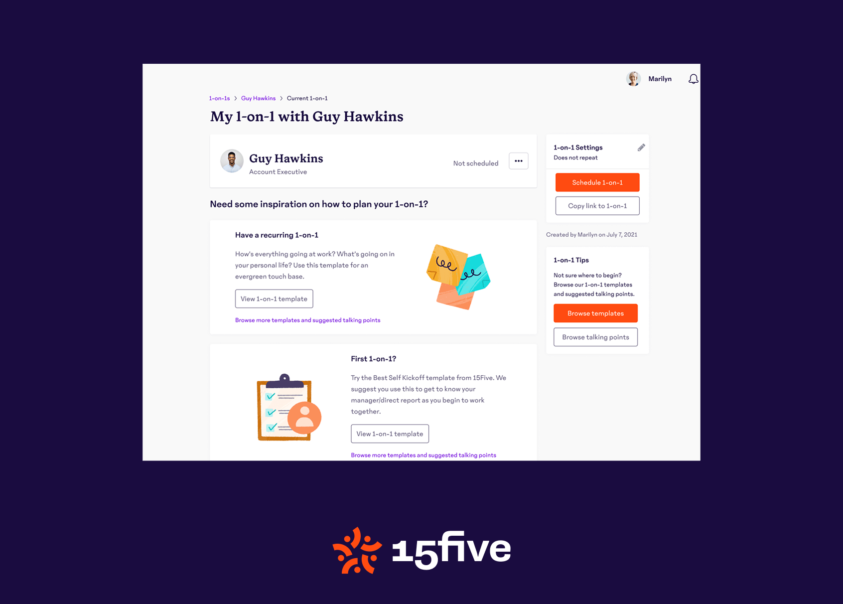
My first large project as Mobile Product Designer at 15Five was a visual redesign. This was to update the look and feel of the app as well as implement a consistent design system in order to better prepare for any future rebranding. Additionally, this redesign allowed us to create a dark mode version of the app.
Process
At the beginning of this project, there was no formal design system in place. I joined as the design team was growing quickly, and not long before I joined there were only two full time product designers at 15Five. They were able to create a generally cohesive product without a formalized system, but as the team and the product got larger, it was clear that we would need to create one.
Shortly after I started working on this redesign, we began the process of hiring a dedicated Design Systems Designer. However, their focus would be primarily on the web design system to start, and as the only Mobile Designer I had the luxury of having full insight into and ownership of the mobile design systems.
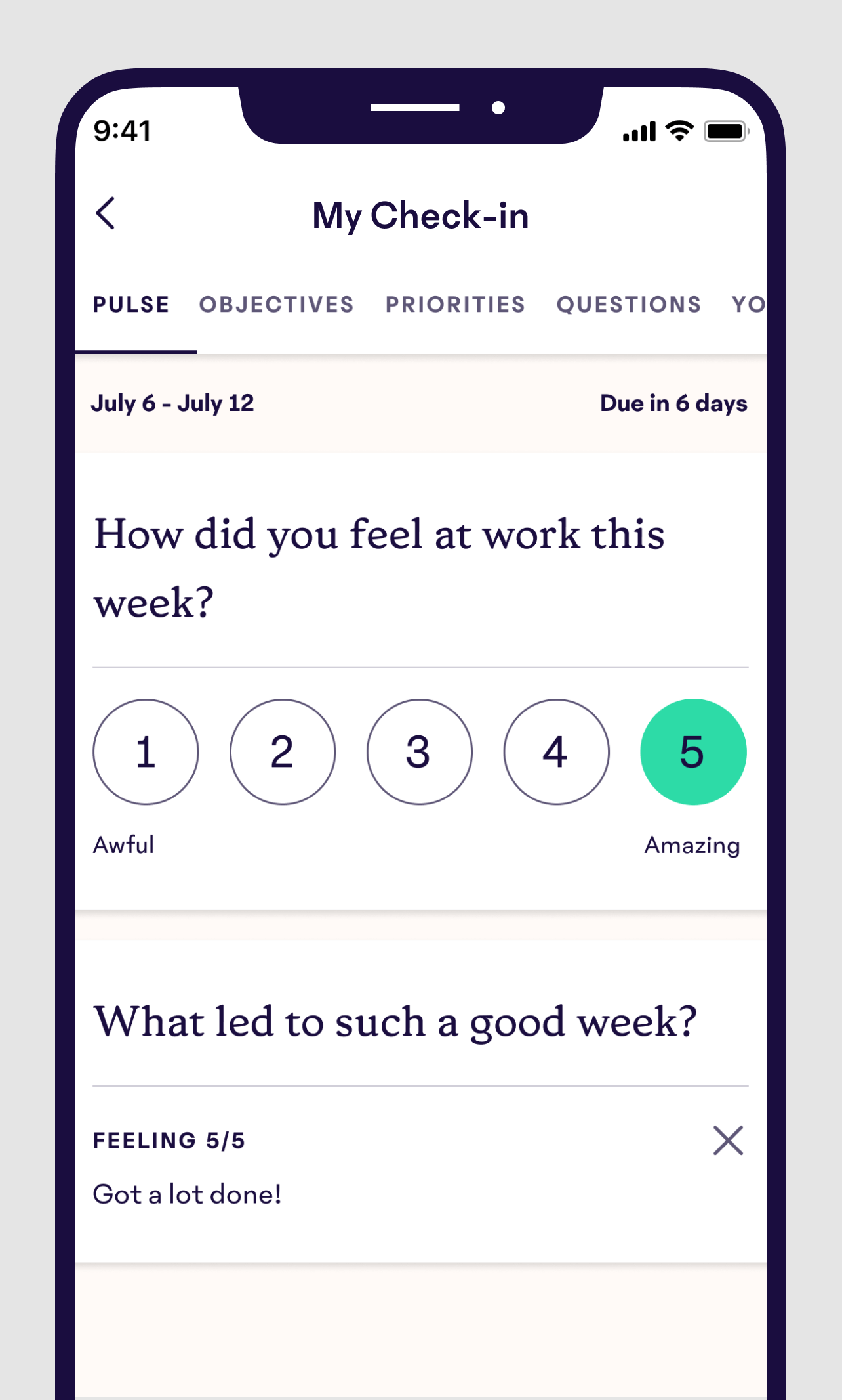
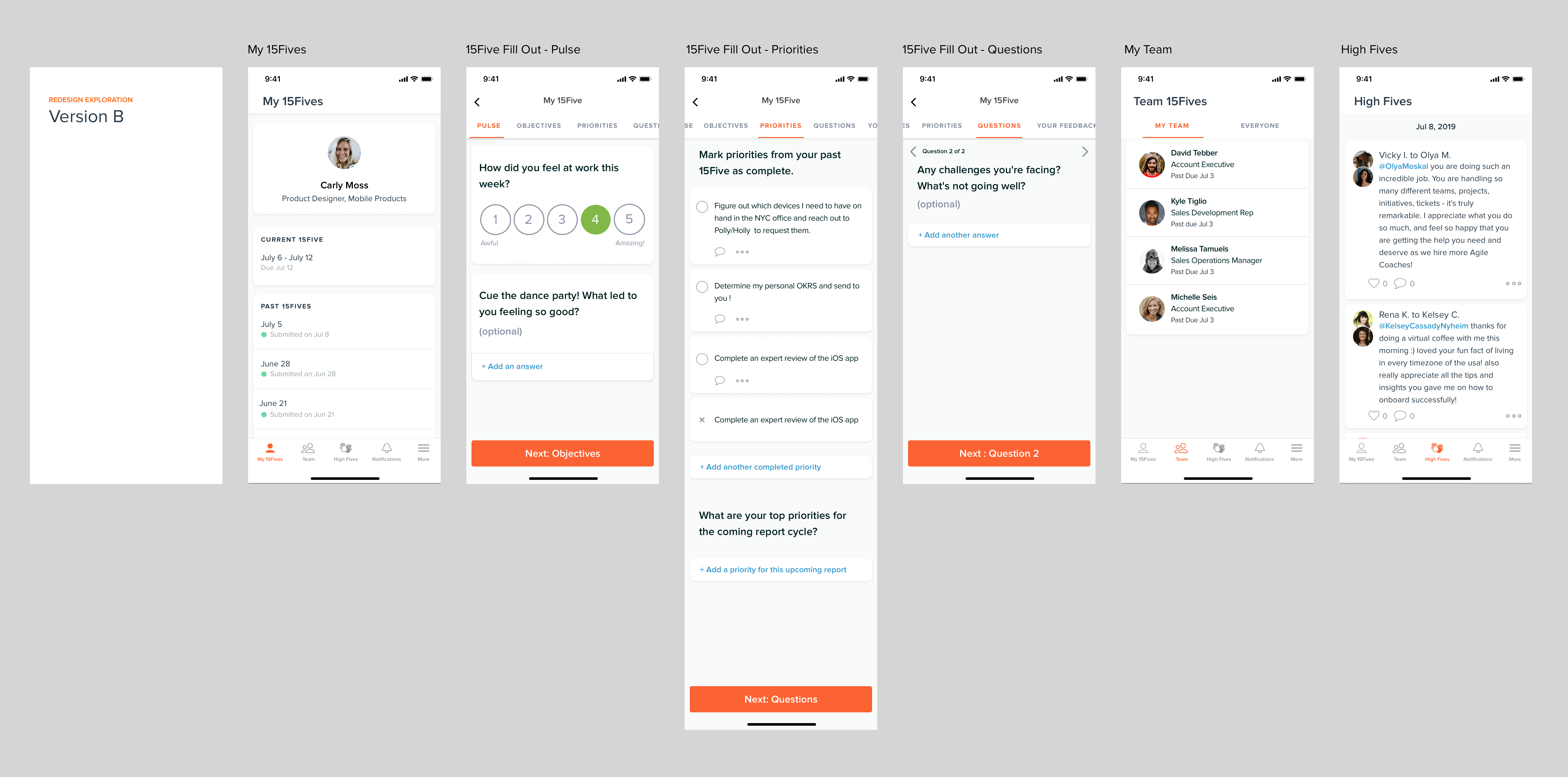
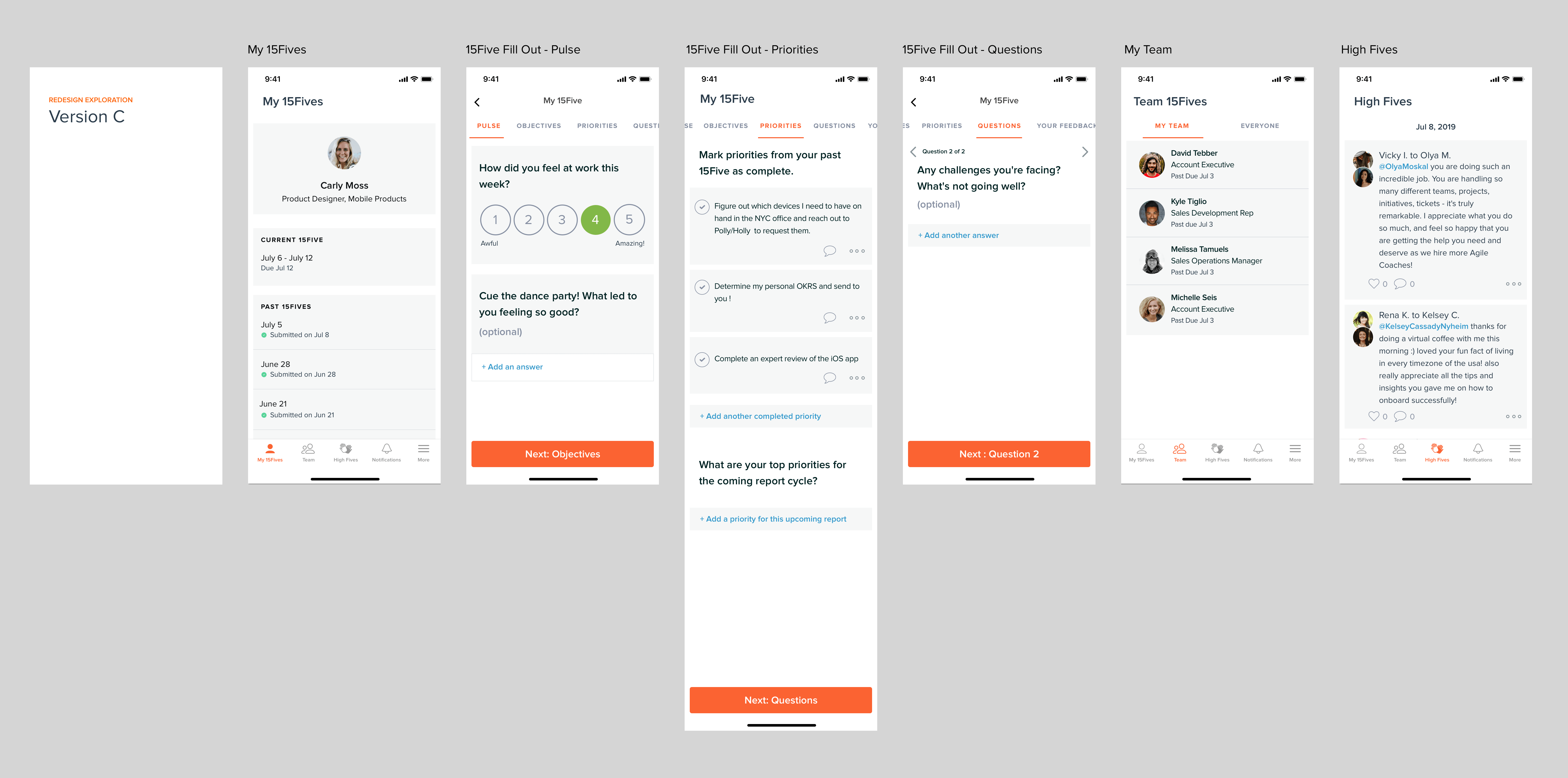
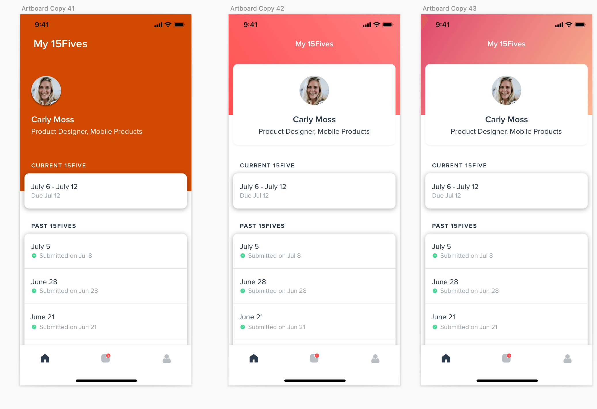
Early Explorations
Very early on explorations on updating the look and feel of 15Five.
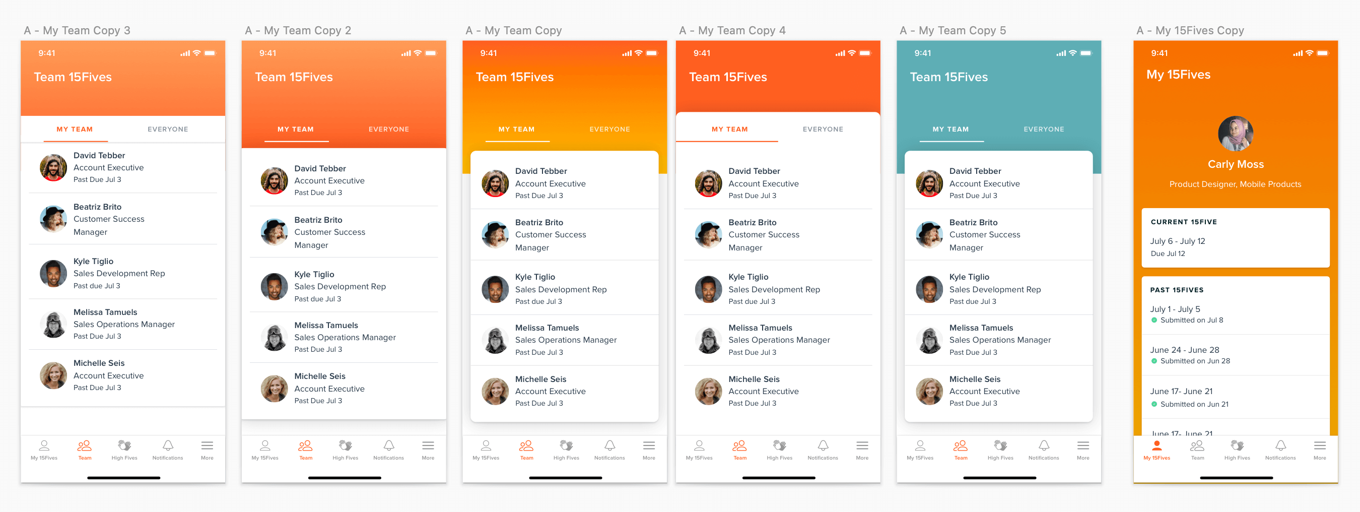
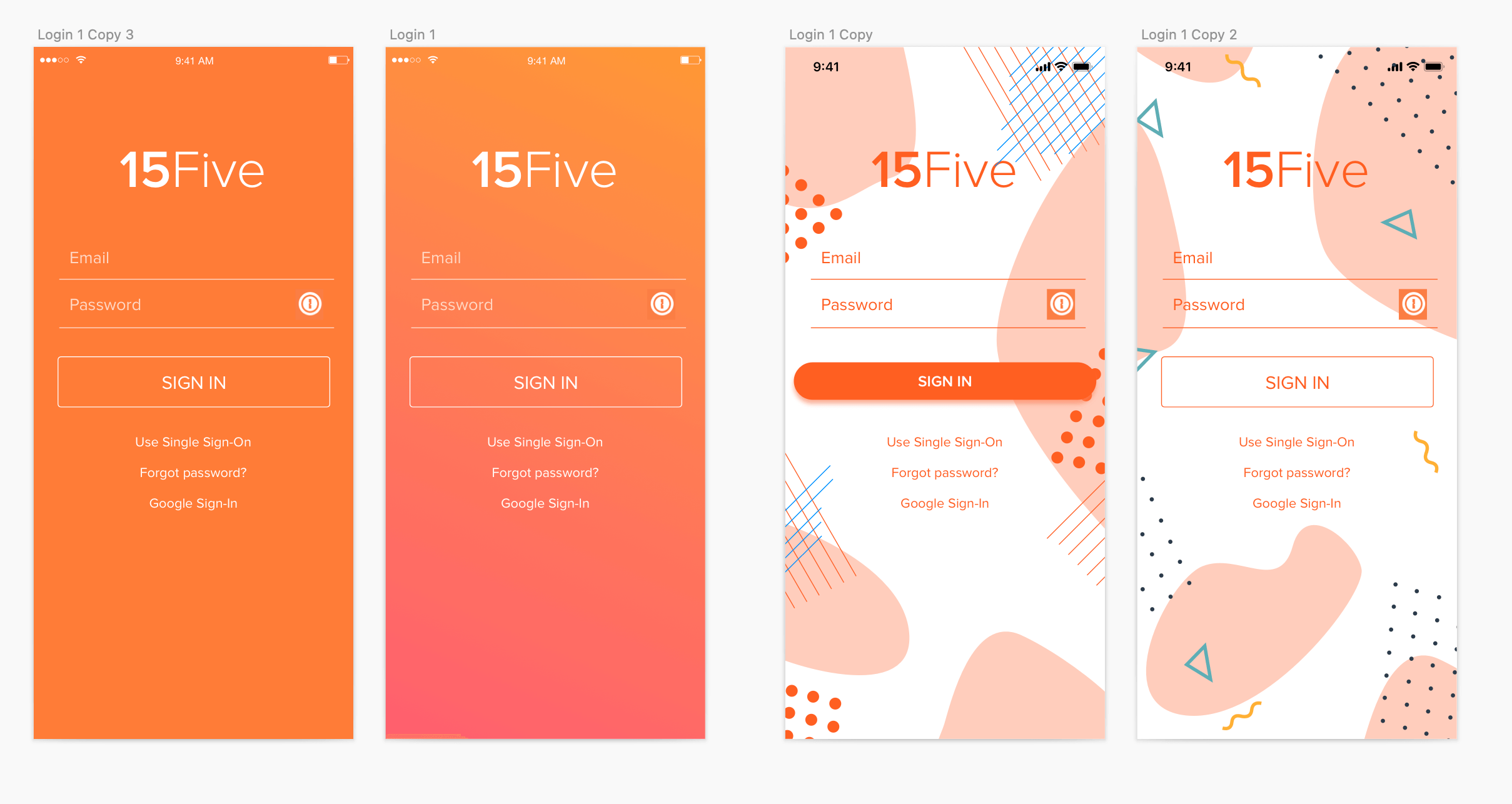
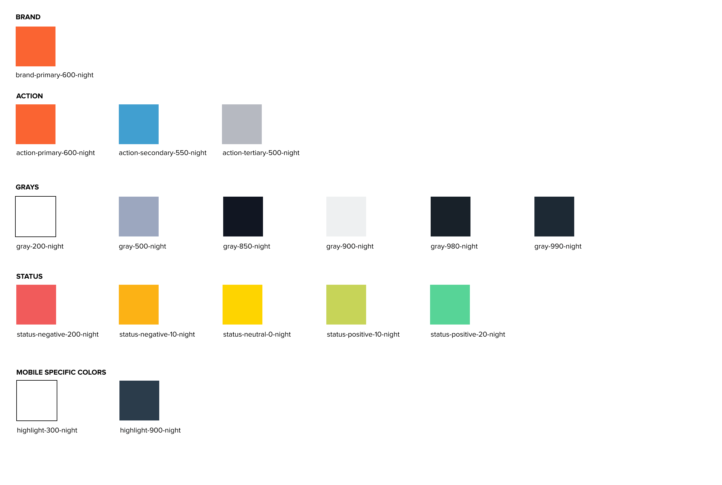
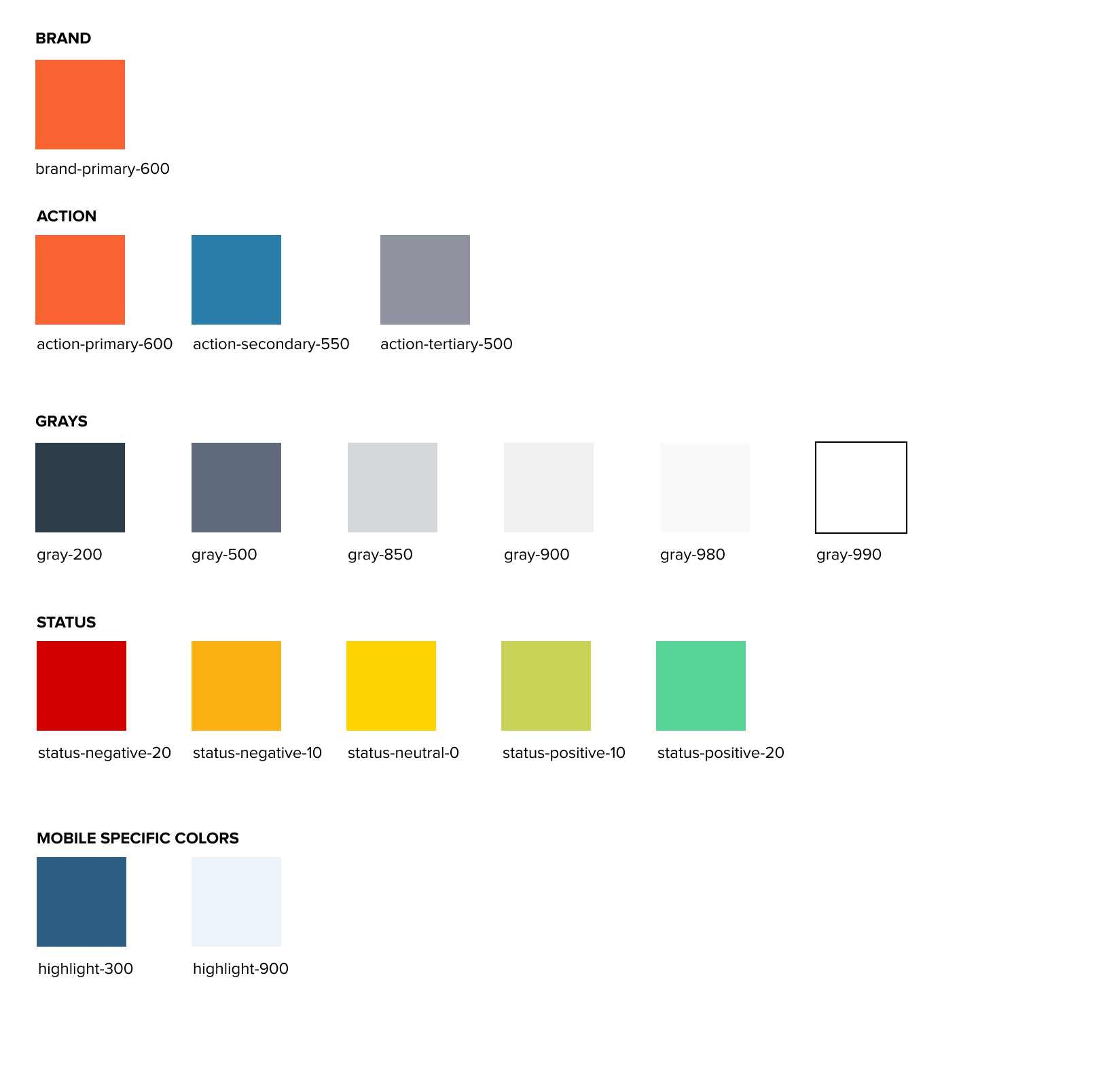
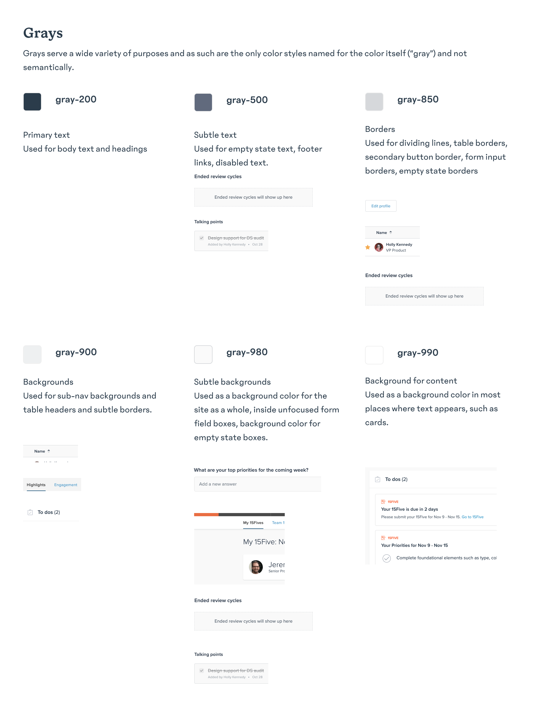
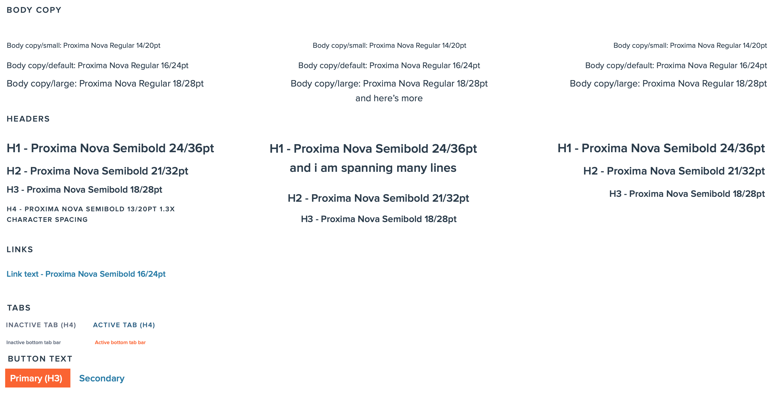
Styles
Text and color styles were created in collaboration with the Design Systems Designer, who had joined the team later on in the process of this project. On web we created a naming system that was not related to the actual hex values, so that the colors could be updated later and the names would still make sense. There were limited text styles in the iOS product so those were simple to consolidate. Working in Figma made it super simple to hand these off to developers without additional annotations.
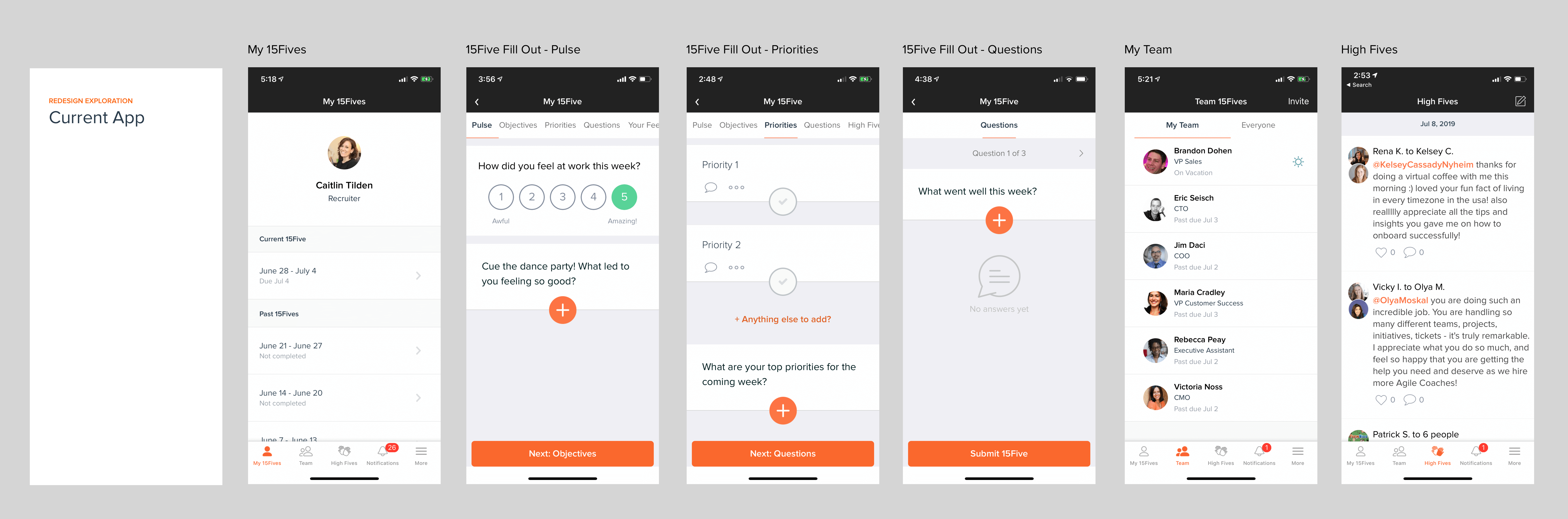
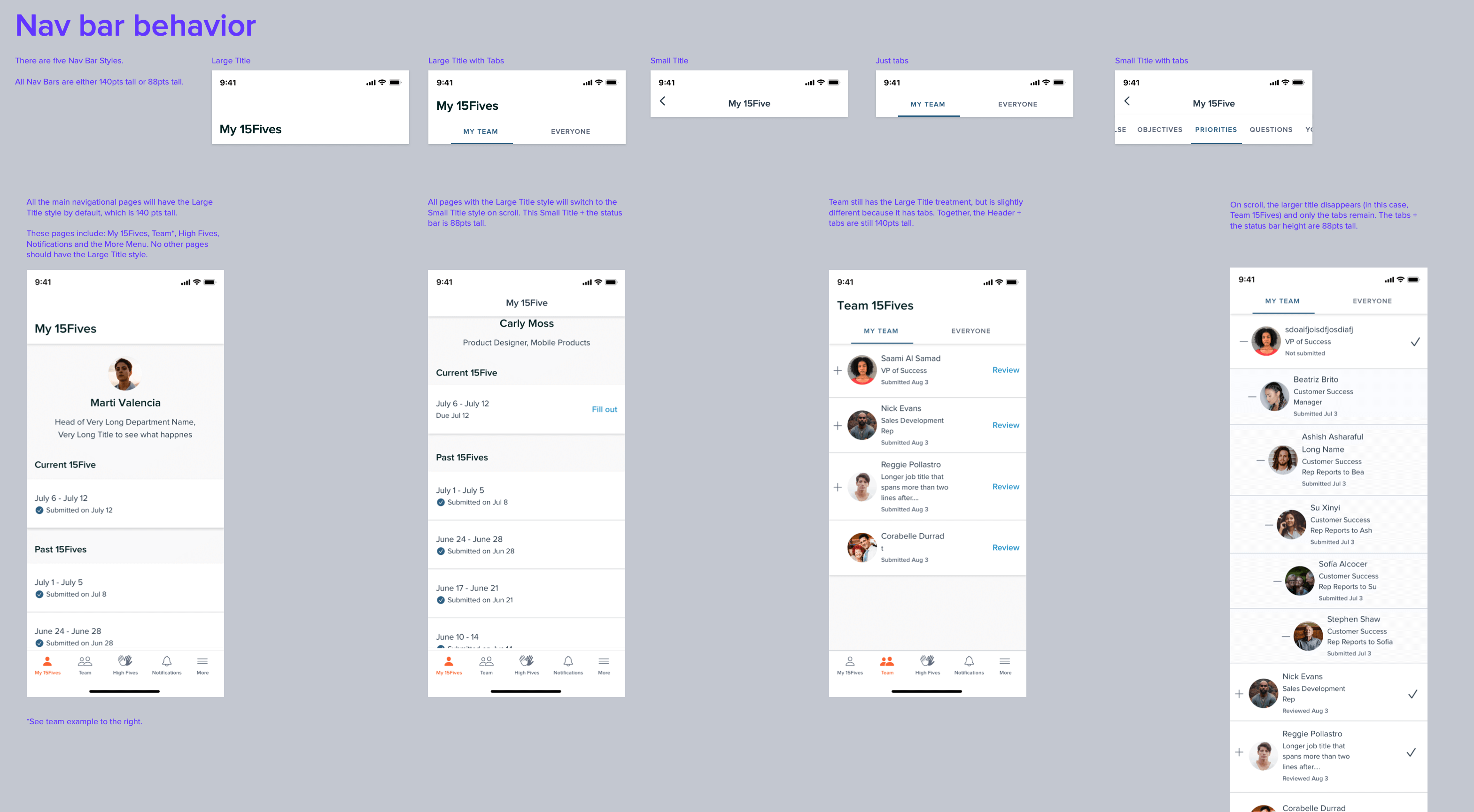
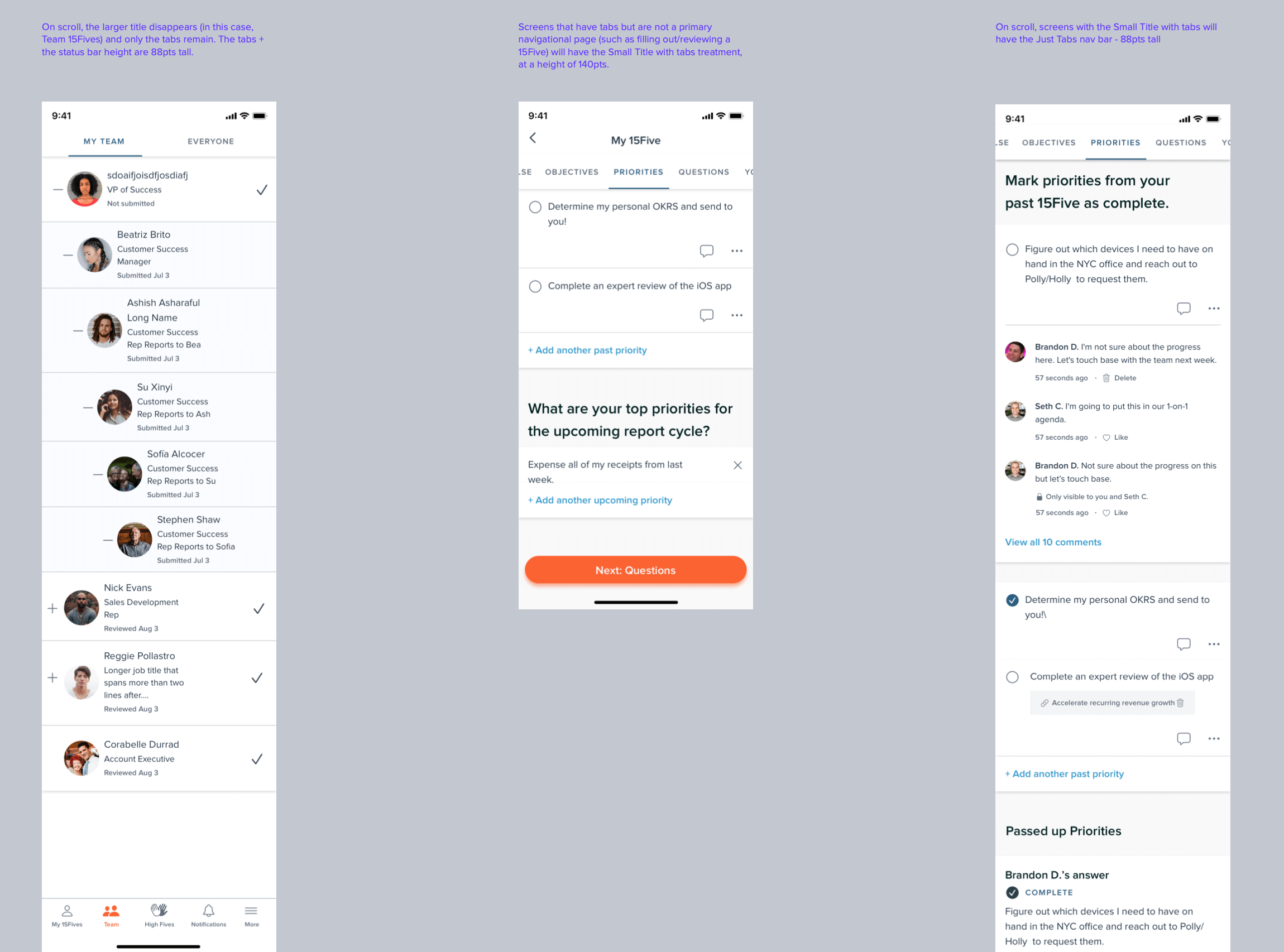
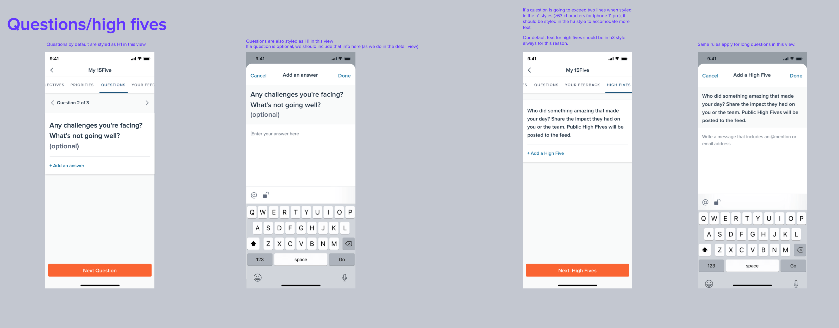
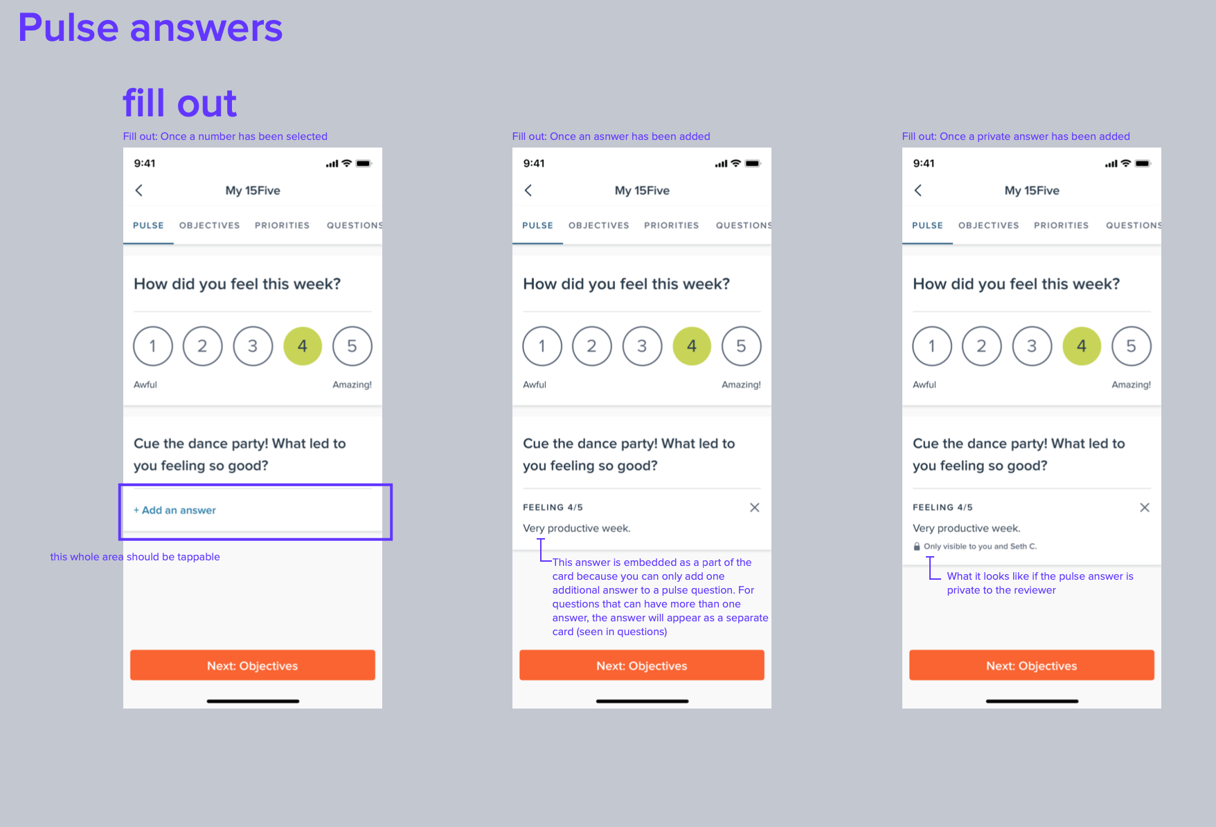
Design Specs
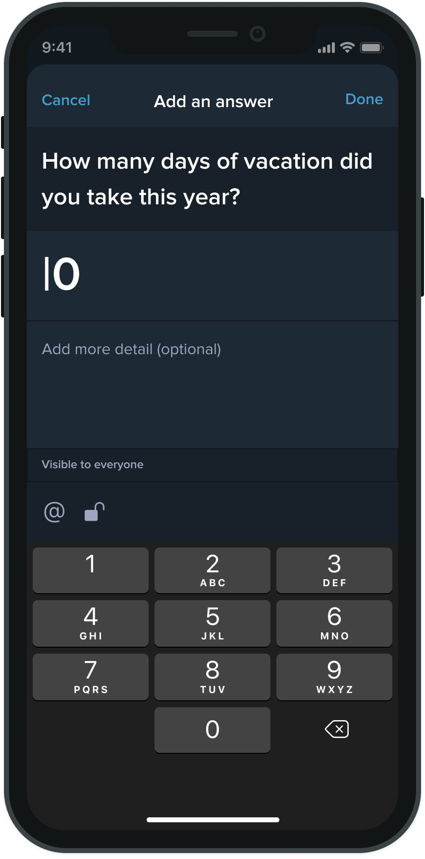
This was a visual rebrand and no major functional changes were included. Specs were still necessary to provide for various parts of the new UI.
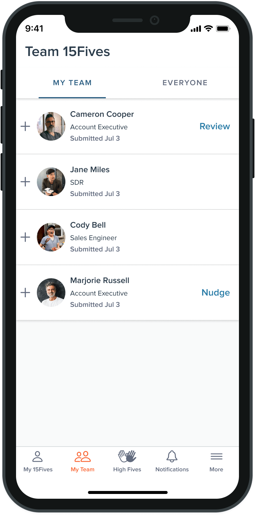
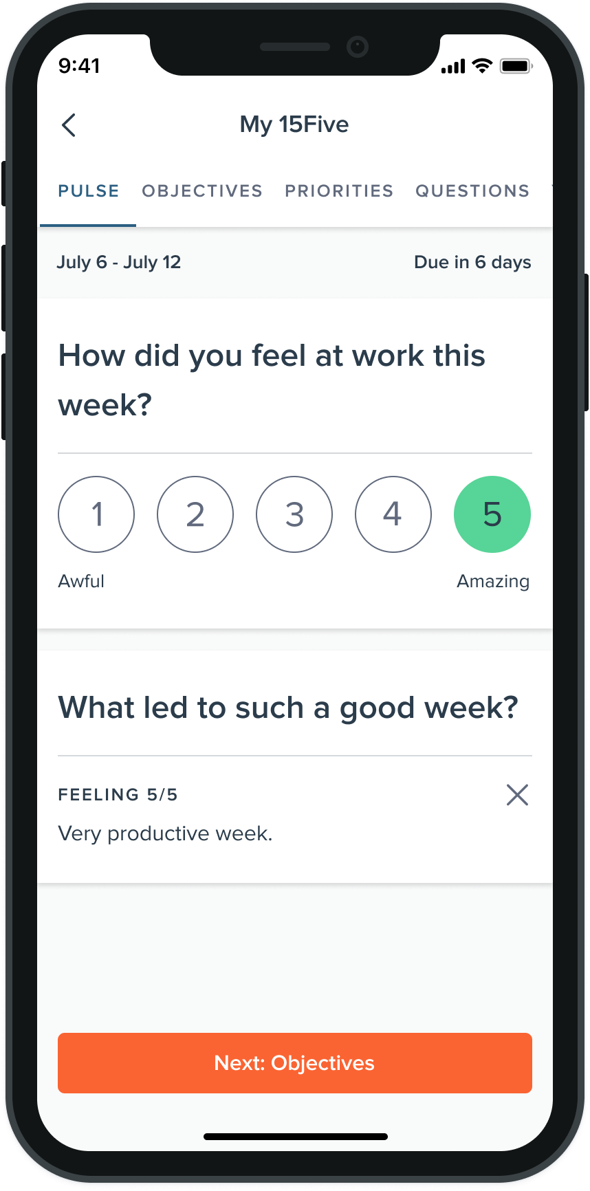
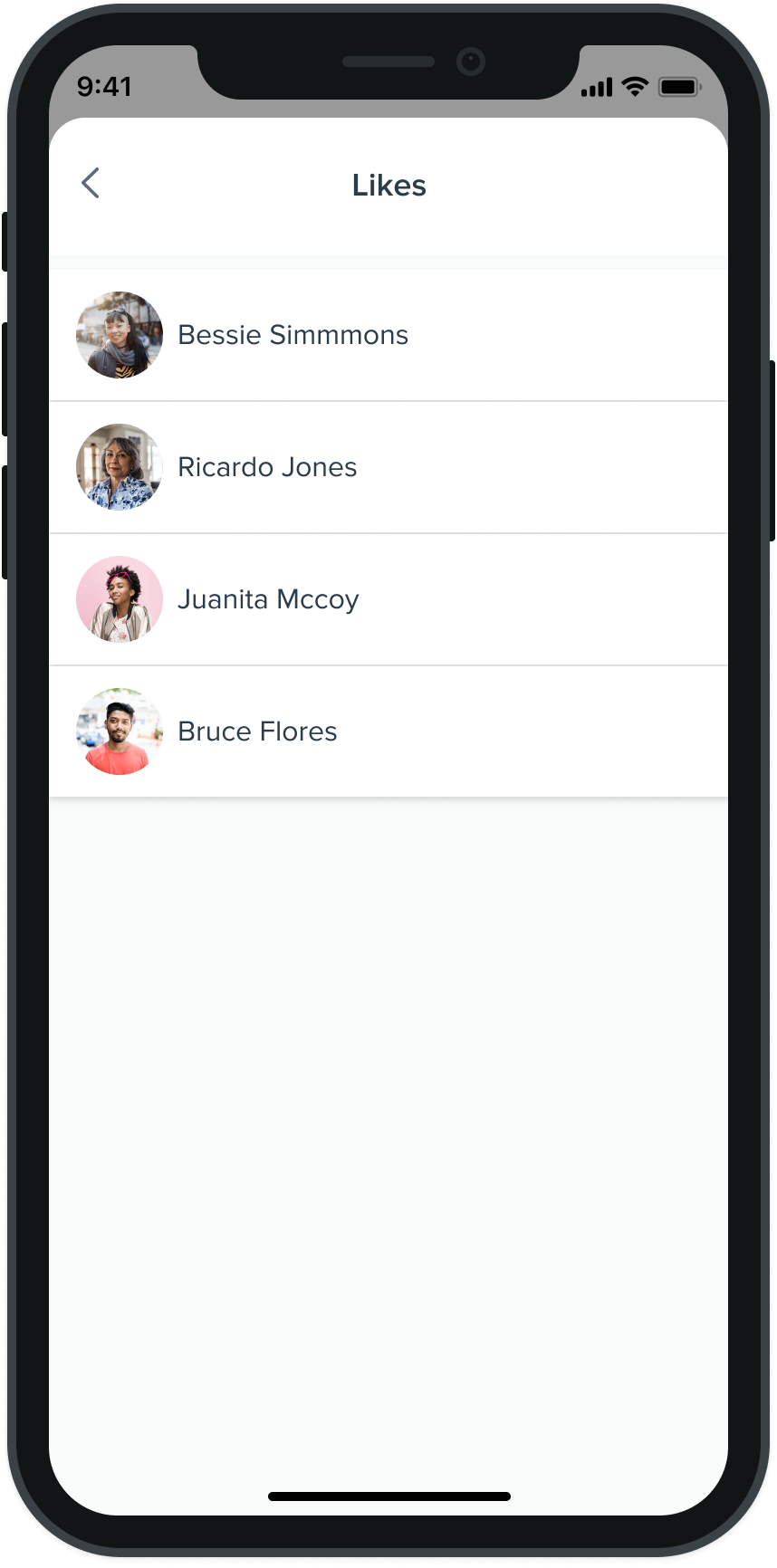
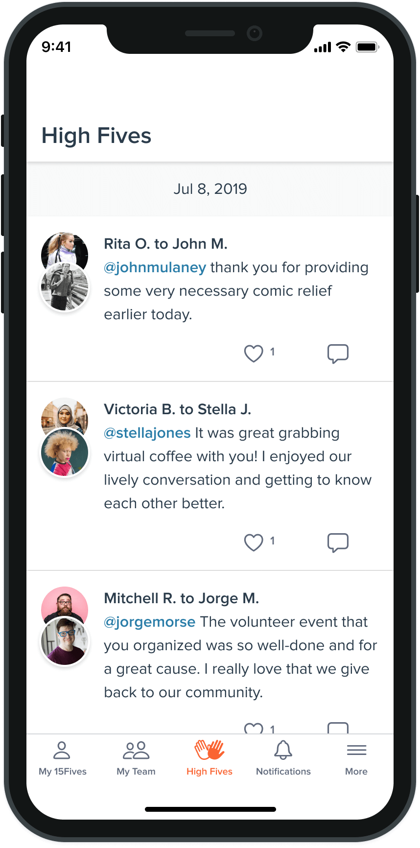
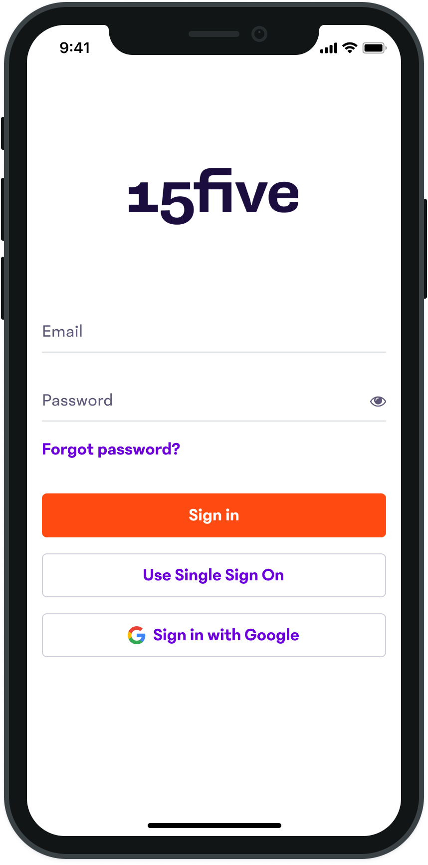
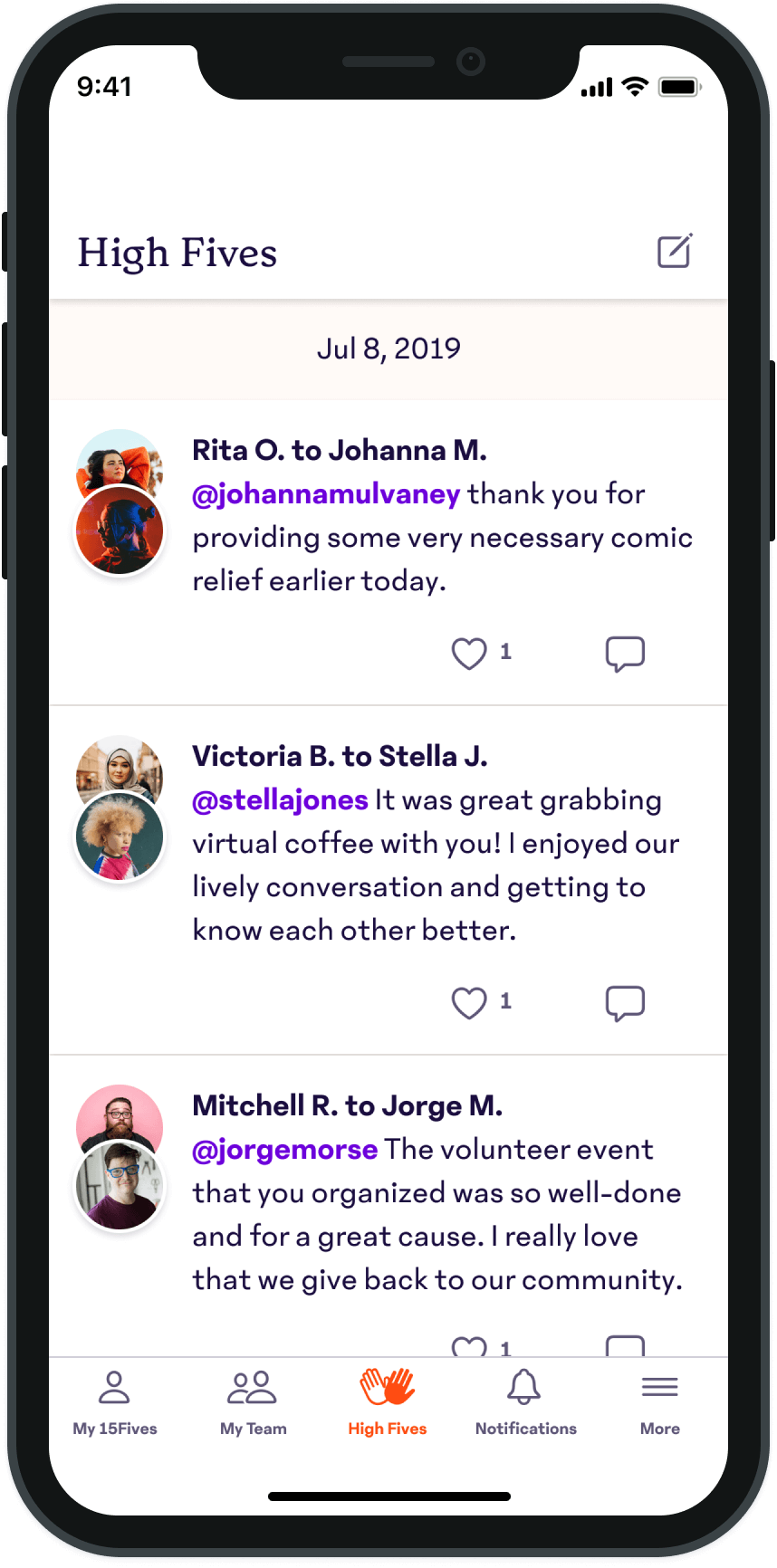
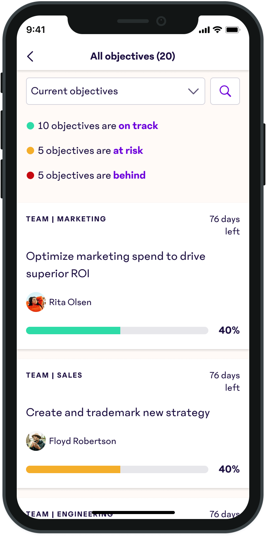
First Release
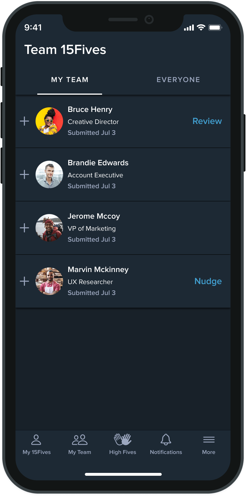
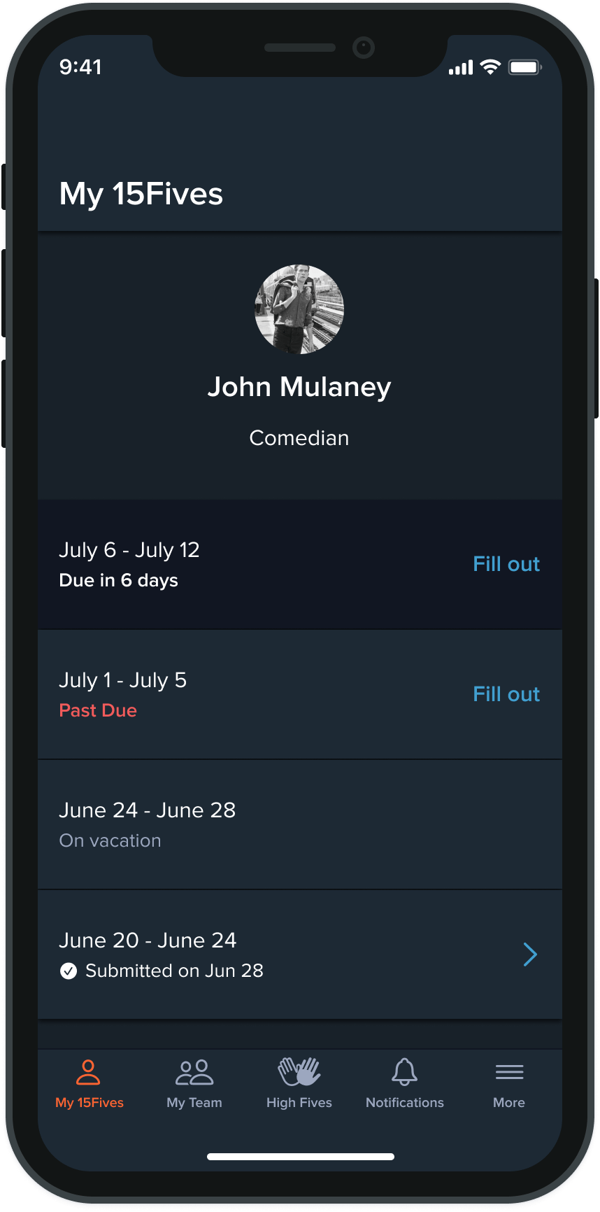
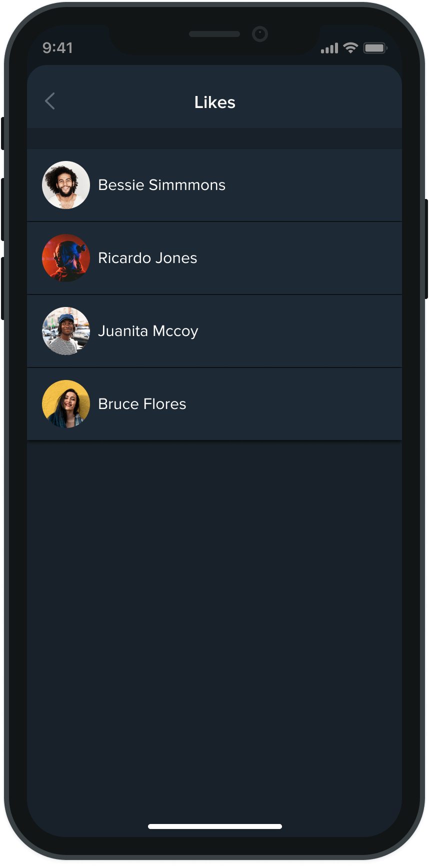
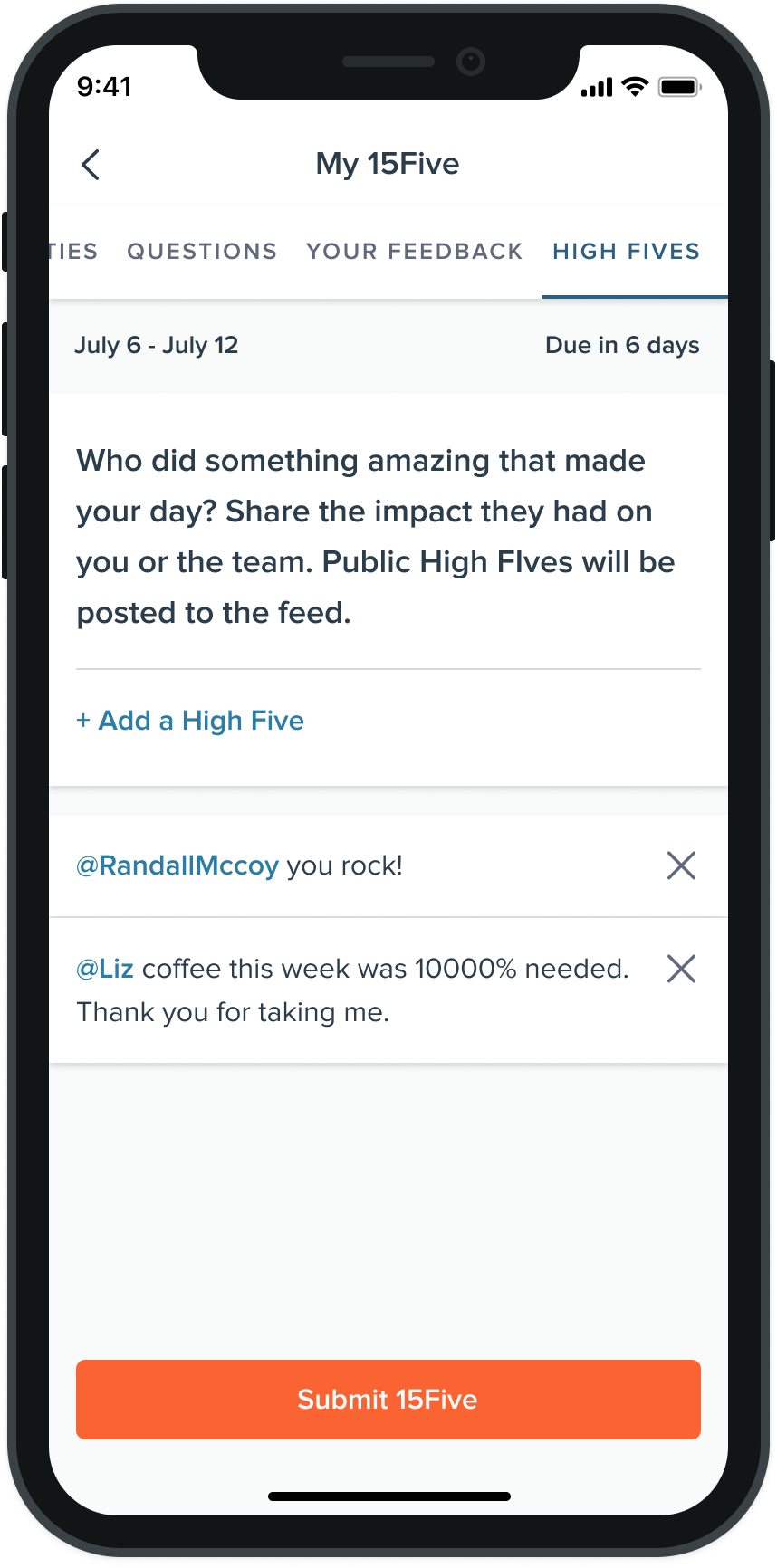
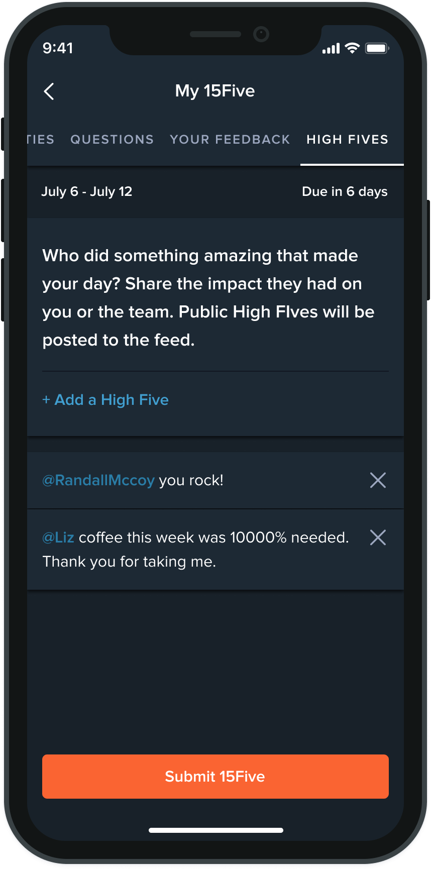
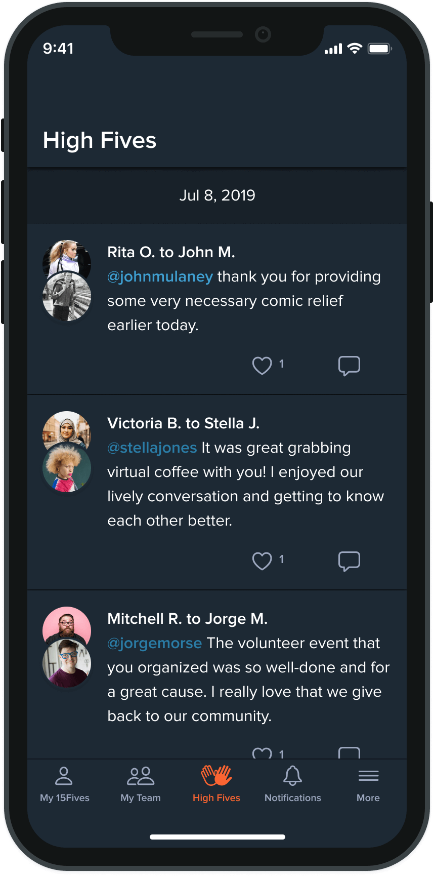

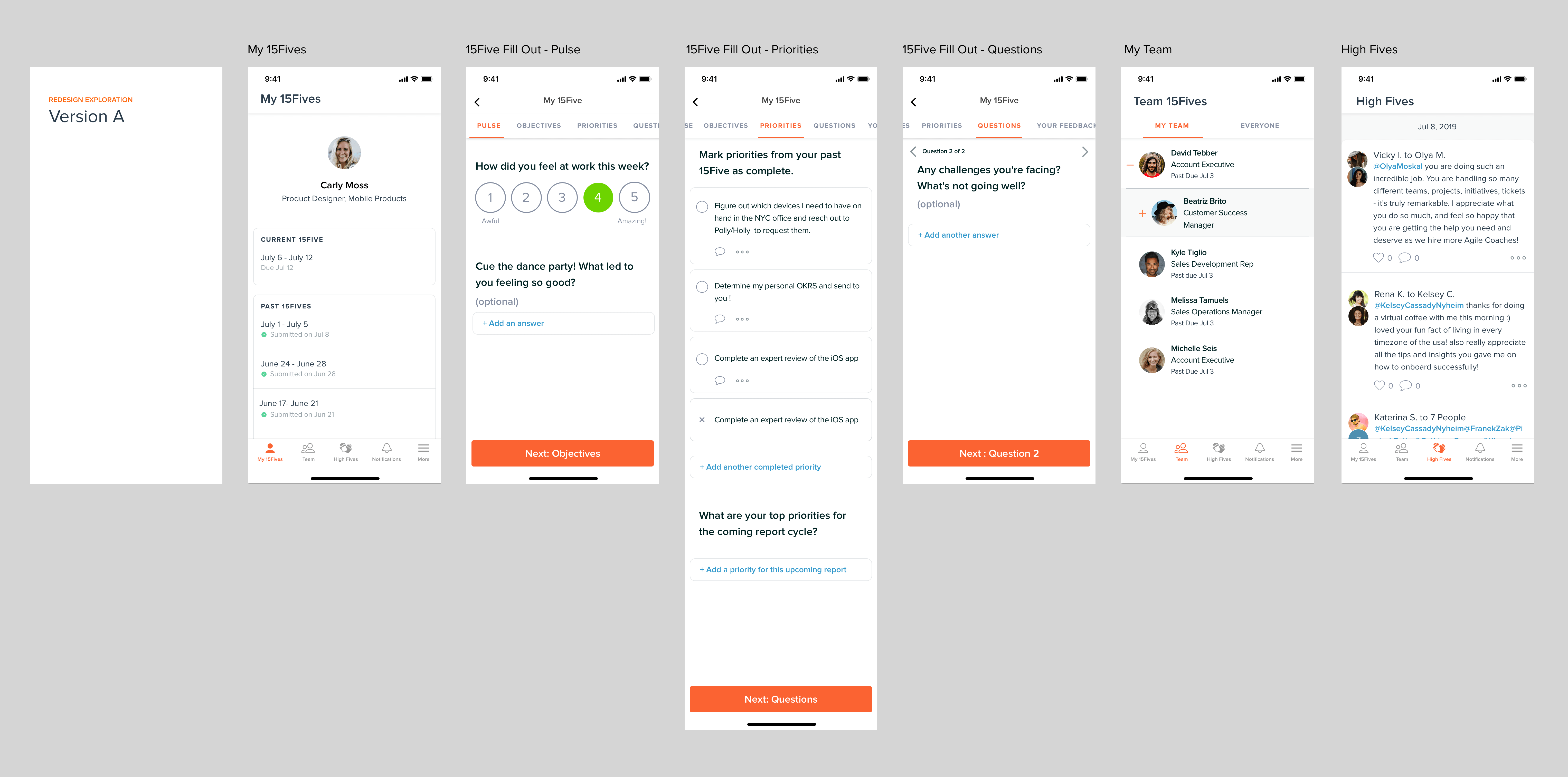
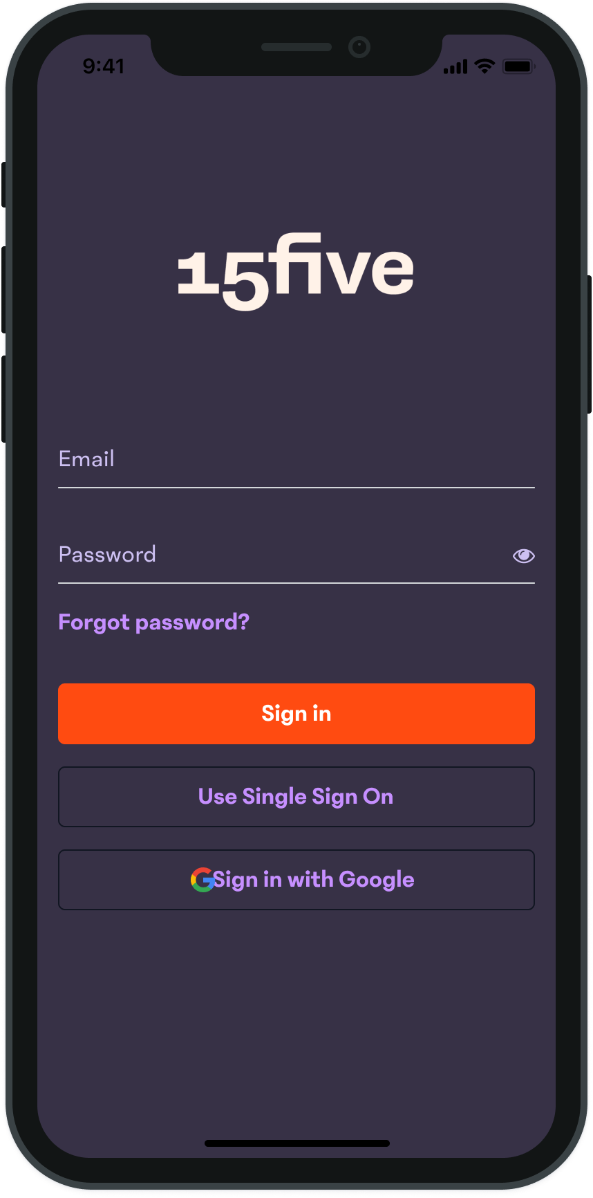
Second Release - Rebrand
Other Projects
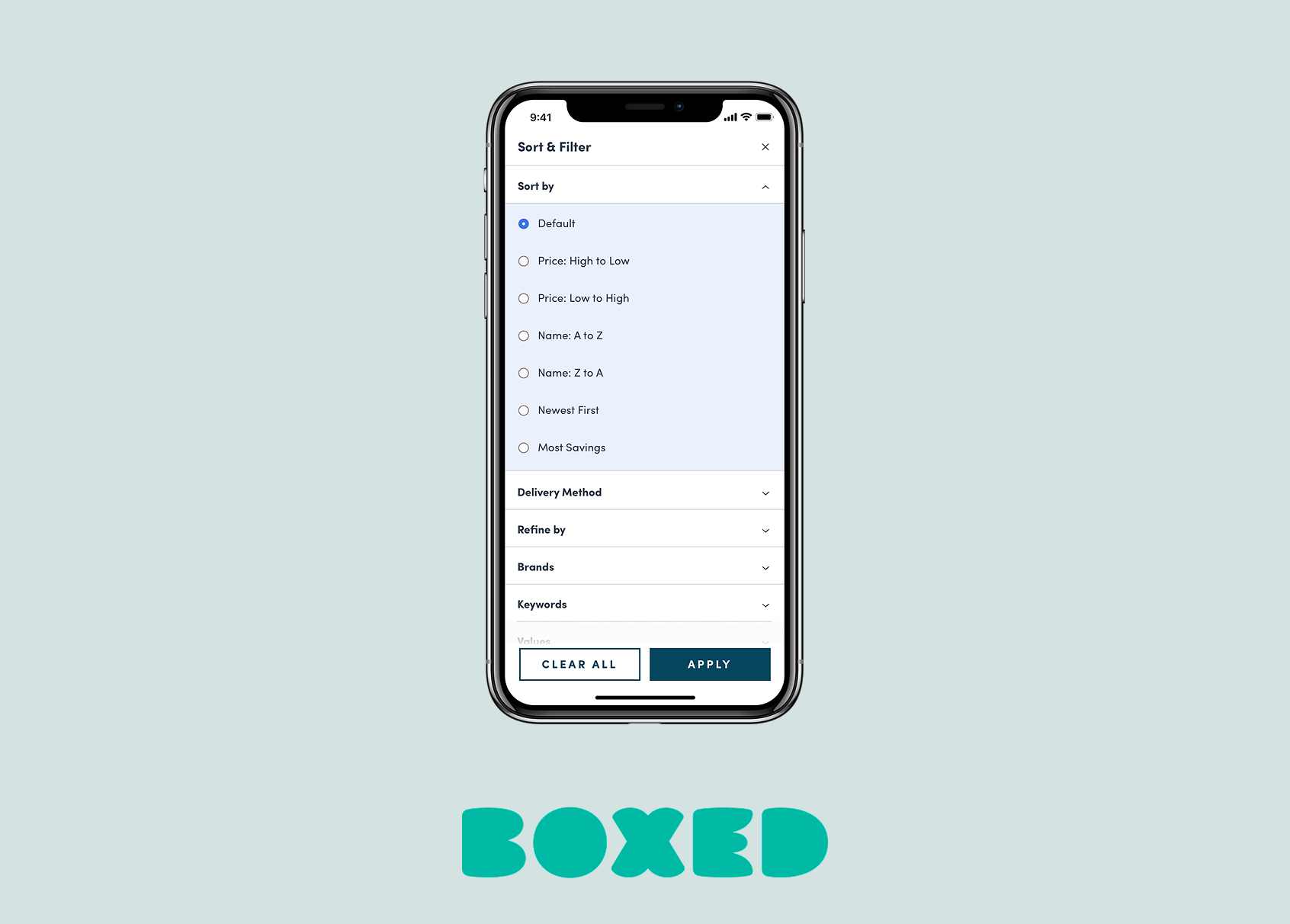
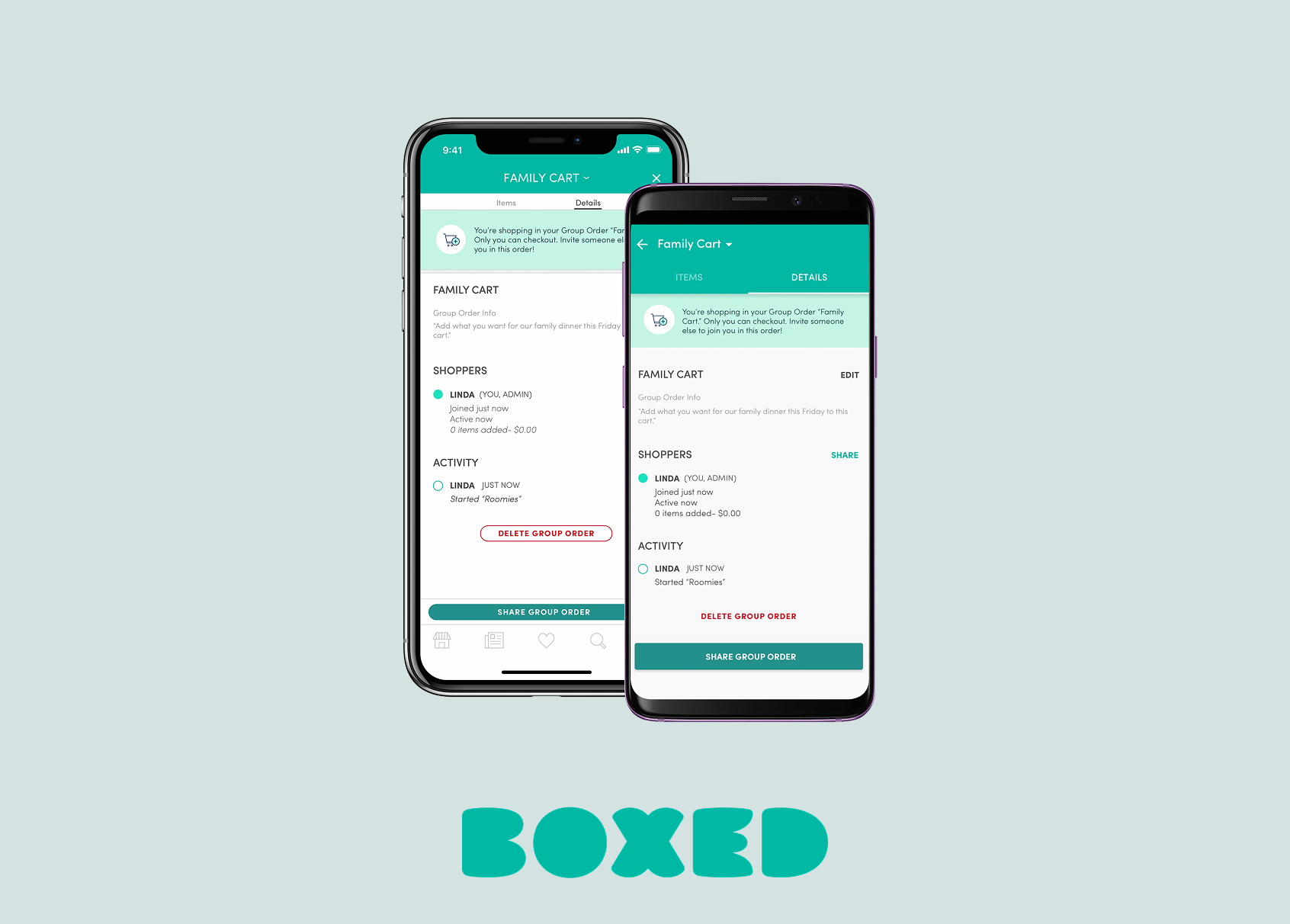
Boxed Group OrderingiOS & Android