Boxed Occasions
Occasions was a feature designed to help Boxed customers shop for common life events, such as parties, vacations, holidays, etc. We wanted to make shopping easier for users by providing them with a curated list of items that they could customize to their needs.
Challenges
Boxed has a specific, curated list of SKUs with many core products that don't go away, but with other items that rotate in and out of inventory. This is something that makes Boxed unique in that every product is specifically selected and approved to be sold on our site, which cannot be said for any given product. However, this also is a constraint that makes certain features challenging to design, such as Occasions. In order to deal with the frequently changing inventory at Boxed as well as allow our users to have as much flexibility in their shopping choices, we made each list associated with Occasions a list of search terms, rather than a list of particular items. On top of this list of search terms, users can add their own search terms or delete the suggested ones, as well as create their own entirely custom list as they need.
Inspiration
What we were attempting to do with Occasions for Boxed was somewhat unique, but wedding/baby registries were helpful to look towards for inspiration and functionality. They were similar in the sense that they allowed users to browse a category of items based on keywords, but not necessarily a specific list of items that is predetermined by the registry service. Some examples I looked at were Zola's, Bed Bath & Beyond, and Target's registry apps.
Inspiration
What we were attempting to do with Occasions for Boxed was somewhat unique, but wedding/baby registries were helpful to look towards for inspiration and functionality. They were similar in the sense that they allowed users to browse a category of items based off of keywords, but not necessarily a specific list of items that is predetermined by the registry service. Some examples I looked at were Zola's, Bed Bath & Beyond, and Target's registry apps.
Wireframes
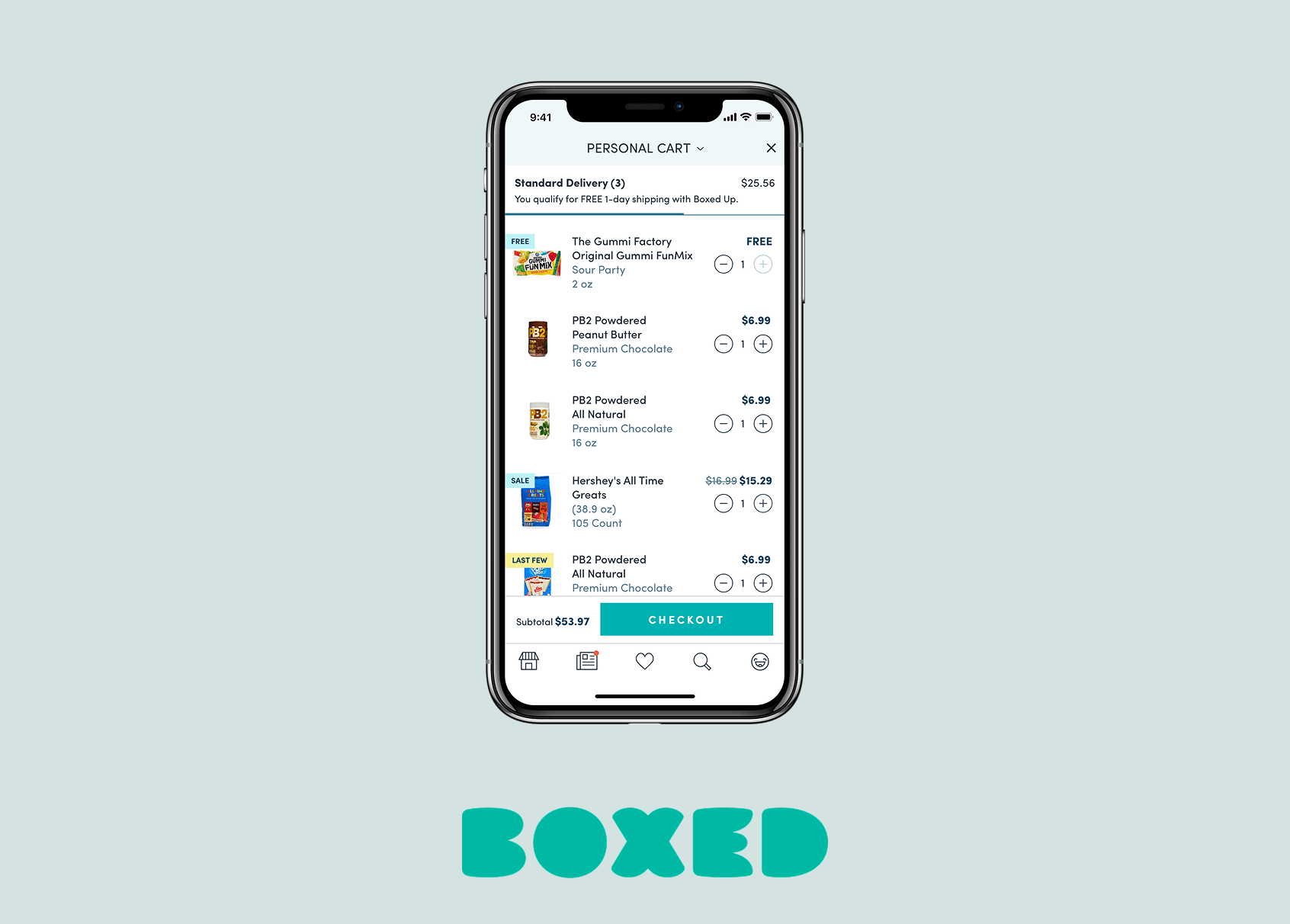
There were three main stages to the Occasions flow - selecting an Occasion to shop for, editing the curated list, and shopping the list. Once a user added items from the Occasions list to their cart, they could checkout or continue shopping normally.
Visual Design Exploration
Occasions was also designed to replace a previous feature that occupied a similar space in the app but wasn't performing very well called Bundles. Bundles was a feature where we algorithmically engineered to have the perfect amount of items taking up the most efficient amount of space inside of our boxes, but would sometimes be a somewhat random assortment of products, which ultimately meant not a lot of people were buying them.
In order for Occasions to be determined a success, it needed to perform better than Bundles. A particular challenge about Bundles was that we devoted time in the Boxed photo studio to photographing the contents of each Bundle, which took a lot of time and energy from our marketing team. For Occasions, we wanted to see if we could end up spending less effort on the creative side of things to make this a more efficient feature. As a result, I explored many simple visual design solutions to the creative side of this feature.
Initial Launch & User Testing
We ended up launching with this design initially, except we ended up using existing creative photos for the featured images for each Occasion.
We brought in users to test this feature shortly after launching it and discovered an issue with the flow. I had designed the feature with three steps in mind- selecting an Occasion, creating the list, and then shopping for it. However, when we brought users in, we found that many of them were confused by the second step of the process and just wanted to shop right then and there.
Adjustments
After user testing, I consolidated steps two and three into one. Users could simultaneously edit their lists and shop for them. Other takeaways from user testing were that users wanted to know if we were showing them our entire product selection or if it was just a snippet (it was just a snippet, so we added a state for loading more products) and we needed to increase the text size of many elements for legibility.
Other Projects
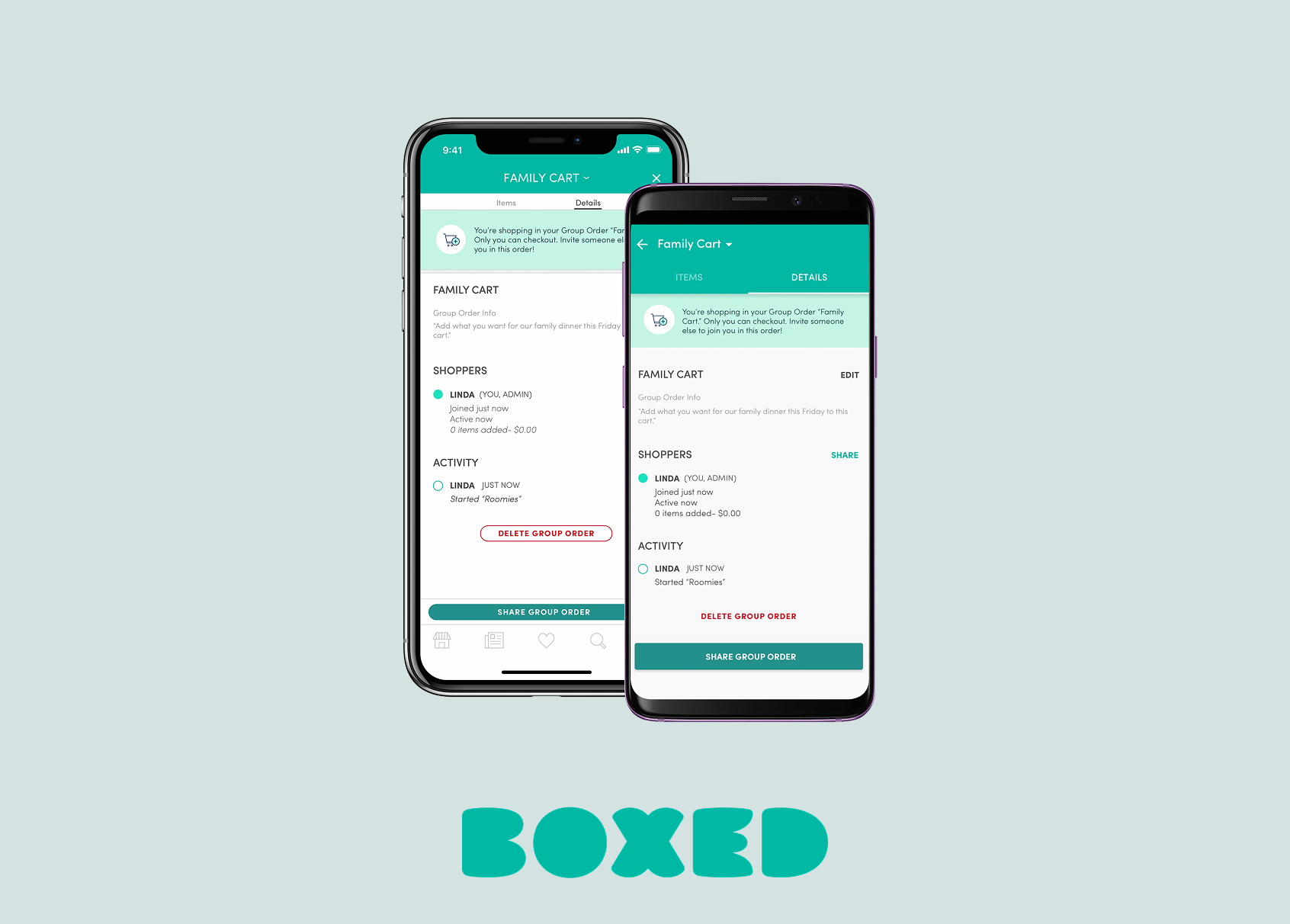
Boxed Group OrderingiOS & Android