Boxed iOS Redesign
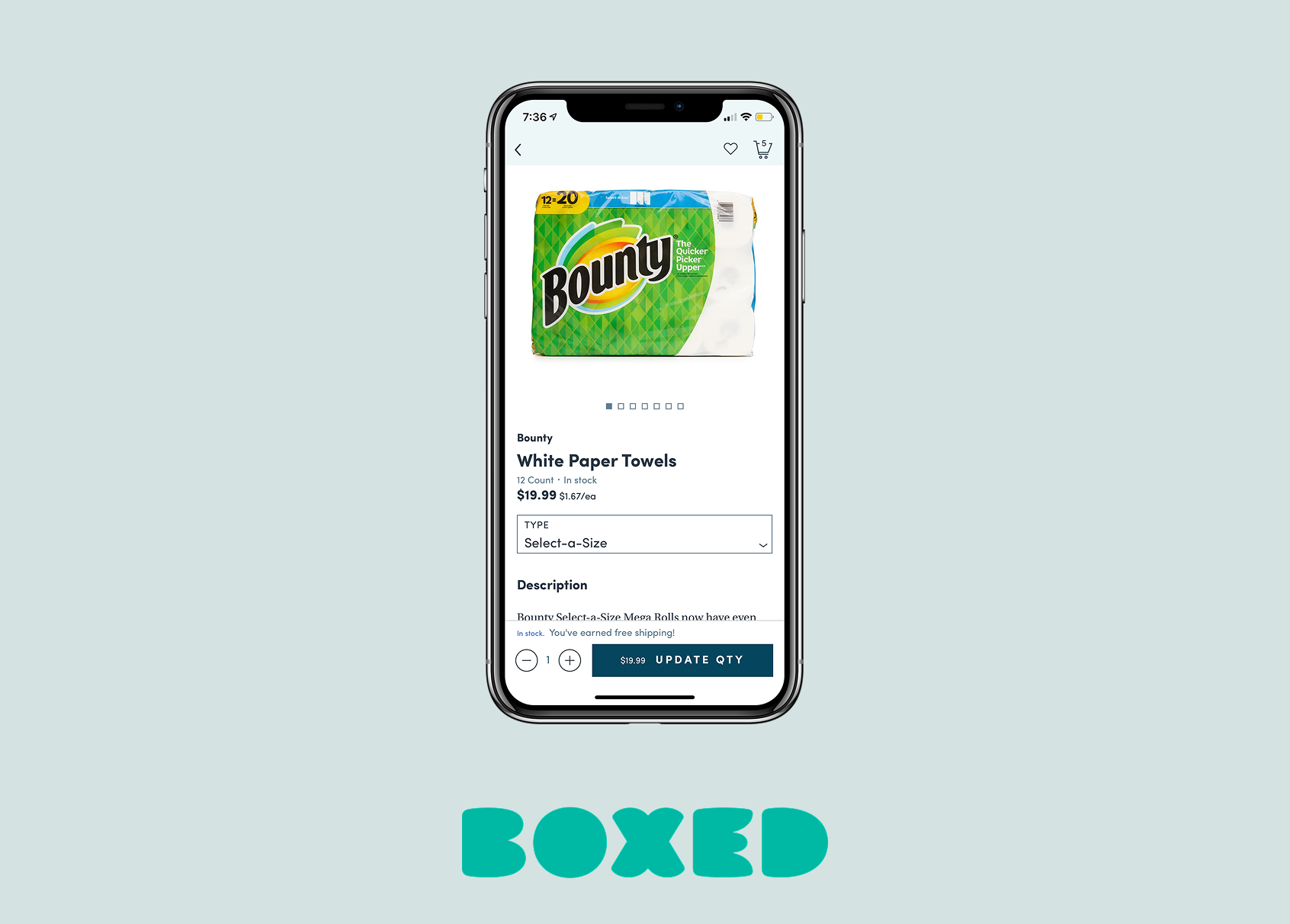
My largest project to date at Boxed has been redesigning the UI of the Boxed iOS app. The app was due for a refresh - the UI hadn't been touched since before I started in 2017 (it's 2019 as I'm writing this) and I was the first full time mobile designer to join the team, so it was finally the right time to devote some resources to updating the app.
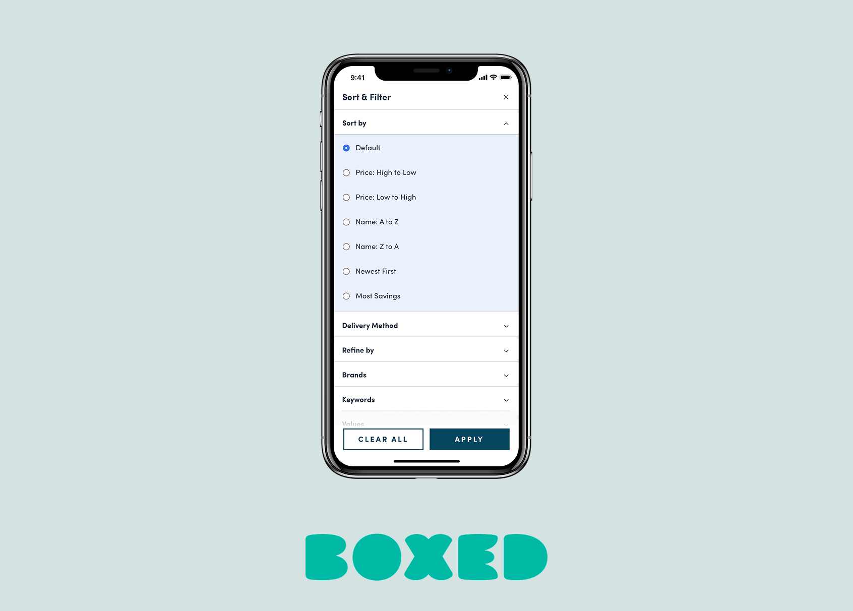
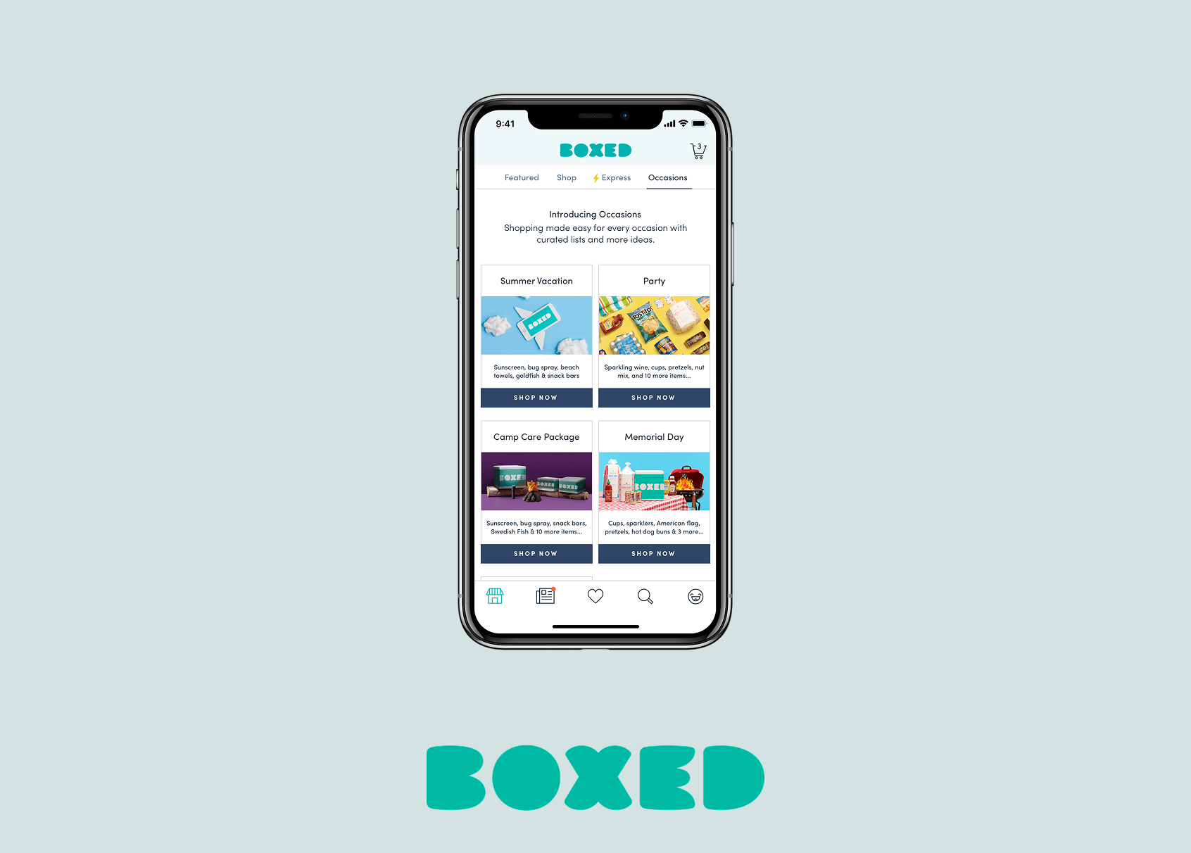
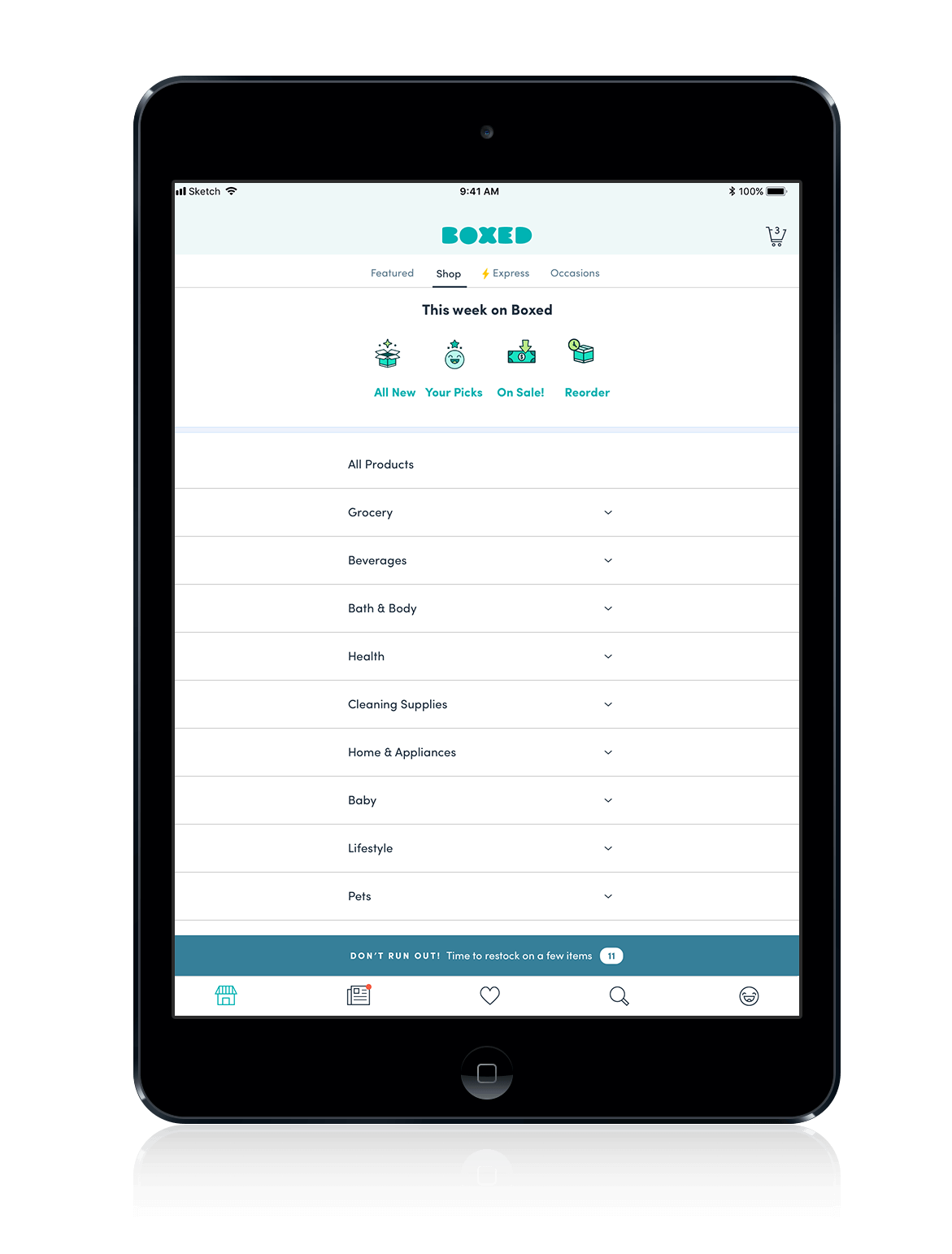
This was almost entirely a visual refresh. The purpose of this redesign was to keep all core Boxed functionality the same while solving crucial issues: improving text legibility and too-small touch targets as well as unifying styles across the board.

Process
We had a previous style guide for the iOs app that was a good place to start for reference, but it wasn't necessarily comprehensive of all of the components we currently had in the iOS app.
I worked with updated branding assets that we were using on the marketing side of Boxed as well as alongside the web product designer to create the new style guide for iOS. I applied the new colors, typography, and patterns to the app UI to make it fresher, easier to read and easier to interact with.
I also went through screens on an individual basis to keep track of how the new styles looked when applied all together.
First pass designs
These were a first draft of applying new styles to the main components of app - the home tab, news tab, search, account and cart.


Styles
These styles were created in tandem as my coworker Claire created similar styles for the web product. I adapted a lot of her existing styleswhile also creating new ones that made more sense for mobile, such as increasing the base text size and making more usable input fields for mobile.
Visual QA
A key part of the design process at Boxed after handing off assets to developers in Zeplin is ensuring that the working build matches the designs. Visual QA was especially important for this product, so I went through each feature as it was updated and made notes to ensure that the new styles were accurate to my designs.


Final Designs


![grocery]](https://carlymoss.com/wp-content/uploads/2019/04/grocery.png)


Other Projects
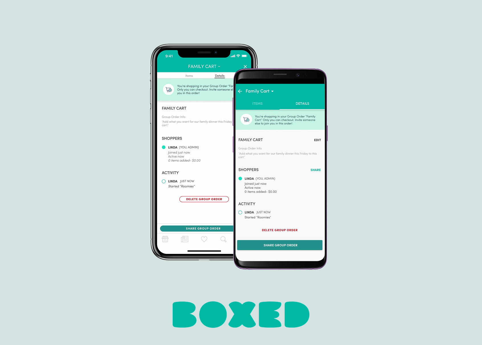
Boxed Group OrderingiOS & Android


