Boxed Group Ordering
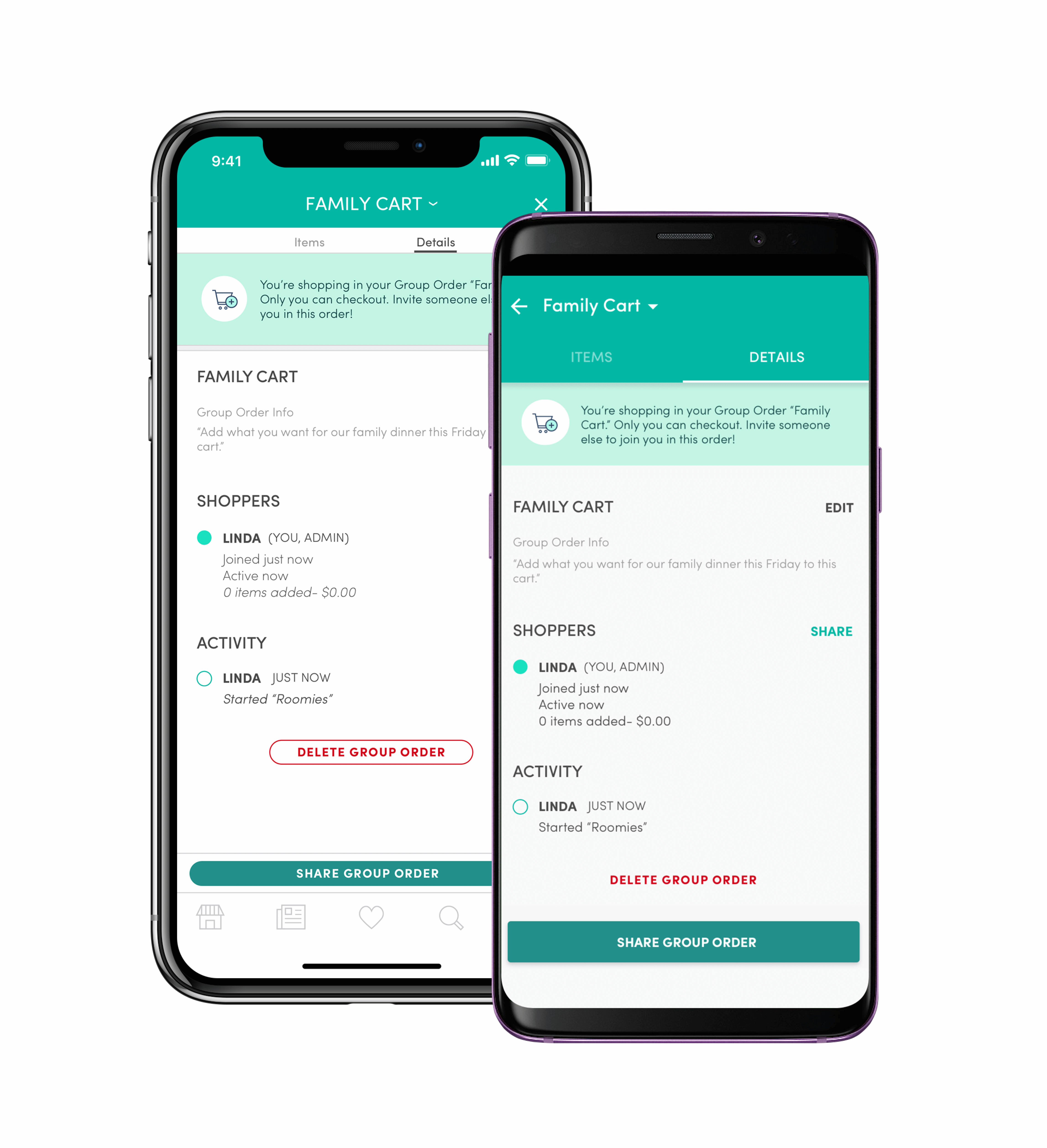
One of my first large projects at Boxed was working on Group Ordering - a feature that would allow users to collaborate on orders together in real time. Users could share an active Group Order that they were adding to with friends and family and have others add the items they wanted, with only the Group Order owner checking out at the end.
This needed to work on every platform so that users could share their orders regardless of the device their friends and family were using. I worked closely with the web designer at Boxed to make sure that this project was seamless across mobile and web.
Research
I looked at existing examples of this sort of group ordering experience - Instacart, DoorDash and Caviar appeared to be doing this particularly well.
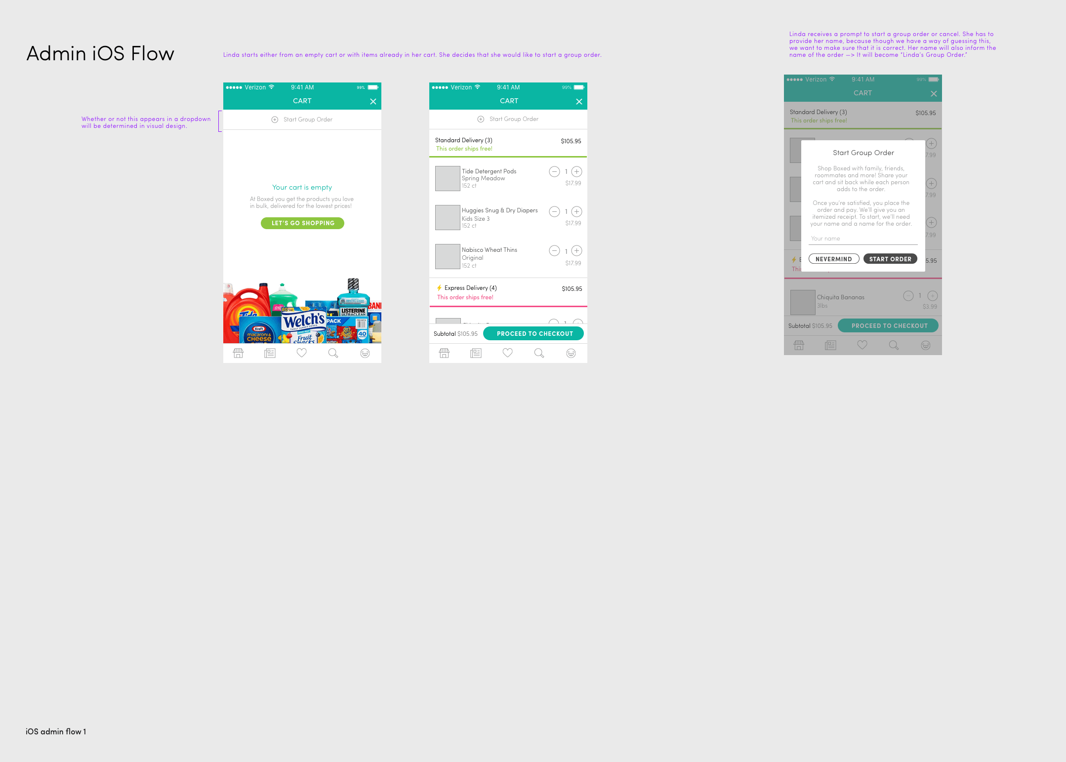
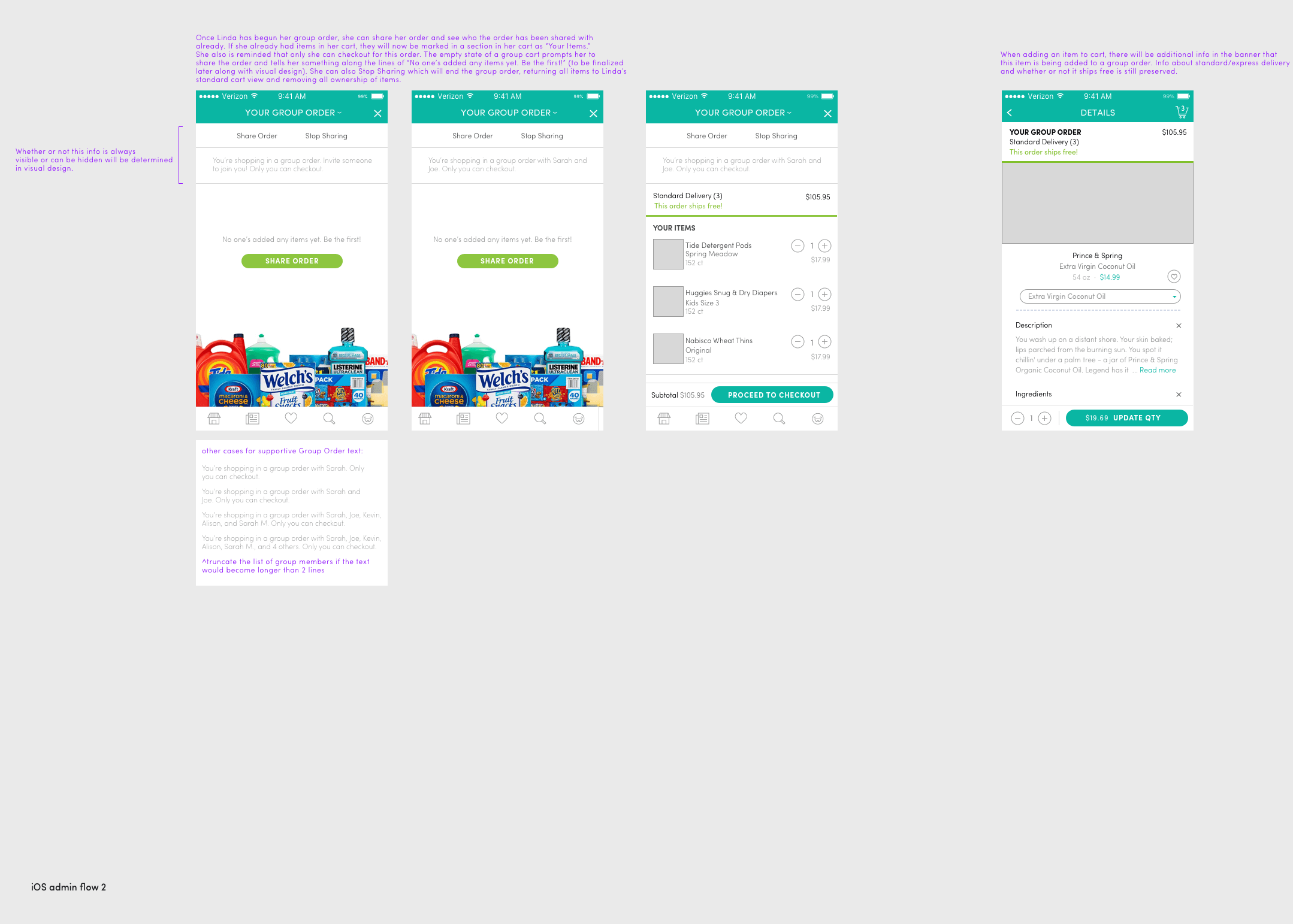
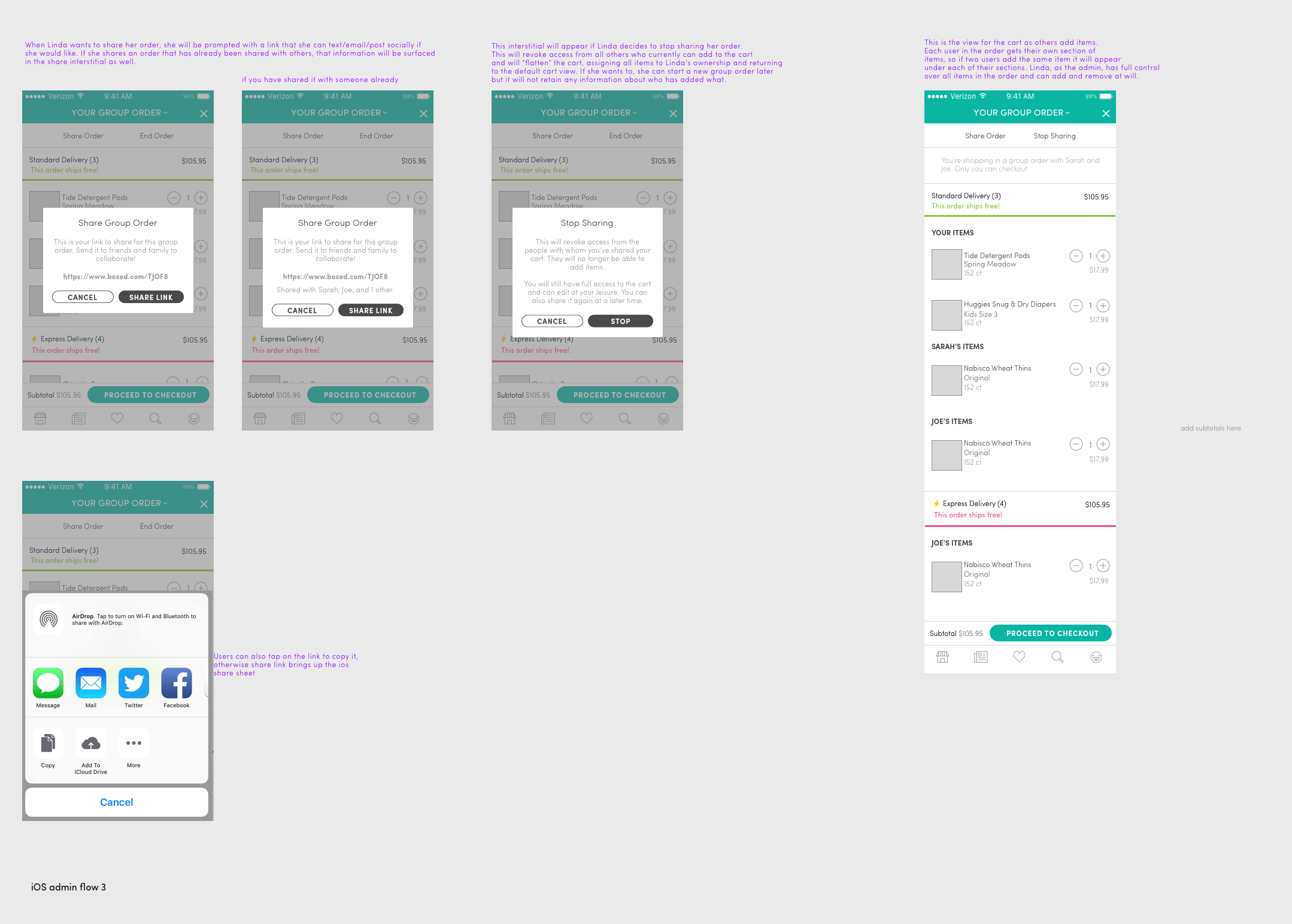
Storyboarding
This was a particularly complicated flow, so this was an essential part of the process, especially to ensure parity with web.
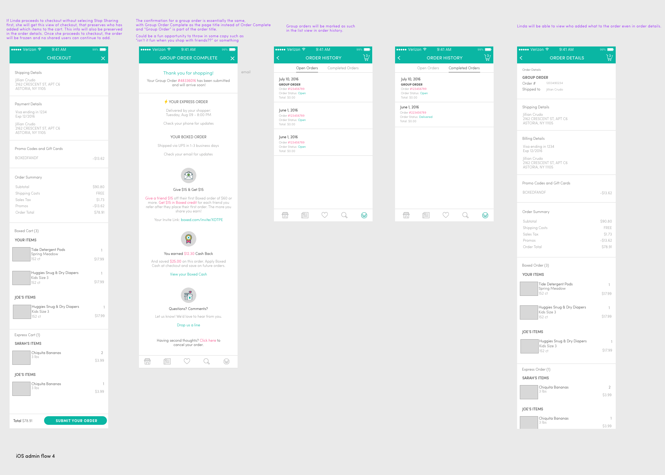
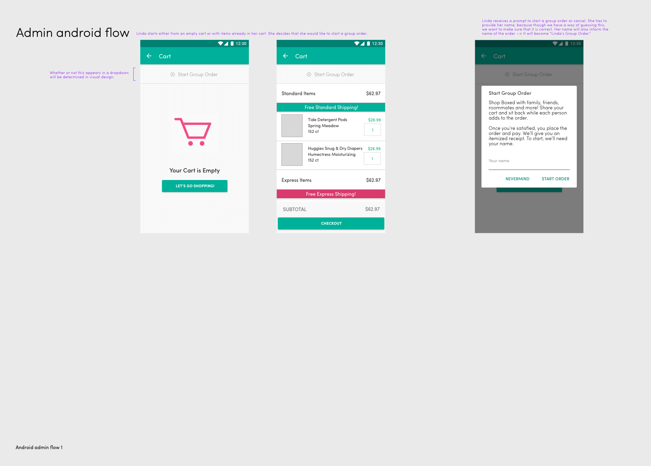
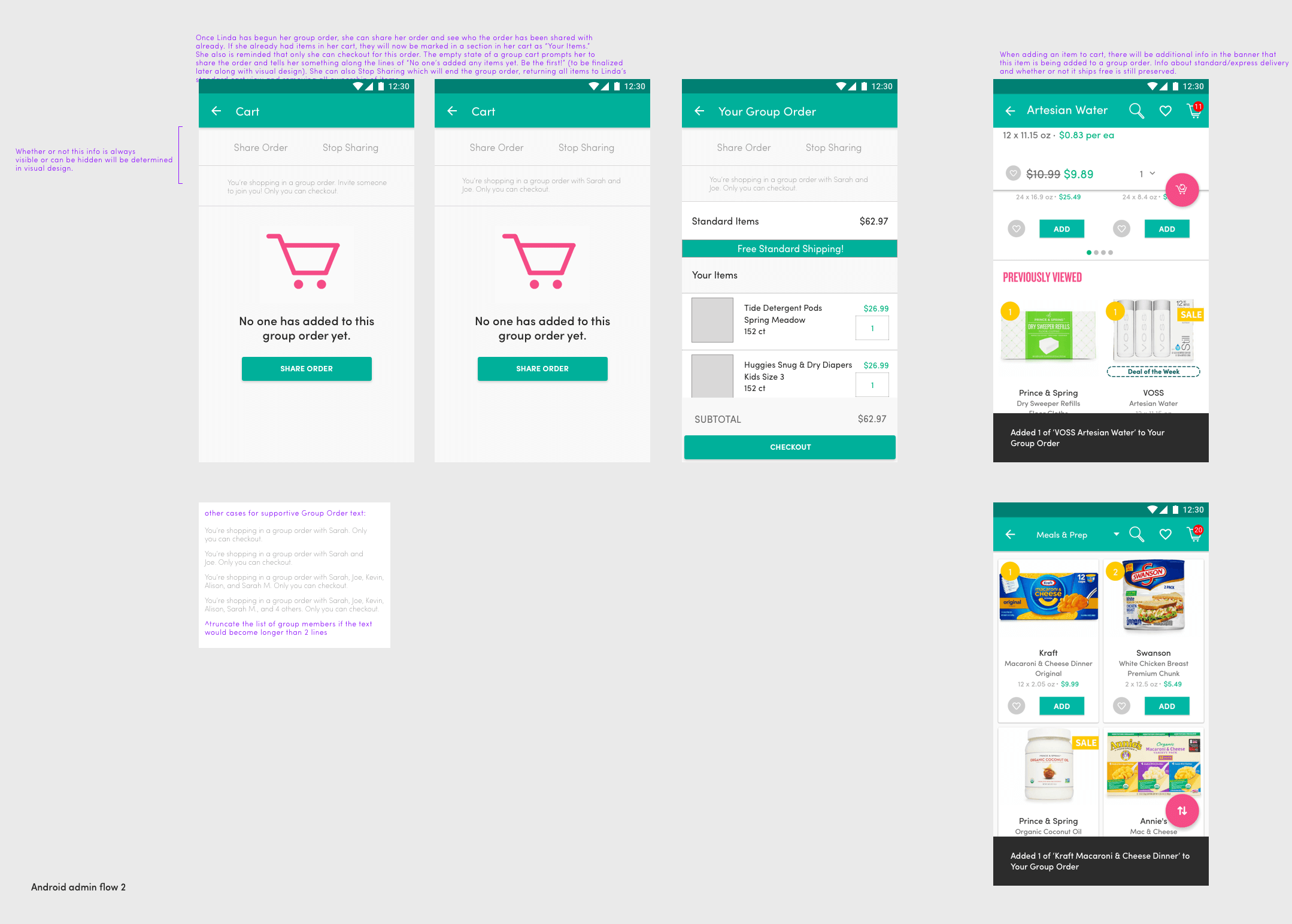
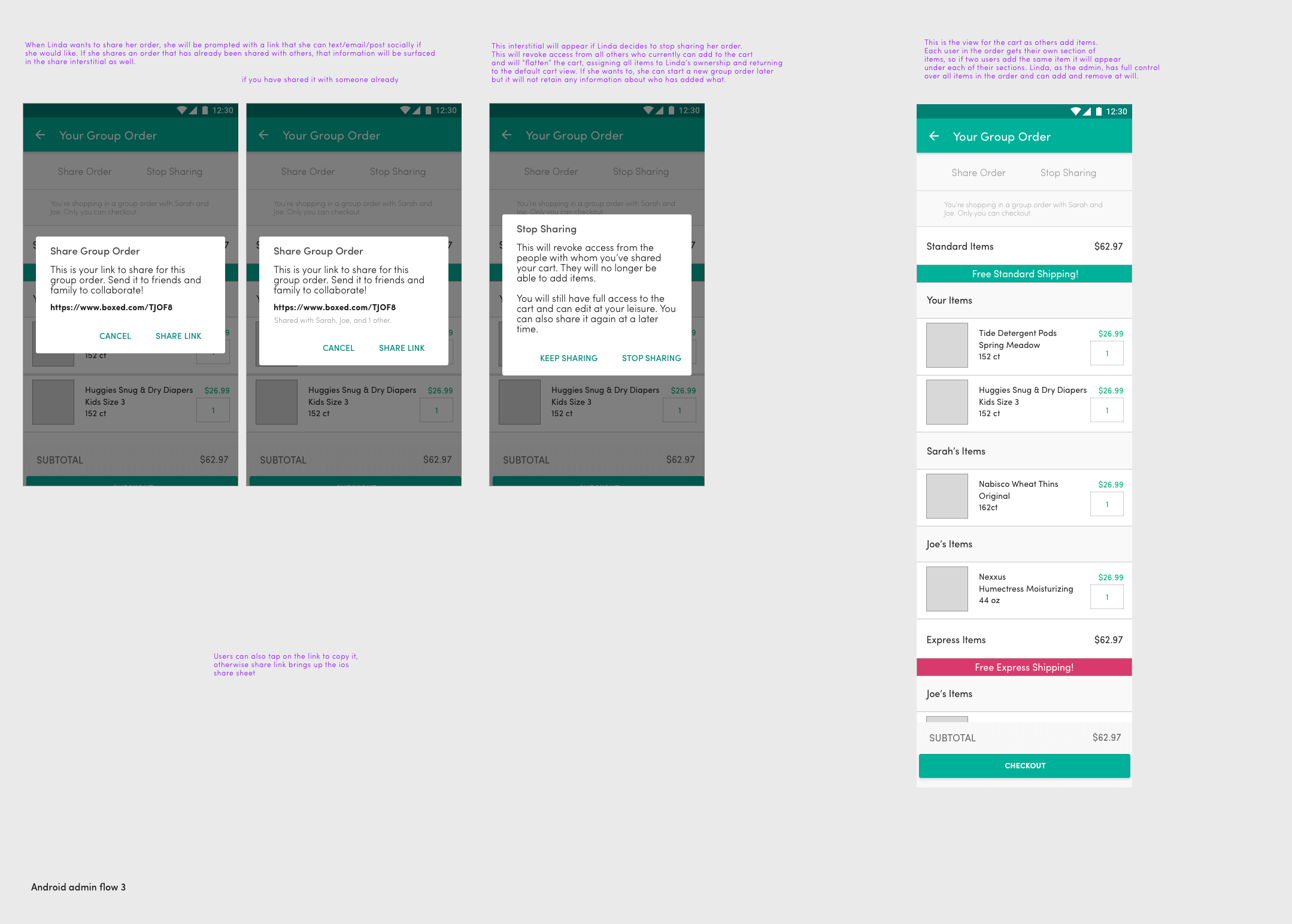
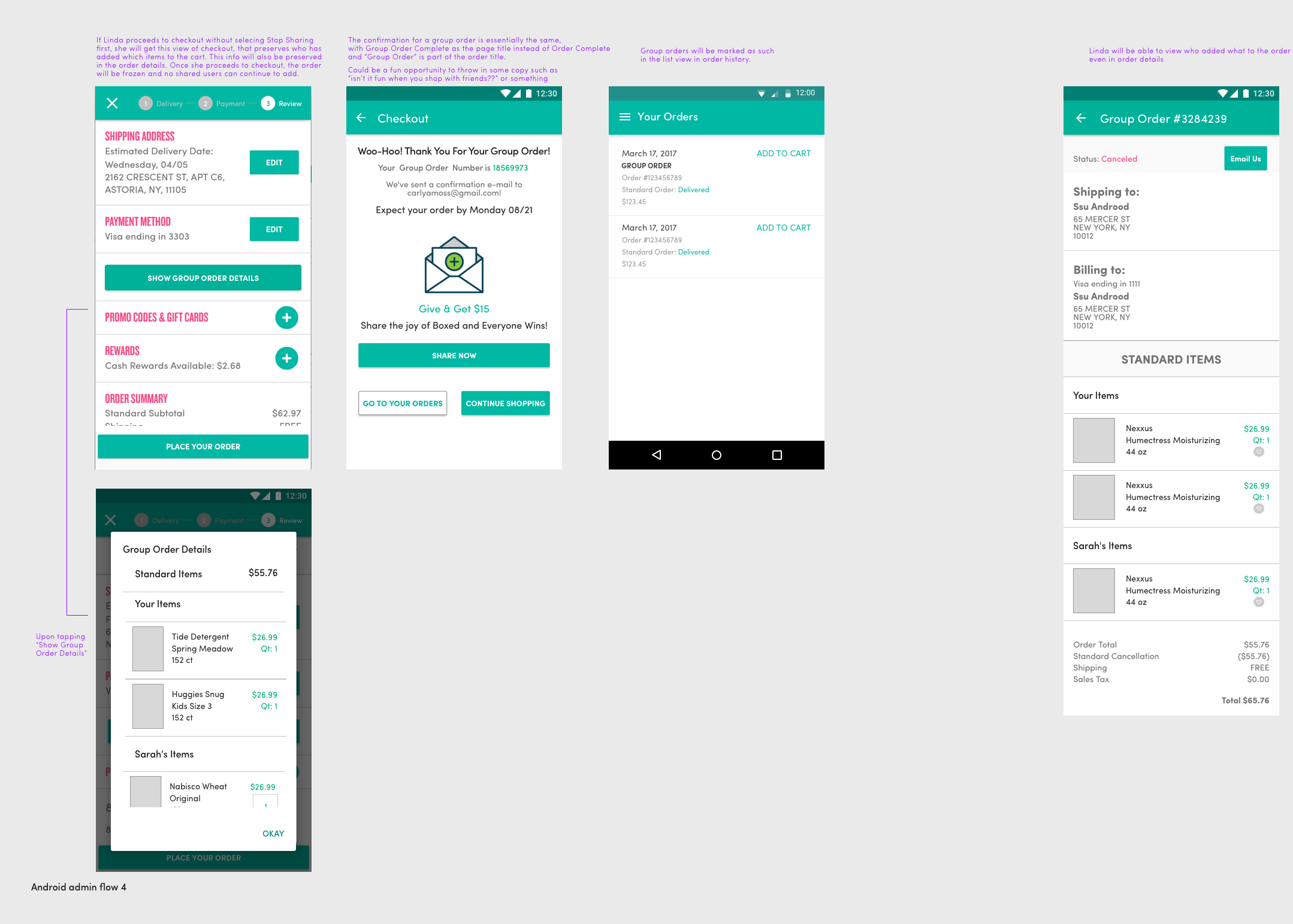
Visual Design Exploration
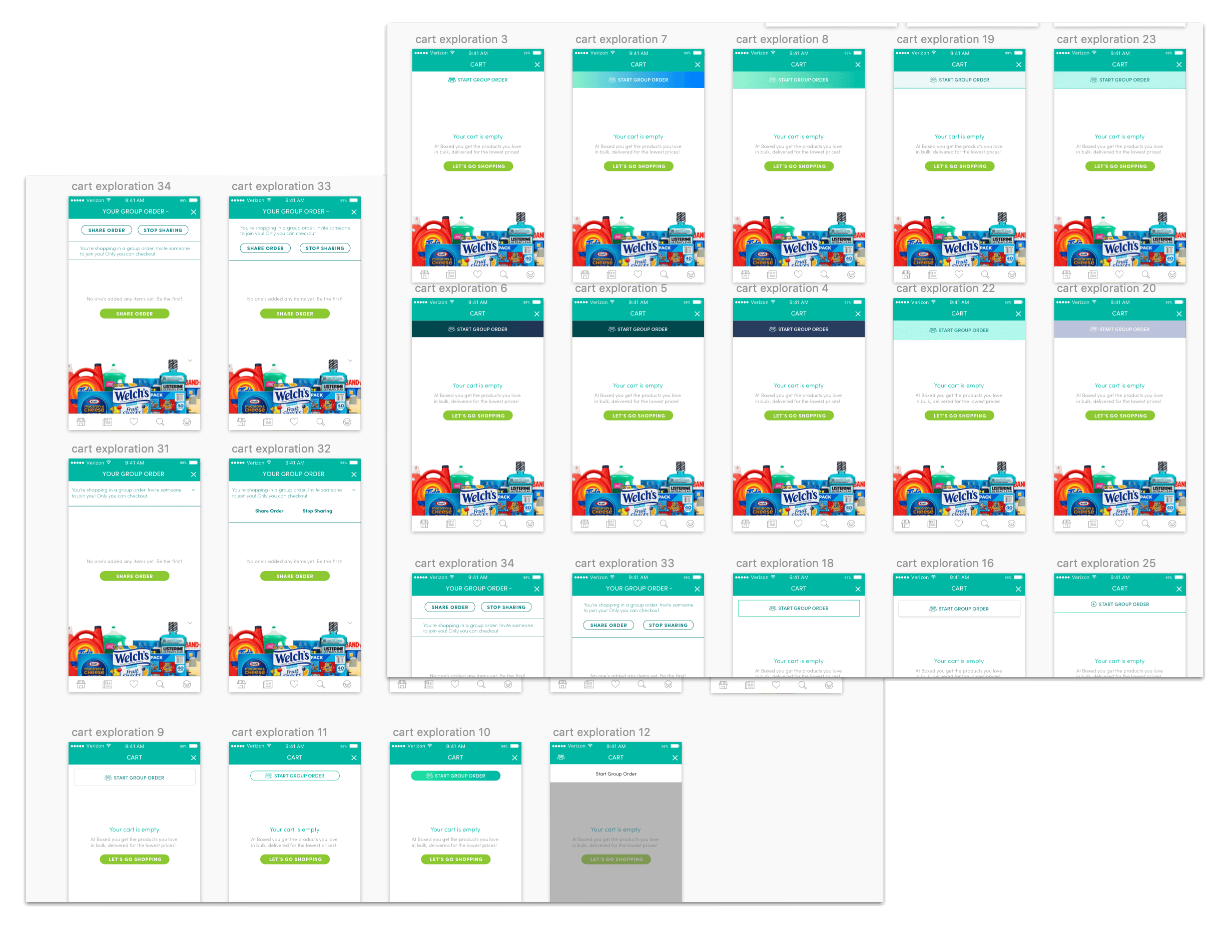
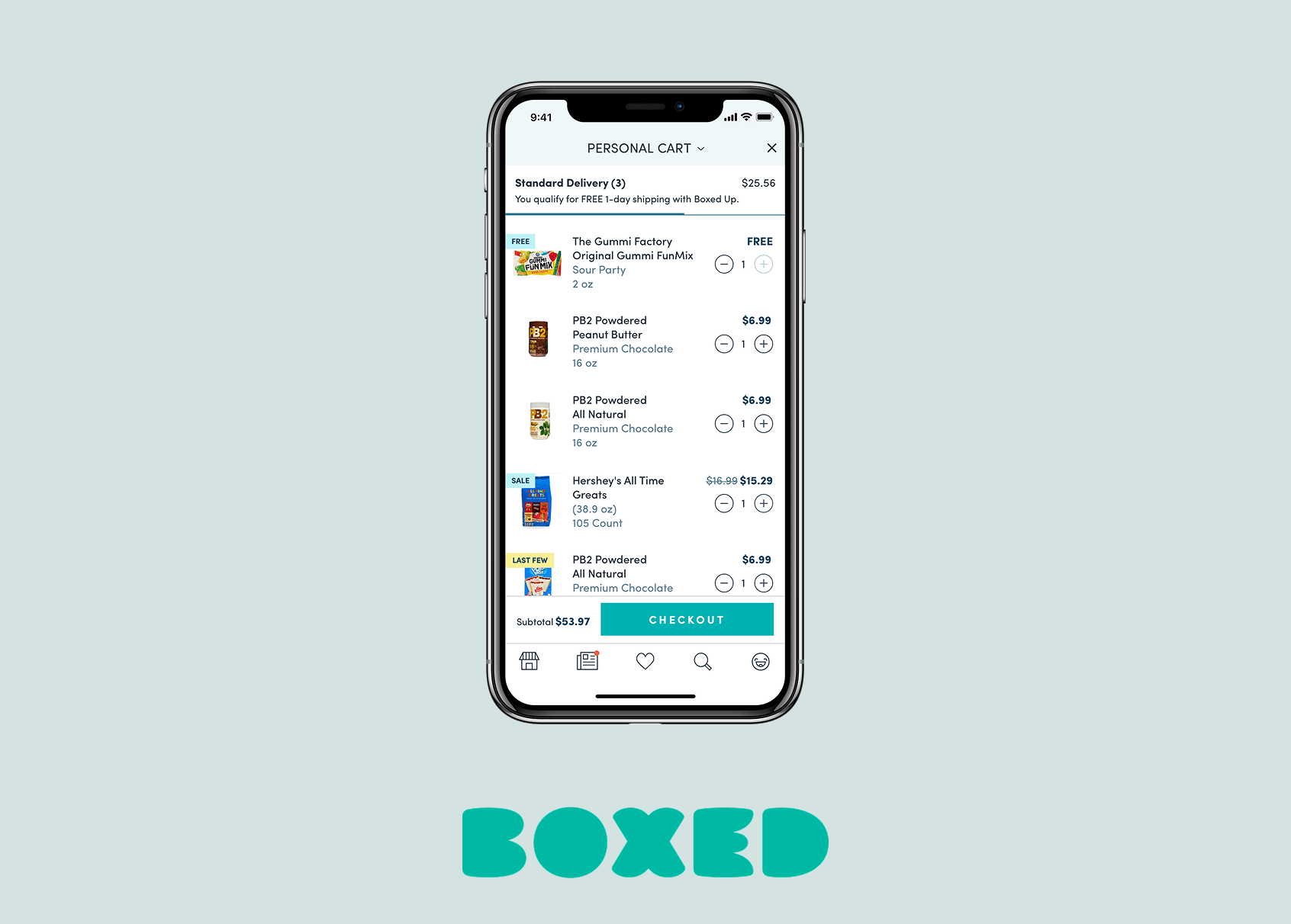
I wanted to use this project as an opportunity to design a new, distinct style that users could associate with Group Ordering. I wanted this style to be in line with the existing look and feel of the app, but also draw the users attention to the new feature. Here are a few explorations of how I wanted to highlight Group Ordering in the cart, which is the natural place where a user can start a Group Order.
The Launch
We launched with this design, and the marketing team created a video to go alongside it and share with our Boxed users to educate them about this new feature.
User Testing
We brought in users to test this feature shortly after launching it. We had a variety of reactions from users around how useful they found this feature. Some users said: “I really like this, it looks like fun! They can see that you’re making decisions, can see how much you’re paying for stuff” and
“I think this seems good for families and multiple people ordering at once. It's cool. I think it’s a great idea, you have a lot of options, very clear." Other users didn't find it useful, saying " not sure when I would use this. If I wanted to make a large purchase with my buddies or family we usually delegate one person to be responsible and then deal with finances on venmo or chase quick pay. I don’t understand how this makes sense since I’m checking out anyway…"
Ultimately, the usage of this feature was a bit lower than we had anticipated, but still the feature brought in 160 orders for $21,542.46 between 2/17/18 and 6/17/18, or $64,627.38 annualized.
UX Takeaways from User Testing
- Group ordering is hard to find. Most users went to account to find it, we should definitely have “manage all orders” in that list
- One user thought you might have to proceed to checkout to make a group order
- Some users expected to be able to change shipping/billing info from Manage Group Orders
- Users wanted to receive notifications when other members of the group order took actions in the cart (adding/removing items etc)
Learnings
In retrospect, I would've loved to do more testing around this feature before launch. I prefer to test prototypes and not builds so that I can catch issues before we put in engineering efforts, and so that we can ensure the best customer experience before we send something out to the world. I would've liked to advocate for more marketing for the feature as well, and spend more time on enhancing the discovery of this feature within the app.
Other Projects
